Product branding* is a tool companies have used to remarkable effect dating back to the late 1800s. Just take a stroll to your local supermarket. There you'll encounter many examples, some in existence for over a century. A few that come to mind: Kellogg's Corn Flakes, Skippy Peanut Butter, Ivory Soap, Coca Cola, Maxwell House Coffee and so on. Through a combination of symbols, graphic design, copy, colors and familiar characters (Mr. Peanut; Kellogg's Rooster), consumers - sometimes unknowingly - make their buying choices. Loyalty and confidence is often built up in a product through quality and consistency. This holds true for everything from cars and restaurants to clothing, electronics, movies.... and, of course, comic books.
*(If you'd like to learn more about the history of branding I suggest sauntering over to this piece: https://99designs.com/blog/design-history-movements/history-of-branding/)
In the nascent comic book field material was culled largely from newspaper reprints, so publishers most often appealed to kids by featuring widely-recognized characters on covers (E.g. Popeye, Dick Tracy, Tarzan) over the need for a company name. This gradually changed when superheroes rose to prominence and new stories were prepared. A few examples include DC's circular image of Superman, Batman, etc, appearing in the upper left corner, accompanied by "A DC Publication" often located on the opposite side; Dell's square logo surrounded by "A Dell Comic" on four sides; "Archie Series" rectangle and the round "EC An Entertaining Publication" colophon. All were located on the top left hand corner in order to easily be seen wherever they were displayed.
Pulp magazine publisher Martin Goodman plunged into the business in 1939 with the debut of Marvel Comics # 1. The company was initially dubbed Timely, and occasionally employed an identifying shield with the slogan: "A Timely Publication" on its covers. In the 40s both a circular "Marvel Comic" and a triangular "A Marvel Magazine" were utilized at various points. In the 1950s Timely was rebranded as "Atlas Comics" (which was also the name of their distributor) with the name encased in a globe.
In the late 1950s, and into the early 60s there were no identifying marks on Goodman's comics line. Five months before The Fantastic Four # 1 debuted an almost unnoticeable "MC" surfaced on the covers of Journey into Mystery # 69 and Patsy Walker # 95, both cover-dated June 1961, with the rest of the line closely following suite, but it clearly lacked visual appeal. This all changed when, sixty years ago, during the month of February, 1963, a new look was displayed on newsstands and candy stores, courtesy of a multi-talented freelancer with a keen mind; an artist who understood the importance of a visual identity and a product that stood out from its competitors.
Steve Ditko had been drawing and crafting stories at Marvel beginning in 1956, often in collaboration with editor-writer Stan Lee, first on an array of fantasy-oriented titles and, circa 1962, bringing his own unique sensibilities to bear on their co-creations Spider-Man and Doctor Strange. Taking notice of the growing array of superheroes at the company he had a noteworthy idea:
"I suggested the corner box with a Marvel hero face and drew a face to show Lee and Sol Brodsky how it would look, and more important how and why the Marvel title with a hero face would be quickly seen, recognized, no matter how comic books sold in stores were placed in racks." Steve Ditko "Martin Goodman/Stan Lee," The Avenging Mind, 2008.
A little background for those of you not in the trenches of comic book history (isn't that what you came HERE for??). Sol Brodsky handled production in the early Marvel period and was of vital assistance to Lee in the day-to-day workings of the company. He was also an efficient artist and inked many early stories. Ditko's suggestion had to be approved by Publisher Martin Goodman, who was savvy enough to recognize a valuable idea. Goodman was also particularly fond of the word "Marvel," since it was the title of his first successful comic.

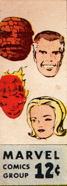
Ditko's corner box was heralded on the letters page of Amazing Spider-Man # 3, a month after it appeared on Marvel covers. The heroes' face, with the Marvel Comics Group company name alongside the price, was an attractive design.
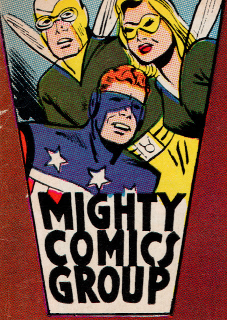
Given the go-ahead, Lee and Brodsky brought in Jack Kirby, their top artist-creator, to illustrate most of the new images, which I'll kindly reproduce below, along with the first cover appearance.


Strange Tales starring The Human Torch # 108. Kirby pencils and inks.


Patsy Walker # 106. Art by Al Hartley.


8 comments:
"Beginning with The Fantastic Four # 1 (August 1961) an almost unnoticeable "MC" surfaced on covers"
It actually began three months earlier, with Gunsmoke Western #65, Journey into Mystery #70, Love Romances #94, and Teen-Age Romance #82
Looking at Mike's Amazing World, the first MC seems to have been on Patsy Walker # 95, published on 6 April 1961, though the other comics out that day don't have it. Kid Colt # 99, Millie The Model # 103, Strange Tales # 86, Tales of Suspense # 19 and Tales To Astonish # 21 published on 13 April 1961 all have it.
It actually began four months earlier, with Journey into Mystery #69 and Patsy Walker #95
Millie the Model Comics #103 doesn't have it.
Ditko was really invested in making Silver Age Marvel a success: the corner logo idea was a quiet but important addition to their growing superhero line.
Nick, you may delete this after reading, as it's off-topic. I lost access to the dashboard to Who Created the Comic Books when I lost my phone number for Google account verification. I've restarted with Who Created the Comic Books 2.
Hi Martin,
Thanks for the info. I've updated and your latest post can be found on my links section as always.
People who criticize Ditko are probably mirroring the criticism of George McClellan by partisans of Abraham Lincoln: they favor Stan's side on arguments. I like Ditko a lot. He was influential on my thinking. He brought a down-to-Earthiness to superland.
Post a Comment