Note: This is a revised and updated piece originally published on September 6, 2011.
One aspect of comic books that I've always been fascinated by - some would say consumed with - is the artwork. From my earliest days I attempted to copy the specific characteristics of artists I grew familiar with, particularly from the nascent Marvel period. This led to an intense scrutiny of Jack Kirby's art (who, in case you didn't know, was a creative force and primary co-creator of Marvel's superhero line). Circa 1959-1963 many talented artists in their own right embellished his pencils, including Chris Rule, George Klein, Dick Ayers, Steve Ditko, Don Heck and Paul Reinman. Not widely known, though, is that Kirby also inked a selection of covers and interior pages. In this piece I will present my findings, aided greatly by the visual aspect of a blog. In burrowing through comics from over a half-century ago I hope to illuminate a largely unknown and fascinating aspect of Kirby's oeuvre.

The Fantastic Four # 7, October 1962
Battle # 67 is the first Pre-Hero Marvel cover I've discovered that points to Kirby inking (Kirby briefly returned to Atlas in 1956-7 and, once again, I suggest you saunter over to Harry Mendrek's blog for an analysis of the stories he delineated in that period: https://kirbymuseum.org/blogs/simonandkirby/archives/884.) Editor Stan Lee assigned most of Kirby's penciled art in this period to his regular stable of inkers (Klein, Rule, Ayers, Ditko). The above image bears none of their signature styles. The face of the soldier, the folds of clothing, the hands and backgrounds (including the squiggle line on the second to left enemy helmet) are indicative of his previous inked work.
This is the first "monster" cover I've attributed to Kirby's inking. Everything looks as though it was succinctly finished, with no frills added. The sharp lines that denote water compare with Kirby's DC story (as shown above). It also looks as though a few additional blocks of ice were crudely drawn, either by production head Sol Brodsky or art director/editor Stan Lee. It should be noted that in this period Martin Goodman's comic book division was small, so anyone in the office (including freelancers) might be called on to lend a hand in emergency situations.
Journey into Mystery was followed by another Battle cover. Inking here looks more precise than usual, perhaps indicating that Kirby labored on this piece a little longer. While there are enough elements pointing to Kirby as the leading suspect (clothing folds, hands, etc.) the possibility that someone else was involved is not out of the question.

Here is an instance where Kirby inked an interior story page. While Don Heck drew the rest of this seven page thriller from Journey into Mystery # 58, May 1960, Lee had Kirby illustrate the splash page, undoubtedly replacing Heck's original version. In all likelihood Heck's creature and startled bystanders lacked the immediacy and over-the-top drama Kirby was known for. He was, after all, king of the monsters! The technique here constitutes minimal details, so I wouldn't be surprised if Kirby rushed this out while dropping off work to Lee in the office (and it still packs a punch!).
I originally credited Dick Ayers with the inking on this cover, but there are a number of Kirby tropes that made me reconsider, specifically his handling of the clothing, wheel squiggle (foreground) and brushstrokes on the water.

The Incredible Hulk # 1, May 1962. Image from the Grand Comics Database.

Strange Tales Annual # 1, 1962
 Unpublished cover, Dick Ayers inks.
Another cover that screams "Kirby" to me. The use of basic strokes to denote hands and blocky inking on the Rawhide Kid's attire, along with the way the buttons are drawn - bigger and closer together - add up to a simple but attractive cover.


Love Romances # 96, November 1963
This is the only Kirby inked romance cover I've discovered thus far. The face and hair of the woman in the foreground has a distinctive Kirby touch. Is this Kirby's last "unknown" inked cover of the period? Stay tuned!


 Detail to the cover of Fantasy Masterpieces # 4, August 1966
While comics historian Mark Evanier has identified the cover of The Fantastic Four # 7 as being inked by Kirby (to which I wholeheartedly agree) I contend that there are many other instances in the period from 1959-63 where he completed the art.
As a starting point I offer a few examples of Kirby's stylistic tics dating back several years before his Marvel tenure. I believe this will provide context to my observations and substantiate my conclusions.
 |
"The Mysterious Mr. Vince," Tales of the Unexpected # 21, January 1958. |
 |
Clothing Folds |
 |
| Face |
 |
| Hands |
 |
| Machinery Squiggle |
 |
| Water Waves The above Tales of the Unexpected page and selected panels are all from Kirby-inked stories he produced at DC months before his return to Martin Goodman's company. These examples reference concrete details in Kirby's brushwork which will be increasingly recognizable in the images that follow. (To read more about Kirby's pre-1959 inking I refer you to Harry Mendryk's blog: https://kirbymuseum.org/blogs/simonandkirby/archives/824 ) |
Dating back to the beginning of his career Kirby could do it all: write, pencil, ink, letter - but going over his art in india ink was not a favorite chore. Paired with partner Joe Simon in the 1940s and 50s, a man who was also multi-talented, the team often collaborated on the art, with Simon inking Kirby's pencils to great effect. When Kirby finished the job he did so competently, with his wife Roz reportedly providing minor assistance from time to time. In several interviews Kirby explained that he felt any professional could complete the job (and, perhaps more telling, his concentration always appeared to focus on telling the next story). While lacking intricate details, since he pays little attention to fine points like fingernails, his depiction of clothing folds to indicate movement, as an example, have a somewhat abstract and organic quality that makes up for any missing elements. More importantly, it presents a glimpse into the undiluted, bare-bones artistry of Kirby; the way one might pit the contributions of The Ramones or Hendrix to Dylan's acoustic renditions. And while the contrast may be a bit more profound in a musical idiom, it is still Kirby working through his own conceptualizations, in much the same fashion as Dylan was doing in his realm. In both cases, I believe insights are gained in terms of the artist's vison.
 |
| Battle # 67, December 1959 |
 |
| Journey into Mystery # 56, January 1960 |
 |
| Battle # 68, February 1960 |

Journey into Mystery # 58, May 1960
Here is an instance where Kirby inked an interior story page. While Don Heck drew the rest of this seven page thriller from Journey into Mystery # 58, May 1960, Lee had Kirby illustrate the splash page, undoubtedly replacing Heck's original version. In all likelihood Heck's creature and startled bystanders lacked the immediacy and over-the-top drama Kirby was known for. He was, after all, king of the monsters! The technique here constitutes minimal details, so I wouldn't be surprised if Kirby rushed this out while dropping off work to Lee in the office (and it still packs a punch!).
 |
| Tales to Astonish # 20, June 1961 |
I originally credited Dick Ayers with the inking on this cover, but there are a number of Kirby tropes that made me reconsider, specifically his handling of the clothing, wheel squiggle (foreground) and brushstrokes on the water.

The Incredible Hulk # 1, May 1962. Image from the Grand Comics Database.
The Incredible Hulk # 1 has been attributed to several inkers over the years, including George Roussos and Paul Reinman, but I'm convinced Kirby is the actual inker. As evidence I'd point-out the short strokes on Banner's lab coat, lack of delineation on the Hulk's feet and face, and overall simplicity. There is neither Roussos' heavy use of blacks, Reinman's more precise line, or Ayers' thickness here. Again, it was probably a case of deadlines and Kirby being available (and a speed demon). At the time of the Hulk's debut no one knew the character would survive over half a century later and become recognized through cartoons, television and movies. It was another job in-between the next Fantastic Four and Rawhide Kid .
 |
| Journey into Mystery # 81, June 1962 |
This cover is generally ascribed to Paul Reinman or George Roussos, but the reductive fleeing figures and the ink-slashes on the robot are indicative of Kirby inks.

Strange Tales Annual # 1, 1962

| Strange Tales Annual # 1 features Kirby inks, which makes complete sense when a rejected cover was discovered several years ago. The original cover was inked by Dick Ayers, one of Kirby's primary delineators on the monster stories and during the first few years of his superhero work. Ayers' thick, solid inking was perfect for the genre and some of his work was retained on Kirby's version (the Shadow Thing vignette, noticeable on the brickwork). Lee apparently wanted the monsters to threaten humans, which Kirby included in the published version. A replacement would likely be rushed out in the office, so it makes sense that Kirby, instead of Ayers, inked the cover. |
 |
| Rawhide Kid # 31, December 1962 |
Another cover that screams "Kirby" to me. The use of basic strokes to denote hands and blocky inking on the Rawhide Kid's attire, along with the way the buttons are drawn - bigger and closer together - add up to a simple but attractive cover.

Tales of Suspense # 36, December 1962
This Kirby fantasy cover clearly has the same distinguishing inking characteristics. Note the policeman in the foreground and the brusque lines on his face and clothing (and don't you just adore the dog!)

Rawhide Kid # 33, April 1963
I long suspected Rawhide Kid # 33 to be an Ayers inked cover but upon closer examination, particularly the clipped strokes on hats, made me reassess this to be Kirby's inking.
While the cover of FF # 11 was altered in places, likely by Al Hartley (mainly the figure of Sue), the inking is another matter. In studying this cover some years ago I asked Dick Ayers if he inked it. He emailed me, informing me that the record books he checked indicated it was not his handiwork. Since the coloring is very dark it's hard to decipher details, but the bottom character faces, as well as the Torch's flame pattern - similar to his features on FF # 7, strongly suggest that Kirby completed the art.

Tales of Suspense # 38, February 1963
This cover has all the earmarks of Kirby inking. Notice the simple lines on the background figures and the slashing technique. This looks nothing like Ayers' work, nor the other inkers of the period. While it is true that Ayers followed Kirby's line closely in a few instances, it was highly unusual and Ayers' signature style is hard to completely miss.
Kirby's inking of machinery was effective, giving it a cold metallic look. Ant-Man's costume is recognizable without any frills, as are the pedestrians, but Kirby was accomplished enough to make it all work.
I'm still on the fence regarding this cover. In the Grand Comicbook Database the possibility of Steve Ditko as inker was brought up, and while I was initially skeptical, I clearly see him as a possibility. There are instances where Ditko literally traced Kirby's pencils, such as the "Giant-Man" story in Tales to Astonish # 50. The lack of definition in the hands and the soldier's garb looks like typical Kirby inking, but there's something about Fury's face (and, oddly enough, his canteen) that has a touch of Ditko.

Rawhide Kid # 33, April 1963
I long suspected Rawhide Kid # 33 to be an Ayers inked cover but upon closer examination, particularly the clipped strokes on hats, made me reassess this to be Kirby's inking.
May 1963 cover-dated titles feature what I believe are a total of three Kirby-inked covers. Lee apparently handed out assignments in batches, so on a given month you would notice Paul Reinman or Sol Brodsky inking two or three covers, with another four assigned to Dick Ayers. My guess is that Lee needed these covers completed in a hurry and assigned them to Kirby, who was sure to finish the work on time.
 |
| Fantastic Four # 11, February 1963 |

Tales of Suspense # 38, February 1963
This cover has all the earmarks of Kirby inking. Notice the simple lines on the background figures and the slashing technique. This looks nothing like Ayers' work, nor the other inkers of the period. While it is true that Ayers followed Kirby's line closely in a few instances, it was highly unusual and Ayers' signature style is hard to completely miss.
 |
| Tales to Astonish # 40, February 1963 |
Kirby's inking of machinery was effective, giving it a cold metallic look. Ant-Man's costume is recognizable without any frills, as are the pedestrians, but Kirby was accomplished enough to make it all work.
 |
| Journey into Mystery # 92, May 1963 |
While the backgrounds are a little more distinctive and Ayers-like than Kirby's style, Loki's hands and costume barely have any black areas and Thor's helmet has a simple squiggle. Kirby also likely inked the smiling Thor corner trademark, which was soon changed to a more dour expression.
 |
| Tales of Suspense # 41, May 1963 |
Iron Man's armor has the same choppy lines that accompany Kirby's inking of machinery, and Dr. Strange's outfit again makes use of a few lines to denote clothing folds.
 |
| Strange Tales # 112, September 1963 |
The characters and background elements all point to Kirby's sparse inking. The Human Torch's "flame lines" appear different enough than those of Dick Ayers or George Roussos (the two primary inkers of the character in the Fantastic Four in this period) to suggest Kirby's hand.
 |
| Sgt. Fury # 3, September 1963. Kirby or Ditko inks? |
I'm still on the fence regarding this cover. In the Grand Comicbook Database the possibility of Steve Ditko as inker was brought up, and while I was initially skeptical, I clearly see him as a possibility. There are instances where Ditko literally traced Kirby's pencils, such as the "Giant-Man" story in Tales to Astonish # 50. The lack of definition in the hands and the soldier's garb looks like typical Kirby inking, but there's something about Fury's face (and, oddly enough, his canteen) that has a touch of Ditko.

Love Romances # 96, November 1963
This is the only Kirby inked romance cover I've discovered thus far. The face and hair of the woman in the foreground has a distinctive Kirby touch. Is this Kirby's last "unknown" inked cover of the period? Stay tuned!
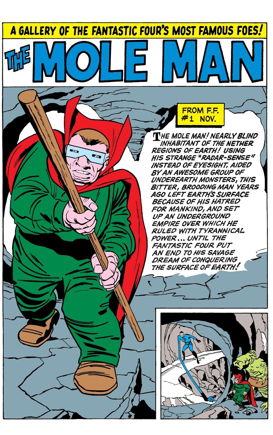


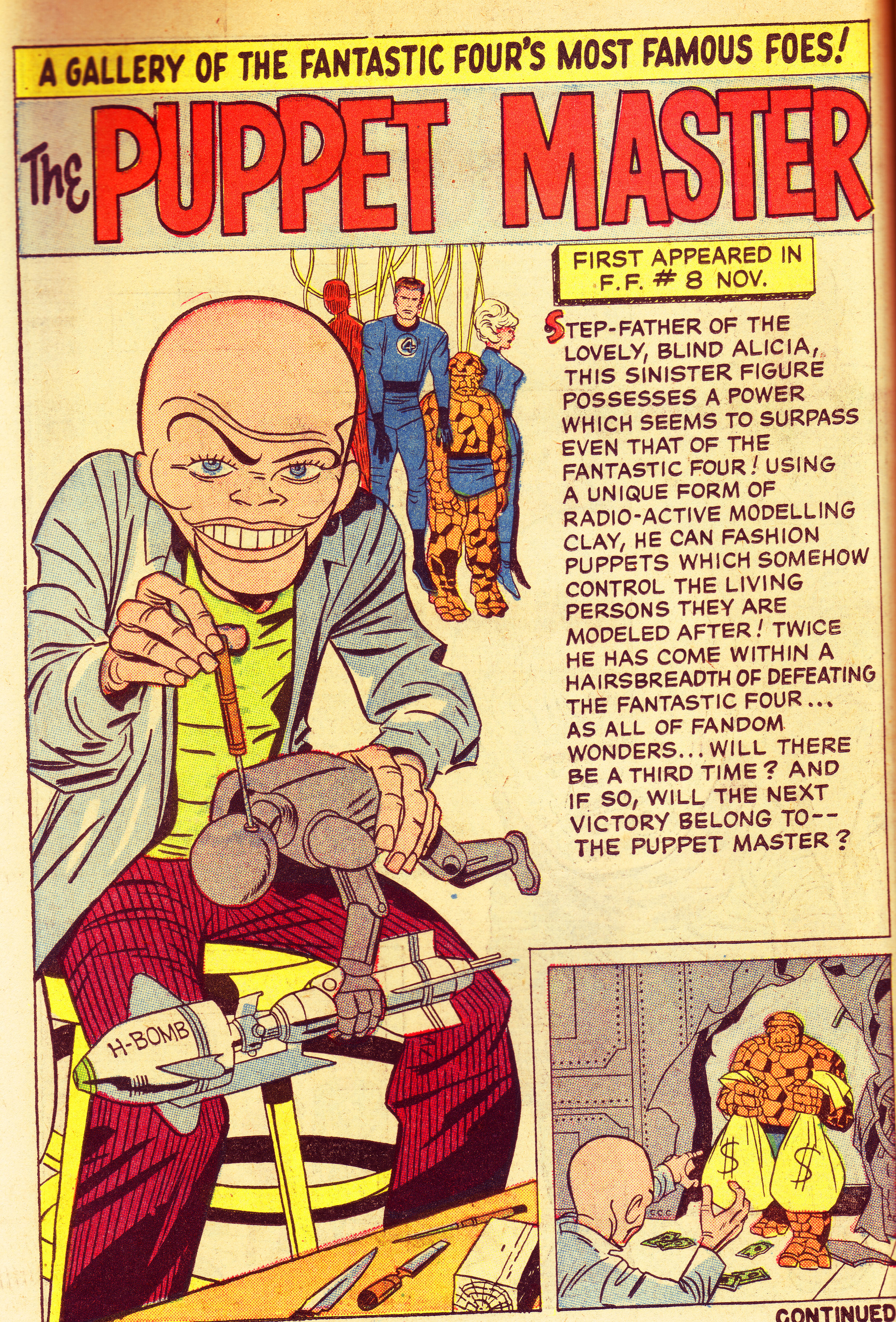


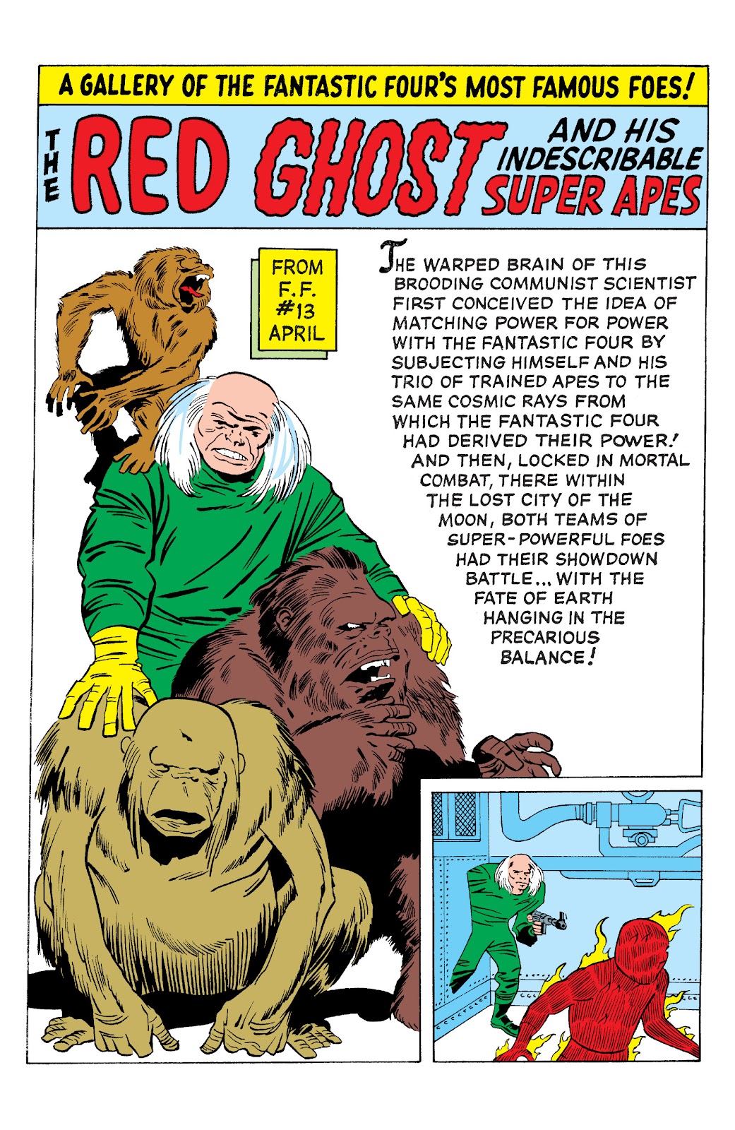
In addition to covers I believe Kirby also inked all but one of the pin-ups in Fantastic Four Annual # 1, 1963. Dick Ayers clearly inked the Mad Thinker, the only illustration that was not lettered by Ray Holloway (Artie Simek did the honors). Since the Annual was triple the length of an ordinary comic more time was afforded to complete the assignment; it's a likely assumption that pages were penciled and inked at different stages. .

In the following years Kirby was a whirlwind of production and creativity, with Dick Ayers, George Roussos, Vince Colletta and most notably, Chic Stone and Joe Sinnott embellishing his pencils. With Lee getting requests from fans asking Kirby to ink a cover or story, the artist did the honors in Fantasy Masterpieces # 4, illustrating his co-creation Captain America. It was to be his last ink-job at Marvel. In a business sense it was understandable. Kirby was too valuable as a penciller and had no interest in going over them, still, it would have been interesting to see how Kirby would have inked an entire issue of FF, Thor, Captain America or the Hulk.
Kirby's efforts as an inker is a small part of his enormous contributions to the world of comic art. Nevertheless, it deserves attention. Like his pencil art, his inking had a raw, unfinished feel that, while not technically perfect, packed a wallop similar to a two minute rock song: fast: furious and wildly exuberant.
Special thanks to Frank Mastropaolo for his "minimal" assistance (it's an IN joke!)