While many covers were new versions by different artists, especially in the 1970s, including Gil Kane, Sal Buscema, Marie Severin, Jim Starlin, John Buscema and Ron Wilson, the originals were also used, but sometimes there were subtle differences. Some of the covers, it turned out, were not the original publsihed covers, but stats of the covers before they were changed in production. There were changes big and small that occured, and I thought it might be interesting to doccument some of them.
 |
| Fantastic Four # 68, Nov 1967, Kirby/Sinnott |
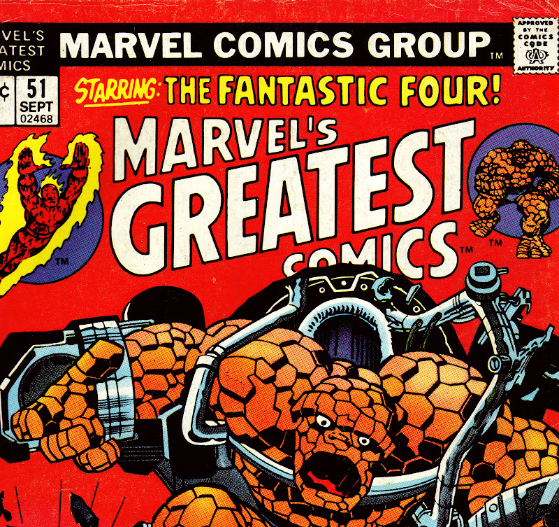 |
| Detail to Marvel's Greatest Comics # 51, Sept 1974 The above example is one of the, um, minute changes that sometimes appeared and could easily escape detection. In the original published version the Thing's mouth is smaller than the stat that was published on the reprint. Why the change? Did someone think the Thing as originally depicted looked too frightening? The coloring on the reprint appears to obscure some of the machinery, but I don't think there are many alterations from the original, although on both versions Marie Severin may have touched up some of the machinery directly above the Thing's head. |
 | ||
Fantastic Four # 70, Jan 1968 Kirby'Sinnott/Romita alterations
|

Kirby's original drawing reveals a number of differences from the printed cover. Sue's figure on FF # 70 was positioned to turn in the direction of the Android. Romita redrew parts of Sue's waist and leg's, as one can see from the way the lines on her skirt are drawn. Also, Johnny was originally drawn without the flames emanating from his body. Some of Sue's figure is covered on the reprint because the original copy was moved in order to add an additional caption on the upper left. In the 1970's editors often felt the need to add more captions or word baloons, making the covers cluttered and less dramatic.
 |
| Thor #129, June 1966 Kirby/Colletta |
 |
| Marvel Spectacular # 2, Sept 1973 |
In the original Thor cover Stan decided to eliminate the architecture in order to focus on the three figures. This turned out to be a good idea, as the black background was more dramatic and attractive. The Marvel Spectacular cover had to crop the images a bit in order to fit the bigger logo.
 |
| Fantastic Four # 71, Feb 1968, Kirby/Sinnott |
 |
| Marvel's Greatest Comics # 54, Jan 1975 As you can see, Marvel used quite a few unpublished stats in this period on their reprints. It is interesting to compare the two versions. In the published FF cover Stan again choose to simplify the background elements, eliminating most of the details on the left side of the cover (Reed and Johnny). Only the outline of a bulding appears by Reed's figure, and Johnny's flame was altered so as not to cover the android's face. The burst in between the characters and the blurb was also cut out. The MGC cover cropped the Sue section in order for the logo to fit, but I find the composition of the burst more attractive than the published cover version. |
 |
| Thor # 133, Oct 1966, Kirby/Colletta/Romita alterations? |
 |
| Marvel Spectacular # 4, Nov 1973 |
The face of Ego was changed considerably on the published Thor cover, perhaps by John Romita, although I'm not certain. Stan must have felt that Ego's face looked too normal and wanted a more otherwordly look. I was comparing these covers with my brother John, who felt the published Thor cover looked better than the Marvel Spectacular stat. I believe minor alterations may have worked better, perhaps deleting the beard. I do like the way Kirby drew the eyes.
 |
Captain America # 101, May 1968. Kirby/Shores/Romita alterations |
 |
| Marvel Super Action # 2, July 1977 Finally we come to a cover that was not not changed due to editorial choice, but by the demands of the Comics Code. Roy Thomas has explained that the Code was very touchy about the depiction of the Skull, and early on made it clear that the Skull's face should look like a mask, not a real skull. Kirby apparently forgot that demand when he was drawing the original cover, and John Romita was called on to make the Skull acceptable. By 1977 the Code had softened enough for the cover to appear on Marvel Super Action. The stat also has a few background elements that are a little different, and the title had to be relettered so that the UPC code could fit on the lower left hand corner. |
Those are a few of the covers that were used on reprints in the 1970s. There are quite a few more, and I may detail some of those on a future blog post.
3 comments:
Nick, these covers you posted were just fascinating. You can look for hours for the small and even large changes.
There is something though I would like to point out. And I am making an assumption, based on your wonderful blog on Stan Goldberg. Most of the coloring for the "before" covers here were done by Stan G and are generally better.But the difference in the coloring is often dramatic.
Second when you mention the blurbs, which became so overwhelming as the 70s went on,I have a slightly different take. Because the comics were not specifically "FF" or "Thor" or whatever, they had to put a bit more information on the cover to attract a buyer. And they would have in any generation. Look at the extra blurbs in the earlier Marvel Tales and MCIC.
You also once should me a cover to Spider-Man #79, which had Peter Parker thrown out a window. In the reprint they changed Peter back to Spidey on the cover because they wanted to promote Spider-Man.
By the way, I wrote this entire post with Kirby on my lap, purring,
Barry,
Of course the new colorists rarely coompared with Stan G.'s work. Most recolored jobs were fairly bland and uninspired. As far as needing more copy on reprint titles, I agree on the earlier Marvel Tales, Marvel Collector's and Fantasy Masterpieces, when there was a number of features included, but not when copy like "Attack of the Awesome Android" is added to the MGC cover, or the addition of word baloons to covers that didn't need them in their original incarnation.
You can see the Marvel Tales cover Barry was talking about here:
http://images.wikia.com/marveldatabase/images/9/9e/Marvel_Tales_Vol_2_60.jpg
The original only had the Spider-Signal with a blurb, but it was decided that Spider-Man was essential to the cover some years later.
Post a Comment