Saturday, October 6, 2018

Steve Ditko's Shade, The Changing Man: A Look Back

The Steve Ditko Omnibus Volume 1 starring Shade, the Changing Man reprints, for the first time, the original eight-issue run of Ditko's 1977 creation, along with the unpublished 9th installment (in addition, all of Ditko's 1970s mystery, humor, sci-fi and war output for DC is collected). A little background is necessary: when DC had a downturn in sales, management demanded massive cuts throughout their line. Contents of the completed comics (minus coloring, which was the final level of production before heading to the printers) were compiled in order to retain copyright ownership. Totaling at a massive 942 pages, 40 xerox copies were printed in two volumes as Cancelled Comics Cavalcade and sent out to contributors. An additional copy was reserved for Bob Overstreet, publisher of The Comic Book Price Guide. A few have surfaced on the secondary marketplace and can be found online. 

While the compilation and preservation of Ditko's work is laudatory, one aspect that troubled me, and which I believe is worth addressing, is the  decision to print Shade # 9 in black and white. When Ditko's unpublished Blue Beetle and Capt. Atom stories surfaced in fanzines, the addition of color in a small press publication was cost-prohibitive. In this instance the concern was of an editorial nature: to present the material without alterations (akin to a DVD release of an uncut film). However, I believe it has the exact opposite effect, since Shade was earmarked for color; the only reason it lacked hues was due to production being called to a halt. Color would invariably have enhanced the work and rendered it closer to what the artist had originally intended.                  
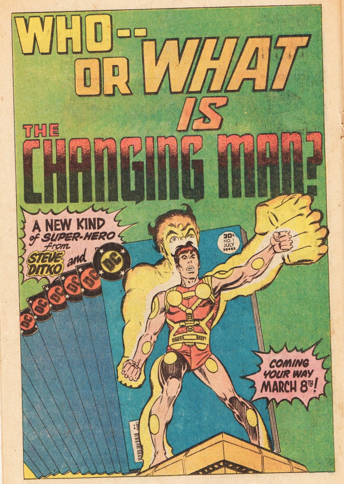


  House ad promoting Shade, incorporating Ditko's cover art to issue # 1, appeared in May-June 1977 dated DC comics. Lettering by Gaspar Saladino. 


The Comics Journal # 33, April 1977 heralded Ditko's new character. Was this intended to be the original cover to issue # 1? A presentation piece? Promotion art for fanzines or conventions? It includes a hand-lettered title by the artist, emphasizing the word "Changing." Perhaps the logo was a preliminary design Ditko suggested to DC? This issue also includes a review by Mike Catron: "Shade: Ditko's new book shows potential."


Gaspar Saladino was one of the top letterers in comics, often sought-after by editors at both DC and Marvel to craft attractive cover copy and logos. Saladino created the "Shade" title, while Bill Morse devised "The Changing Man." 
    
 DC had planned to feature Ditko's name above the title, but since this was a collaborative effort and not a sole creation, the unerringly ethical artist  vetoed that idea. From The Comics Journal # 32, January 1977.

It's clear that these stories look infinitely better on higher grade paper. In 1977 the printing quality in most comics was abysmal. Straight lines wobbled and pages bled through consistently, making it difficult to appreciate the art, and sometimes hard to read. Here we see Ditko's illustrations reproduced with a much sharper texture, achieving a more rewarding experience.

   
An example of DC's hardcover reprinting of Shade. Unless otherwise noted, images are taken from the original publications.  

Ditko created the character of Shade, who fits into his concept of a hero and a moral ideal. As with many Ditko protagonists, Rac Shade is a man wanted for crimes he did not commit and pursued by both criminals and the law. He wears an outfit that gives him the ability to alter his appearance based on his opponent's fears. Like his later character, Static, the device could be used for good or evil, depending on the wearer. Although there is a base on earth, much of the story takes place in other-dimensional realms. 


Ditko adds conflict to the strip in Shade's relationship with Mellu. "The Forms of Destruction," Shade the Changing Man # 2, September 1977. Michael Fleisher dialogue, Bill Morse lettering, Liz Berube colors.   

Ditko's plot is thick with characters and concepts - perhaps a little too dense in places - but he devises a number of interesting twists and turns throughout the series. Shade's love interest, Mellu, is a strong, independent woman. A Government agent, she blames Shade for the crippling of her parents, but harbors a modicum of doubt over his apparent guilt. While others may have played this plot-line out interminably, Ditko wisely resolves it in the 6th issue. 


   A trio of bizarre villains crafted by Ditko. From top to bottom, Form, Sude and Khaos.  

Ditko's visual concepts stand out in his design of villains such as Form: a woman who can change into a misty substance, Sude: a large mechanical face with arms and enormous teeth, and Khaos: a distorted figure who represents anarchy. 
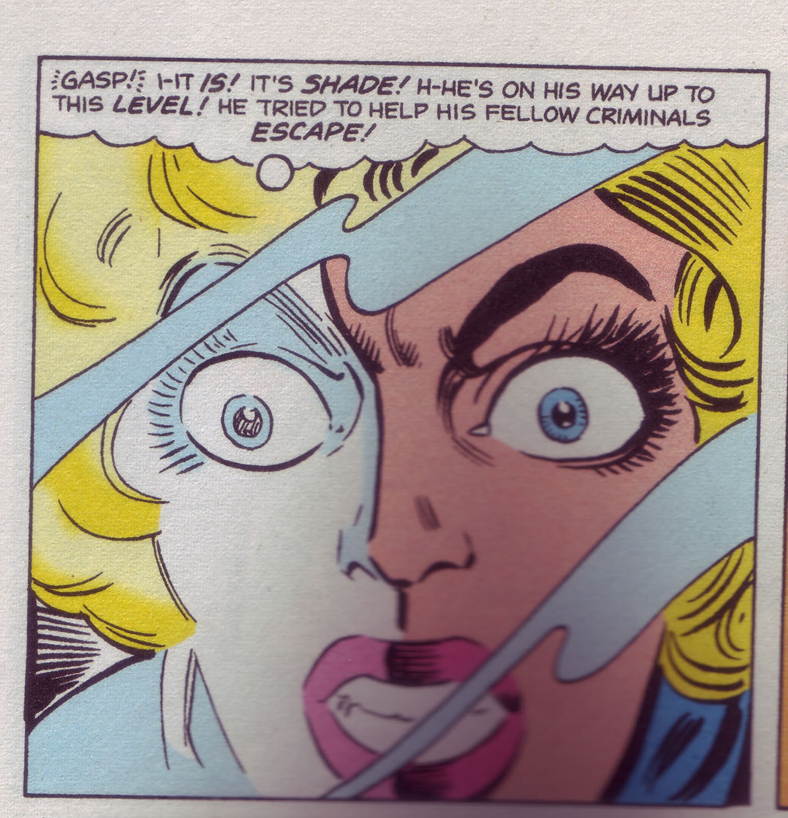
  Ditko's use of lighting for dramatic effect is evocative of cinematographers such as Karl Struss and reminiscent of his friend and fellow artistic powerhouse, Wally Wood. Image from DC's hardcover edition.  

While Shade has a lot to offer, there are a few drawbacks. I find Shade's visual signature of "changing" his appearance and frightening his foes lacking in drama. A big fist and a scary face can only go so far. One of the most inventive designers in comics, Ditko's costuming of Shade lacks his usual flair (his villains, as seen above, are much more dramatic visually). Michael Fleisher wrote the dialogue for every issue, which is at best workmanlike (the author stated in interviews that he didn't particularly care for the assignment). while I've enjoyed his solo writing on strips such as Jonah Hex, it's unfortunate DC didn't employ an author sympathetic to Ditko's philosophy; someone who could have invested as much into the dialogue as Ditko did his plotting and artwork.


Shade was reprinted in other countries, including Brazil and France. O Mutante cover from Shade # 6, May 1978. Super Heroes image is reworked from the splash page of Shade # 3, November 1977. 

This was essentially Ditko's last hurrah at DC in terms of investing effort in his own concepts. As the article by Joe Brancatelli below reveals, Ditko was growing disgusted with the policies of the major companies, who wanted their product to fit into a comfortable niche. This was anathema to Ditko, who thrived on seeking out new concepts to explore. After the cancellation of Shade most of Ditko's new creations would go the independent route, his work for DC and Marvel concentrating primarily on pre-existing characters. Speedball, created in 1988, was an exception, although a number of hands were involved in the character's development, which lead to a retreading of the teenage superhero motif.  

Joe Brancatelli's column, The Comic Books, from Creepy # 93, November 1977:
                                       DITKO—AS ALWAYS 
 It always seems that no matter how often the four-color comic book business goes into a creative nosedive, Steve Ditko is there with-a new concept, a new character or some new idea. Lately, Ditko has been plying his trade at DC, plotting and drawing a book called. Shade, The Changing Man.. Three issues into the book, Shade doesn't look to be another Spider Man. or another Dr. Strange, or even another Mr. A, but it is easily the most intriguing comic on the market. It's got everything a classic Ditko series has: a character, who is unalterably good, somehow finding himself in combat with organized society; an underlying battle between good and evil; philosophic musings about society, corruption and idealism; and a bunch of typically Ditkoish characters, plot twists, strange and exotic dimensions and artwork. And if the art itself isn't quite up to Ditko's usual exacting standards, it's -improving immensely with each issue.
Unfortunately, the coloring on the book is atrocious ("I always give them color guides," Ditko says, "and they never follow them.") and Ditko's work has never prospered on the smaller pages of today's comic books. "I've plotted up to issue 15 of the book," Ditko says, "but I don't know anything about the book except for the fact that (Mike) Fleischer is writing the sixth issue. I don't know anything at all about sales, either. DC doesn't tell you anything. For all I know it could be a big bomb." Always fiercely outspoken about industry matters, Ditko claims DC editors have been forcing Shade into the standard superhero niches at every opportunity. "I always try to do something different. I never wanted Shade to be just another costumed superhero. I'd have done it differently, but they (DC) want to stay with the hackneyed old stuff. "You look at the long-range prospects of the character and you know Shade isn't the kind of book you can do in 17 pages an issue. But after a while, I just blank out after I take the book in to the office." "You learn," he says bitterly, "that all they ever want is a half-assed reprint of the story you did for them last week. You learn that if you want to survive you have to put up a wall and stay away from all the comic people before they make you as dull and repetitive as they are."

Shade the Changing Man was not only a victim of economics but an example of the limited 17-page format that plagued creators (including Jack Kirby) in the 1970s. Less than a decade later high quality, longer, complete stories (called Graphic Novels) became part of the comics landscape. Unfortunately, the formats that would have been perfect for Ditko's work were reserved for fan favorites such as Frank Miller, John Byrne or Alan Moore. If you were not the current flavor-of-the-month Marvel or DC had no intention of spending money on what they believed to be a money-losing proposition. It took over 30 years for DC to publish a collection of Ditko's work for the company, including Shade. That is to be commended, but imagine if the artist was given the opportunity years ago to complete the Shade saga? What might that have looked like? 


  Ditko revisited Shade for the final time when he agreed to provide an illustration for Who's Who: The Definitive Directory of the DC Universe # 20, October 1986. 

The Steve Ditko Omnibus starring Shade is available for purchase at Amazon:

https://www.amazon.com/Steve-Ditko-Omnibus-Starring-Shade/dp/140123111X 

Saturday, July 7, 2018

S. Ditko 1927-2018: An Independent Mind

"The creator seeks worthy values. He has the drive and ambition and is willing to struggle with no  guarantees of success or security. He offers his best for all others to consider - to accept or reject." Steve Ditko, Laszlo's Hammer, 1992


The thinking artist. A page from Lazlo's Hammer, (1992) which illustrates Ditko's storytelling process.  

A fiercely independent man, Steve Ditko walked a path distinctly his own through the comic book industry for over 60 years. Early on Ditko distinguished himself as a versatile artist, drawing horror, science fiction, crime, mystery, war, western, romance and humor stories. In itself worthy of praise, but Ditko transcended mere technical proficiency by infusing his work with a deeply-held, unwavering philosophical ideology. That aspect, above all others, wove its way throughout his storied career.      


Captain Atom, which debuted at Charlton in1960, was Ditko's first superhero strip. the character was created and written by Joe Gill and  designed by Ditko. Ditko's tribute to Charlton writer Joe Gill appeared in Steve Ditko's 160 Page Package, 1999. 

In the years (and decades) that followed, Ditko created, co-created, or re-created a litany of heroes, including Spider-Man, Doctor Strange, Blue Beetle, The Question, The Creeper, Hawk and the Dove, The Destructor, Stalker, The Void, Killjoy, Shade, Starman, The Missing Man, Speedball, The Mocker, Static, Miss Eerie, Madman and many others. Ditko's striking designs made his characters instantly recognizable. Just as important was Ditko's ability to bring characters to life with gestures, body language and facial expressions. He was one of the masters in that category.    


A sampling of Ditko's costuming. From top to bottom: Spider-Man, certainly his most recognizable design, rendered in cartoons, movies, computer games, tee shirts, toys and other merchandising; Doctor Strange; The Blue Beetle (a long-running character Ditko overhauled in 1966); The Creeper; Shade, the Changing Man; Static and The Baffler.         

In 1967 Ditko broke new ground by creating Mr. A, a character copyrighted in his name. Lacking either a costume or special powers, only Mr. A's face was concealed. Freed from the confines of the Comics Code Authority, Ditko's moral avenger took on the underworld and criminals in a black and white world, both literally and figuratively (Mr. A, quite deliberately, never appeared in a color comic). Featured in fanzines and independent publications on and off for over 50 years, co-publisher Robin Snyder has continued to release reprint and unpublished material starring Ditko's seminal hero. 


                       Mr. A illustration from Eon # 3, 1968

Ditko's characters inhabited a world where actions have consequences. He believed in heroism, justice and individual rights, which was echoed in all his fictional constructs. He was unwavering in his convictions and refused assignments that didn't adhere to his standards. He avoided the spotlight and had no interest in being a celebrity. To some that made him an oddball, a kook, or worse. What mattered to Ditko - what he ferociously embraced - was the work. It was this single-minded intensity that made him a compelling figure.  

Ditko was an inspiration from my earliest days. His art spoke to me on a very personal level. I'm glad I was able to correspond with him these past years. He was a man of letters, more comfortable, I suspect, writing than speaking. As many familiar with my blog know, I've written much about Ditko's work these past years. That will most assuredly continue. 

Thank you, Steve, for the innumerable hours of crafting stories with pencil, ink and paper. Most importantly, thanks for the thought you put into so much of your work.


Dedicated with respect and admiration to Steve Ditko and Robin Snyder.          

My friend Barry Pearl has also written a touching tribute on his blog: http://forbushman.blogspot.com/2012/10/steve-ditko-stan-lee-peter-parker-and-me.html

Thursday, June 28, 2018

55 Summers Ago: Fantastic Four Annual #1

At this time of year my thoughts often drift back to an afternoon in late June and a classroom in Brooklyn, New York. As I sat at my desk I stared longingly at the outside world through an expansive open window - a perfect day in my mind’s eye. The semester was dwindling down, final exams were concluding, and the months of July and August beckoned, when the days seemed endless. Summer meant exploring parks, back yards and city streets with friends; baseball and stoop ball, collecting gum cards, flying wooden airplanes and rushing to purchase Ice Cream from the Mr. Softee truck when its familiar melody wafted through the air. Sometimes it was an immense pleasure just to stare at the clouds above as time stood still. 

Trips to local candy stores (for those too young to know, those establishments sold loose candy, soda, rubber balls, newspapers, magazines and, of course, comics) offered numerous surprises: June, July and August brought an array of 25 cent, triple-length Annuals comprising Marvel’s top titles: Sgt. Fury and his Howling Commandos, The Avengers, The Amazing Spider-Man, The Fantastic Four, The Incredible Hulk, Journey into Mystery with Thor and the long-running Millie the Model, but I didn't pay attention to that type of comic back then. The Bullpen Bulletins' page and Marvel checklist told us what Annuals to expect each month during the summer, but we didn't know what week they would arrive, so anticipation was high with each visit to the newsstand.


While most superhero fans paid little attention to the teen/humor titles they were best sellers at Marvel for decades. Millie the Model starred in 12 Annuals, from 1962-1975, a strong run. Patsy and Hedy were not as fortunate, headlining a single Annual, but it was on sale the same day as FF Annual # 1, so I featured it here. Al Hartley cover art, Sam Rosen lettering and Stan Goldberg colors.     


Sgt. Fury King-Size Special # 4, August 1968. Dick Ayers pencils; John Severin inks; Sam Rosen lettering; Marie Severin possible coloring. 

Strange Tales Annual # 2. Jack Kirby pencils; Sol Brodsky possible inks, Artie Simek lettering; Stan Goldberg colors.  

Strange Tales Annual # 2, on-sale in July, 1962, was Marvel's first 25-center to showcase superheroes. The Human Torch, who headlined the monthly comic, was teamed with Spider-Man in an 18 page story that failed to live up to expectations - even with the considerable talents of Lee, Kirby and Ditko (the remainder of the issue featured reprints of pre-hero monster tales). Fantastic Four Annual # 1, which debuted the following month, was a superior product in both content and presentation, and is deserving of a closer look.


My first encounter with FF Annual # 1 occurred when it was reprinted in its entirety, in FF King-Size Special # 8, appearing on stands in September, 1970. John Romita pencils; John Verpoorten inks; Sam Rosen lettering.  


 The iconic corner insignia depicted head or full figure drawings of Marvel's characters, with the company logo and price underneath it; this allowed consumers to easily identify a favorite title on the crowded newsstands. It was Steve Ditko who suggested the idea to Stan Lee, which was approved by publisher Martin Goodman and implemented across the entire line with comics dated May/June 1963. It may be surprising to some in the modern era of corporate titles and specific duties, but the small-time operation that was 1960s Marvel allowed for innovations such as Ditko's. The informal approach was akin to a group of musicians who contribute in various ways that are often unknown but add immeasurably to the finished product. The first Fantastic Four Annual utilized the same images of the quartet that adorned the monthly comic. Jack Kirby pencils and possible inks. 


Who else to feature in the first FF Annual other than their primary antagonist, the Sub-Mariner? Stan Lee and Jack Kirby upped their game considerably, crafting a 37 page special with Namor waging war against the surface world. Lady Dorma returns from the 1940s Timely era (originally Namor's cousin, the character was reinvented as a love interest and rival to Sue Storm for Sub-Mariner's affections), Warlord Krang is introduced as an antagonist, lusting for both the throne and Lady Dorma. Namor's origin is retold and expanded, with his homeland (never named by creator Bill Everett) now established as Atlantis. Lee and Kirby are admirably supported by Dick Ayers, whose inking brought substance and personality to Kirby's pencils. Artie Simek's stylish lettering and Stan Goldberg's effective coloring added the finishing touches.    

    
A close examination of page 37, panel 4, reveals that the top portion of Namor was redrawn, most likely by production assistant Sol Brodsky. Kirby's original illustration apparently had Sub-Mariner knocking citizens around a little too forcefully for the stringent Comics Code. The sloppy movement lines and  a few of of the bystanders, including the woman in the background, are clearly touched up.  

                                           The Skrulls. Kirby inks; Ray Holloway lettering. 

 .                                    Dr. Doom. Kirby inks; Ray Holloway lettering. 


The Mad (I think he looks more perturbed) Thinker. Dick Ayers inks. Artie Simek lettering.  

                                     The Puppet Master. Kirby inks; Ray Holloway lettering.  

FF Annual # 1 included a plethora of special features, such as the 11 page "Gallery of the Fantastic Four's Most Famous Foes!" Every villain up to FF # 15 appeared, with sensational Kirby artwork and dramatic copy by Stan Lee. To my eye it appears that Kirby inked all the illustrations, with the exception of  "The Mad Thinker", which had a later job number and was likely included at the last moment. Stan Goldberg is believed to have colored the entire issue.

(for a detailed analysis of Kirby's inking techniques see my earlier post, "Kirby inking Kirby":  https://nick-caputo.blogspot.com/2011/09/kirby-inking-kirby.html    

  Other special features in the Annual include a two page "Questions and Answers about the Fantastic Four," which revealed heretofore unknown facts about the powers and personal lives of the FF, and a schematic of the Baxter Building. 


"The Fabulous Fantastic Four Meet Spider-Man!" is an expanded retelling of the FF's first encounter with the loner hero (from Amazing Spider-Man # 1). Inking Jack Kirby's pencils, Steve Ditko kept Spider-Man's look consistent, fixing errors in costuming that often occurred when Kirby drew the character, such as incorrect web-lines, lack of underarm webbing and a missing spider symbol on his chest. Ray Holloway lettering.  

The Annual concluded with a truncated reprint (pages 1-12) of Fantastic Four # 1 which was published two years earlier. A number of alterations were made in order to maintain consistency with their present-day incarnations. The Thing and Mr. Fantastic were slightly redrawn, but the biggest change was in the depiction of the Human Torch. 
  
The Human Torch was originally drawn as a featureless blob of flame, as seen in Fantastic Four # 1, November 1961 (as reprinted in Marvel Masterworks Volume 2, 1987). Stan Lee script, Jack Kirby pencils, George Klein inks, Artie Simek letters. 

     
For the 1963 reprint Lee had the Torch redrawn (Sol Brodsky being the likely suspect), conforming to his more human appearance which was familiar to readers since issue # 3.     

In future years, the Fantastic Four Annual was a source of special events, including the origin of Dr. Doom, the wedding of Reed and Sue, the re-introduction of the Original Human Torch, the announcement of Sue's pregnancy (although, like early television, the word was deemed unsuitable; it was simply stated that Sue "is going to have a baby") and the child's birth the following year. 

While page lengths and special features changed from year to year depending on time constraints (new stories became much shorter, with reprints filling out the 1965-1966 specials) from 1963-1968 Marvel's Annuals (also known as "King-Size Specials" from time to time) showcased the work of an array of talented writers, and artists, including (to name a few) Steve Ditko, Roy Thomas, Don Heck, Gary Friedrich, Dick Ayers, John Buscema, Gene Colan, Larry Lieber, Al Hartley, Stan Goldberg and Marie Severin. 


John Romita's stunning cover to Amazing Spider-Man King-Size Special # 5, Summer 1968. As a youngster confronting this image in a candy store would YOU pass it up??

By 1969 Marvel's Annuals consisted almost entirely of reprint material and were even withdrawn from the schedule for several years. When they returned in the mid-1970's many  were lacking the imagination, excitement and creative punch that exemplified their earlier efforts. I'll always be grateful, though, for those magical moments when I walked into a candy store and discovered a brand new Annual awaiting me - a clear sign that those precious days of summer had not yet come to a close.            


What better way to conclude this post than by showcasing the cover of that magical first FF Annual? Kirby pencils; Dick Ayers inks; Artie Simek letters; Stan Goldberg colors. It arrived at most newsstands on July 2, 1963. I'd concur that it really was a magical time to be reading comics.     
                       

Friday, April 20, 2018

Ditko and Wood

Steve Ditko and Wally Wood exist in a rarefied estate of comic book hierarchy. Their body of work has been admired and critiqued by fans and historians in numerous articles, books and online forums. Separately they each garnered accolades and showed great promise from the outset; Ditko in countless horror, mystery and sci-fi stories for Charlton; Wood for his superlative artistry throughout EC Comics line, particularly his ornate depiction of spaceships and interplanetary flights of fancy. Both Ditko and Wood were non-conformists with a strong sense of independence, which by the mid-1960s led them to seek out avenues outside the dictates and constraints of mainstream comics where they did not have to acquiesce to an editorial status quo.   

Wood led the charge with his self-published magazine witzend, where Ditko (who was reportedly friends with Wood) created a character he fully owned in its third issue: Mr. A (1967). The two had joined forces professionally a year earlier, when Wood sought out artists to fill the pages of Tower Comics' adventure line. Wood was hired by publisher Harry Shorten to package the titles, which - priced at 25 cents - were double the size of an average 12 cent comic. Wood contributed profusely as writer/plotter, artist and inker, but even with a staff of assistants he was unable to handle the load. In addition to Ditko, Wood called on many highly-respected professionals to illustrate T.H.U.N.D.E.R. Agents, Dynamo and Noman, including Mike Sekowsky, George Tuska, Dick Ayers, Reed Crandall, Paul Reinman and Chic Stone. 

The auspicious debut of the Ditko/Wood combo began at Tower Comics in 1966; from the onset their pairing resulted in an undeniable synergy. The artists continued to partner sporadically in the ensuing years for a variety of publishers, with results that were always interesting and frequently quite stunning. I believe the following review, in which I chronicle every Ditko and Wood story produced in the 1960s and 1970s*, provides tangible evidence why attention to the work of these two remarkable craftsman is warranted.  

*The format I've employed is chronological, and based primarily on cover-dates, although in the instance of The Stalker I decided to discuss all four issues consecutively. Job numbers also come into play at times, as I will explain in the body of the text in greater detail. 


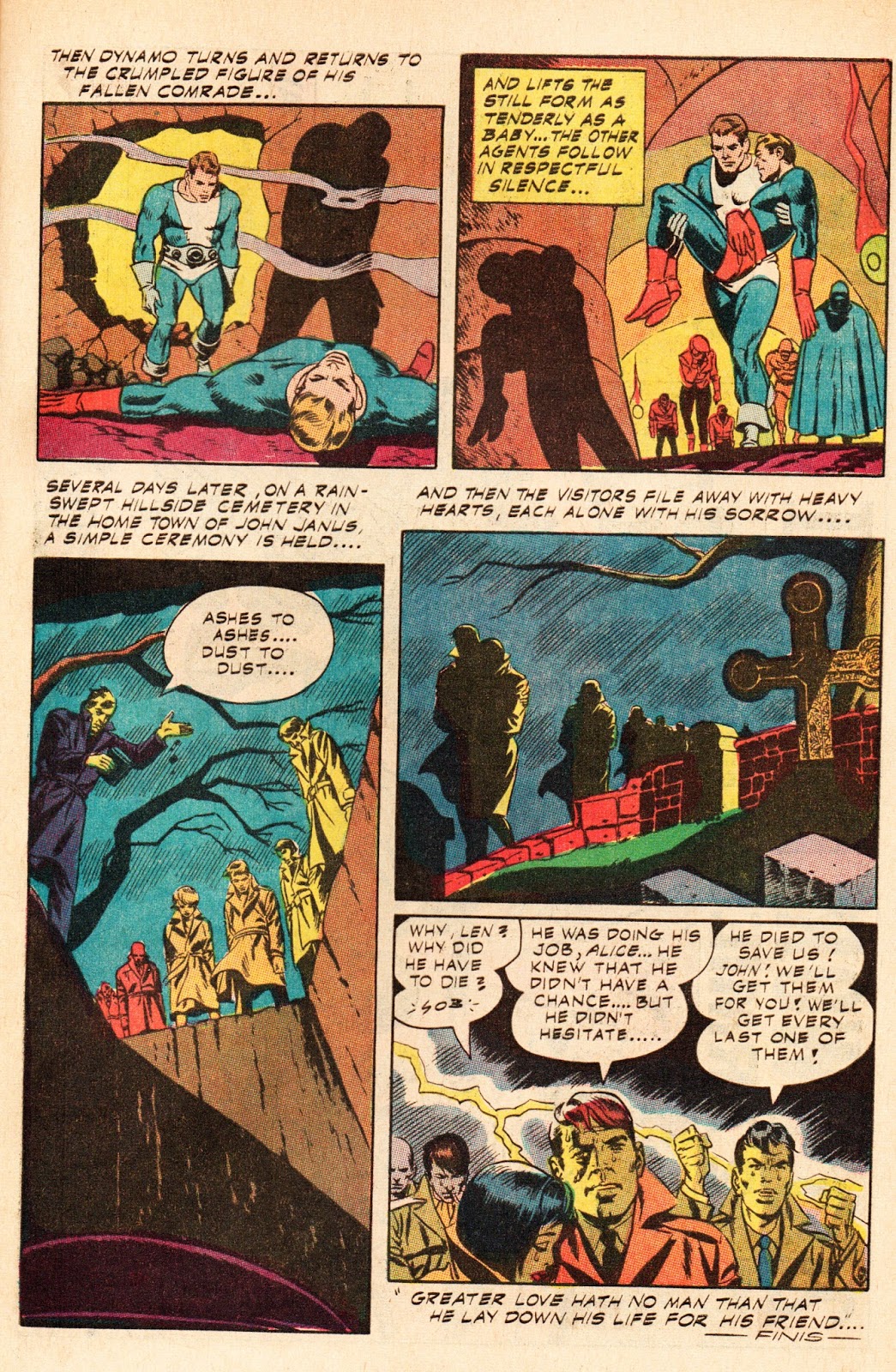
"Dynamo Meets the Amazing Andor," inking assistance by Dan Adkins. Tim Battersby worked on the script (per his work records) with Wood possibly involved. Dynamo # 1, August 1966.

The first issue Ditko penciled and Wood inked was either Dynamo # 1 or T.H.U.N.D.E.R. Agents # 7. Both are cover-dated August, which means they were on newsstands in May of 1966, but since Tower didn't employ job numbers on their published stories (often seen on splash pages and used in an editorial capacity to keep track of jobs) there is no way to ascertain their premiere undertaking. I've chosen the Dynamo splash because of Ditko's striking point-of-view shot, looking up from the manhole, a perspective that may have been influenced by Orson Wells' cinematic masterpiece (studied by many artists in the field) Citizen Kane. Wood lends the perfect touch with his precise inking. 


Another reason I led off with this story is - quite frankly - purely visual. The "Ditko/Wood" signpost that is illuminated on the splash page is symbolic of the two artists symmetry in graphic storytelling. Ditko's signature showed up in a similar manner on a Charlton cover years earlier, so it's a distinct possibility Ditko playfully added the credits here. 


  Ditko's fight-scene choreography has been admired by many comic book aficionados, and with good reason, as page 8 from "Dynamo Meets the Amazing Andor" illustrates.   


Panels from page 8 and 9 and the entirety of page 10; "A Matter of Life and Death," T.H.U.N.D.E.R. Agents # 7, August 1966. In an unusual move for the time, Dan Adkins had the idea of killing one of the Thunder Agents. After receiving approval from editor Samm Schwartz, Ditko was assigned to the story. Who else could convey emotions of disbelief, anger and grief with a sense of craft and authenticity? Adkins script, layouts and inking assistance. 
Dynamic splash page art showcasing Ditko's poses and command of anatomy combined with Wood's lush inking. T.H.U.N.D.E.R. Agents # 12, April 1967.  


One of the Thunder Agents played largely for laughs was the non-super powered Weed. Wood reportedly had a fondness for the character and his appearance was even patterned after the artist. Ditko who had a good feel for humor, exaggerated postures and hand gestures throughout the story. Wood imbued The Iron Maiden, a voluptuous femme fatal, with a strong dose of what all his women had...sex appeal. "Once Upon a Time..," Dynamo # 4, June 1967.


Credits were occasionally hidden in backgrounds, as seen in this panel. Ditko's name appears on a billboard (as does RR for Ralph Reese); Wood's on a bus. Wood's then-wife, Tatjana's name is partially visible on the side of a building. Tatjana was a talented colorist and likely did the honors on this story.      
      
The adventures of Dynamo were not always taken as seriously as some of his super-heroic peers, an influence imposed by Wood. Here is another example of Ditko character-types populating a story, including satirical beatniks and mobsters. "Return Engagement," T.H.U.N.D.E.R. Agents # 14, July 1967. Wood layouts and possible script, with inking assistance by Dan Adkins. 
  

While this Dynamo story is drawn solely by Ditko I decided to include it because Wood may have been involved as plotter (with Roger Brand scripting) as posited on the Grand Comic Book Database. If so, it's still an example of the two working together (and besides, I liked the page so much I HAD to share it!). "Dream of Doom!," T.H.U.N.D.E.R. Agents # 16, October 1967. 


"The Wizard of Dark Mountain!," Bhob Stewart, script and layouts; Steve Ditko finished pencils; Wally Wood inks, with possible assistance from Dom Sileo and others, Bill Yoshida lettering. Jungle Jim # 22, February 1969.  

Ditko and Wood's next collaborative effort took a circuitous route to Charlton comics. On his blog Bhob Stewart explained that Jungle Jim was originally an assignment Wood produced for King Features, the newspaper syndicate who decided to start a comic book line utilizing some of their popular characters. Unimpressed with sales figures, management decided to drop the line, selling off the remaining material to Charlton. Stewart recounts that, with a deadline fast-approaching, Wood recruited a number of artists to get the stories completed, including Ditko:  


  Wood turned that one ("The Wizard of Dark Mountain") over to Steve Ditko, who followed my rough layouts with such precision that he carefully included every detail. I saw that he had made a few slight alterations and improvements. On page five, panel five, I had Jungle Jim holding Rima’s ass as he gave her a boost into the ventilating shaft; Ditko gave it a simple change to make it acceptable to the King editors. On page three, panel four, my rough of the trio rock climbing was awkward, and he easily solved the problem by repositioning the characters.   

You can read a more detailed account of Stewart's work with Wood on Jungle Jim here:   http://potrzebie.blogspot.com/2012/04/heres-another-of-jungle-jim-stories-i.html


Jim makes a brilliant observation on this page from "Reptile God of Lost Island."  Ditko and Wood illustrated three stories in Jungle Jim # 27 (December, 1969).  Charlton had been producing all-new material by staff writer Joe Gill and artist Pat Boyette, beginning with # 23 and continuing until issue # 26 (for reasons lost to the ages Charlton did not publish the remainder of its King inventory until nearly a year later. Go figure!)


 "The Beast Man and the Man Beast" is the second Jim story featured in JJ # 27. Ditko may have only contributed layouts or breakdowns, with finished art by Wood and other unknown assistants. I see less of Ditko's expressive faces and figures here, although Jim's pose in panel four and the villain's fingers in panel five confirm his input. 


     "Winged Fury," the final Jim tale appearing in issue # 27, has a more pronounced Ditko presence, from the characters poses to the bat-winged creature lurking above the heroes. Bill Yoshida lettering on all stories. 


 Heroes, Inc. presents Cannon, 1969. Story/inks by Wood; pencils by Ditko.  

In 1969 Wally Wood produced a comic book for the publisher of Overseas Weekly, where he had created Sally Forth and other comic strips for Military News, a paper distributed to G.I.'s. and circulated on Army bases. Heroes, Inc.  was not restricted by Comics Code regulations and included depictions of violence and sexuality. The stories and characters were all copyrighted in Wood's name, which was another incentive for the artist. Wood recruited Ditko to pencil the 12 page lead feature, Cannon, a soldier turned into an unemotional fighting machine and sent on missions by the US government. Freed from the confines of the Code, Ditko and Wood turned in one of their most impressive pencil/ink jobs.     

From 1970-1973 Ditko and Wood went their separate ways creatively; Ditko working primarily for Charlton while writing and drawing Mr. A, Avenging World and other independent comics appearing in fanzines and small press publications; Wood was busy inking stories for DC, drawing and occasionally writing material for Warren Publishing's black and white magazines (Creepy, Eerie, Vampirilla) and producing creator-owned tales in witzend and for overseas publications.   


The impressive splash page to The Destructor # 1, February 1975. Inking assistance by Paul Kirchner; lettering by John Duffy; coloring by Bhob Stewart.  


Mobsters, heroes and classic storytelling. "Deathgrip!," The Destructor # 2, April 1975. Archie Goodwin script; Paul Kirchner inking assistance; Dave Hunt letterer.  


  From his dark glasses to the metallic hands, Deathgrip is reminiscent of the insane scientist Dr. Gogol, as played by Peter Lorre in the 1935 thriller Mad Love. Perhaps author Goodwin suggested the visual reference to Ditko?

In late 1974 Ditko and Wood were reunited under the auspices of Atlas-Seaboard, a new comics company overseen by former Marvel publisher Martin Goodman. In an effort to get some of the top creators in the field to join, Goodman offered higher rates and a return of original art pages. Ditko penciled a few titles for the company, notably The Destructor, a teenage superhero with a hard edge. Ditko was certainly no stranger to teen heroes, having previously crafted both Spider-Man and The Hawk and Dove. Written by Archie Goodwin (who Ditko had worked with at Warren, illustrating black and white horror/thrillers in a medley of breathtaking ink/wash techniques), Wood embellished the first two issues with his usual expertise.


     "Quest for a Stolen Soul," Paul Levitz script, Stalker # 1, July 1975


     "Darkling Death at World's End Sea," Stalker # 2, September 1975


   "The Freezing Flames of the Burning Isle," Stalker # 3, November 1975 


"Invade the Inferno," Stalker # 4, January 1976. All stories written by creator Paul Levitz, with inking assistance from Paul Kirchner, Al Sirois and Wayne Howard. Lettering by Ben Oda.  

DC Editor and former Wood studio partner Joe Orlando corralled Ditko and Wood to illustrate Stalker, Paul Levitz's sword and sorcery/fantasy hero. Playing to the strength of both artists, Levitz crafted a world populated with demonic creatures, beautiful women, ornate castles and fantastic adventures. Unfortunately the series was cancelled after four issues, a victim of both the comic book glut and an overall slump in industry sales. 

On Paul Levitz's blog you can discover more about the character's origins and how fandom was miraculously graced with a 4th issue: http://paullevitz.com/random-causality/


"Love is a Dandy!," Steve Skeates script; Milt Snapinn lettering, Paul Kirshner inking assistance, Plop # 16, September 1975.

Wood, who had drawn and designed a few bizarre covers for Plop, Joe Orlando's humor title, was teamed with Ditko on Steve Skeates unusual tale of a young man who takes his love of horticulture to a whole new level!    


"The Gnark is Coming! The Gnark is Coming!," Steve Skeates script; Milt Snapinn lettering, Amazing World of DC Comics # 13, November 1976

Ditko and Wood's last published work for DC appeared in Amazing World of DC Comics, a fanzine produced by the company to promote their line. The story was originally intended to appear in Plop, a title that was due to be cancelled. While Ditko had only drawn a few humor strips in mainstream comics, Wood was revered for his madcap parodies of comics, movies and advertising (teamed in its early years with the brilliant satirist Harvey Kurtzman) in Mad comics and its later incarnation as a magazine.


Untitled Cannon story; script by Wally Wood. Heroes, Inc. Presents Cannon # 2, 1976. 

The Ditko-Wood team ends, appropriately, on one of their final published stories, a return engagement with Wood's creation, Cannon. Published seven years after the first issue, the dimensions changed from a color comic to a magazine-sized black and white publication. Bob Layton, who became a well-known inker, artist and writer for DC, Marvel and other companies, published this issue (under his CPL/Gang Publications banner) which was sold through mail order, in comic shops and at conventions.

Ditko and Wood did not cross paths professionally after 1976. Ditko was busy with assignments at Charlton, DC (where he wrote and illustrated several "Creeper" stories in World's Finest Comics and created Shade, the Changing Man), science-fiction tales for Questar and returned to freelance for Marvel after over a decade's absence; Wood also penciled and inked various DC stories but one of his most accomplished projects, The King of The World, a book-length fantasy extravaganza, was published in 1978. Tragically, Wood died by his own hand on November 2, 1981. 

For over a decade two extraordinary stylists and creative powerhouses fused their storytelling aptitude with impressive results. It is a testament to their imagination, creativity and purity of craft that the work of Steve Ditko and Wally Wood continues to be studied, analyzed and dissected. Like those who rise to the top in any field - authors, directors, musicians, actors, athletes - they invite further investigation into the creative process.        


    A fond farewell to the Ditko-Wood team. Final panel of Stalker # 1, July 1975