Saturday, September 5, 2015

Bill Everett at Skywald

Sol Brodsky was a long time artist, inker and production man at Marvel comics. Writer/Editor Stan Lee relied on his right hand man to make sure the trains ran on time but the entrepreneurial Brodsky also worked on outside projects including the Big Boy Restaurant promotional comics and editing the initial issues of Cracked magazine. When he was offered an opportunity to co-publish/edit a line of comic books and magazines with Hershel Waldman, who had published/packaged comics in the past, he left his production job with Lee's blessing. The new venture, entitled Skywald Publishing Corp. (for Sol BrodSKY and Israel WALDman) awaited.

Through his contacts in the comics industry Brodsky knew many freelancers he could offer additional work. Some came directly from Marvel, including writer Gary Friedrich; artists Dick Ayers, Don Heck, Syd Shores, John Tartaglione, Frank Giacoia, Tom Palmer and letterers Sam Rosen and Jean Izzo. One important member of that entourage was Bill Everett.


Everett's "Angry Young Man" as he appeared in Marvel Mystery Comics # 11 (september 1940). Everett story, art and lettering. From a stat as published in Alter Ego # 3, Winter 2000.   


Everett was one of the pioneers in the nascent comic book industry. Like many in that period, Everett wrote, drew and often lettered his stories. His earliest work surfaced in 1938 for companies including Centaur, Novelty, Eastern Color and Timely, where his most famous creation Namor, The Sub-Mariner appeared. The Sub-Mariner was a unique character who lived under the sea and was none too friendly with the surface world. He soon fought Timely’s first superhero, the android Human Torch (created by Carl Burgos) in exciting stories that set the stage for Marvel's 1960s hero crossovers. 

The Sub-Mariner was an extremely popular character, particularly during the World War II years (where he joined forces with humanity to take on a deadlier foe – The Nazis) and, along with Captain America and the Torch, was part of Timely’s triumvirate of heroes, appearing on numerous covers and features. 

When the super heroes lost their appeal after the war Namor was put out to pasture, revived in 1955 for another try (due in large part to the possibility of a television deal).  Everett returned to draw, letter and often write the new stories, his artwork showing continued growth. Sales sunk to the bottom of the ocean though, and when the TV negotiations fell through the Sub-Mariner was retired, returning six years later when Stan Lee and Jack Kirby revamped the character in the early 1960s Marvel era.  


Along with talents like Joe Maneely and Russ Heath, Everett drew many of Atlas' horror covers during the 1950s. This example takes its inspiration from the classic Phantom of the Opera. Uncanny Tales # 7, April 1953.

Everett's versatility allowed him to excel in practically every genre. In the 1950s he produced stories and covers for Stan Lee’s war, western, horror, jungle, adventure, crime, romance, humor and even funny animal line. Everett’s art was distinctive, influenced by comic strip great Roy Crane but with a style that transcended mere mimicry. 

The comic book business floundered in the mid to late 1950s, a byproduct of bad press and the growing popularity of television. When work dried up Everett moved to a new field (his last comics stories appearing in 1960), finding employment at Norcross Greeting Cards and later becoming an Art Director for another firm. Sometime in 1963 he again connected with Stan Lee, where the two developed Daredevil (the first issue dated April 1964). Unable to meet deadlines due to his full-time job, Lee was forced to enlist Sol Brodsky and Steve Ditko to complete the inking/backgrounds. Everett returned to his managerial job, realizing he didn't have the time to freelance for comics.


Back at Marvel Everett's first job was penciller/inker over Jack Kirby's layouts on the Incredible Hulk feature. Here is an effective splash page from Tales To Astonish # 80, June 1966.

When Everett quit his position he returned to comics for good. In late 1965 Lee welcomed him back to Marvel, getting him up to speed by finishing Jack Kirby’s layouts on “The Incredible Hulk” (beginning in Tales to Astonish # 78, April 1966). Everett also received inking assignments, adding his lush brushwork to artists such as Gene Colan (who, coincidentally, was penciling Sub-Mariner, the co-feature in Astonish). Everett worked on many features for Lee, taking over “Dr. Strange” in Strange Tales when Steve Ditko quit; drawing his beloved westerns in back-up stories, inking Stan Goldberg on Millie the Model, and, inevitably, returning to his creation, this time with Lee co-plotting. The revised Namor, while still having a chip on his shoulder, was now Prince of Atlantis and spoke in pseudo-Shakespearean tones. 

Everett often faced deadline problems, some due to alcoholism, forcing others to finish penciling or hastily ink his work. By the late 1960s Everett also preformed production duties, including coloring, and wrote several issues of Sgt. Fury. His best efforts in that period, arguably, was his embellishment over Jack Kirby’s pencils on Thor. Everett’s inking added a layer of sheen to Kirby’s art, making every page stand out. 

Sometime in 1970 Everett was offered work by Sol Brodsky when he moved to Skywald. Everett accepted, although he continued to freelance for Marvel. Everett's art appeared in their premiere publication, Nightmare # 1 (December 1970), a black and white horror magazine designed to compete with Warren Publishing's popular titles (Creepy, Eerie, Vampirella). A companion magazine, Psycho, debuted the following month.      


Everett produced superb work in black and white. The Skywald magazine line made great use of his meticulous etchings, which could give EC Comics master of the macabre Graham (ghastly) Ingles a run for his money! Nightmare # 1, December 1970.  


Three of Everett's images accompanied the text story "The Skeletons of..Doom!". Everett drew gorgeous women and, unrestricted by the Comics Code Authority, he took full advantage of the situation. 


In addition to the new stories in Nightmare # 1, a number of 1950s horror reprints appeared in the early issues. This helped cut production costs, although most were retitled, relettered and altered (sometimes heavily), apparently so they would not look old fashioned. Ross Andru and Mike Esposito did the honors on a few stories, but here is a direct comparison of how extensive the redrawing was. On the left is Everett's revised version. On the right is the original Norman Nodel/Vince Alascia splash, originally published in Eerie # 11, April 1953 (courtesy of the indispensable ComicBook plus site http://comicbookplus.com/?dlid=23585  The splash panel is almost entirely redrawn and Everett added touches to many of the pages/panels, particularly the male and female protagonists.   


                       Two more examples of Everett's alterations from the same story.


Bill Everett illustrated a series of horrific pin-ups, this one offers his depiction of The Creature from the Black Lagoon. Dripping with atmosphere, this was the second time Everett illustrated the Creature,having drawn him in a 1950s Sub-Mariner story. Nightmare # 2, February 1971.


Another example of how reprints were thoroughly renovated  from the original. On the left is the original story drawn by Gene Fawcette, from Avon's one shot Robotmen of the Lost Planet # 1 (1952). On the right is Bill Everett's altered version. Everett's main changes are on the male and female protagonists and a more traditional take on the robots. The original typeset lettering was also replaced with hand lettering, often by Jean Izzo. Nightmare # 2, February, 1971.


Bill Everett's third pin-up is another example of incredible artistry and meticulous detail. Nightmare # 4, June 1971. 


The Heap was a revised version of the monster originally appearing in Hillman Periodicals Air Fighter's Comics and Airboy in the 1940s and 50s; Skywald's Heap was featured in Psycho and a one-shot color comic drawn by Ross Andru and Jack Abel. Bill Everett fashioned his own interpretation for the back cover of Psycho # 4, September 1971.   


 Everett's frenetic scene of a monster earthworm attacking a highway is filled with a few inside jokes, including the name "Roman" (opposite of Namor) on the truck and a Bergenfield, NJ address, which may have been his residence at the time. Psycho # 5, November 1971.


Everett's last pin-up appeared on the back cover of Psycho # 6, May 1972, his Mr. Hyde is clearly based on Fredrich March's 1931 film version.  


Skywald's Hell Rider magazine was an "adult" version of a super-hero, with the requisite sex and violence. Along with the motorcycle riding hero other characters were introduced in their own features, including the first African-American super heroine, Butterfly. Newcomer Rich Buckler drew the second and last instalment (Hell Rider only ran two issues before cancellation) although Bill Everett touched up some of the main figures throughout. Hell Rider # 2, September-October 1971. You can read more about Butterfly and see the entire story at this interesting blog:  http://museumofuncutfunk.com/2011/12/05/hell-rider-2-circa-1971/    

The color comic book line consisted of oversized 25 cent titles (instead of the then-standard 15 cent size) featuring an assortment of western, jungle, horror and romance features. The standard format consisted of a new lead story, followed by reprints from various defunct publishers, material which had been acquired by publisher Israel Waldman. As far as I can ascertain Everett did not alter many of the western comics, concentrating mainly on creating a contemporary look to the clothing and hair styles of the male and female characters in the romance stories, a trend many publishers followed. It’s unknown whether this fooled many (or any) of the young female readers.    


An Everett face is attached to Sheena, Queen of the Jungle, quite noticeable in panel two.  Everett drew his share of attractive jungle heroines for Atlas, particularly on 1950s covers. The original art is credited to Robert Webb and is from Fiction House's Sheena, Queen of the Jungle # 17, Fall 1952.


 Skywald's longest running color comic was Tender Love Stories, which ran four issues. Each issue featured one new story by the likes of Jack Katz and Kurt Schaffenberger, followed by 1950s or early 1960s reprints. While Ross Andru and Mike Esposito revised many of the reprinted stories in Tender Love Stories # 1 (February 1971), Everett modernized the final story, although underneath his alterations I believe the original artist is Ogden Whitney.


Everett reworked the art on three of the reprinted stories in Tender Love Stories # 2, April 1971. The mouths and hair are usually dead giveaways.


While the woman's face and a few other figures are altered by Everett, the original artist is not totally obscured. Bill Draut drew the original story, from Prize's Young Love Vol 6, No. 3, October-November 1962. Sam Rosen lettering. Tender Love Stories # 3, June 1971.


The second Everett altered reprint includes another fine artist whose work is recognizable. Bob Powell originally drew this unidentified story. 


The final two reprinted stories in Tender Love Stories # 3 are both originally credited to Rafael Astarita (originally published in Avon's Realistic Romance #'s 4 (February 1952) and 12 (July 1952) but the Everett faces and figures shine through.     


While it's interesting to examine much of Everett's undocumented corrections and revisions, it's also maddening to conceive that a talent of his proportions performed such menial production work. Everett would have been better served lavishing his drawing skills on horror stories, a genre he was obviously skilled at. Perhaps he was too busy inking for Marvel at this point and didn't have time to draw many stories. Whatever the case the only story he illustrated appeared in Psycho #3, May 1971, a superbly drawn 10 pager dripping with atmosphere. Everett's use of pen and ink is exquisite and his fog-shrouded scenes display great craft. It is truly some of the best work of his career.     

Everett's last work for Skywald appeared in early 1972. Sol Brodsky left the company around the same time, returning to Marvel. Coinciding with his departure from Skywald he was offered the job of taking over the writing and art of his creation, Sub-Mariner (beginning with #50, June 1972). With sales slumping Everett was given an opportunity to refashion the strip, returning some of Namor’s original personality and charm. Everett's art continued to flourish; his depiction of the sea was particularly enchanting, enhanced by his real life experiences as a young man stationed in the Merchant Marine. 

"..I had always been interested in anything nautical, anything to do with the sea- - ever since I was born, I guess." Bill Everett, interview with Roy Thomas, Alter Ego # 11, June 1978


Who says you can't go home again? Not Bill Everett, whose return to his creation over 30 years later was magnificent. Sub-Mariner # 50, June 1972.  

Everett's run on Sub-Mariner was cut short when he passed away on February 27, 1973 at the age of  56.  He had fought alcoholism much of his life, but became a proud member of Alcoholics Anonymous, a group that helped him greatly in his struggle. At the peak of his artistic prowess he left both fans and pros mourning the loss of a unique craftsman and a true original. 


Special thanks to Michael J. Vassallo for the loan of his Skywald romance comics, where I discovered Everett's unknown corrections, inspiring me to write this post. 

Monday, June 8, 2015

A Journey Begins

Memory is often unreliable, and piecing together a moment from forty five years ago can be a struggle. I'm confident that it was a weekday when I stopped in a luncheonette with my Mother after shopping on Knickerbocker Avenue. I grew up in the Bushwick section of Brooklyn and candy stores, newsstands and luncheonette's were familiar sights. Staring at me from a spinner rack filled with paperbacks was a brightly colored book sporting a Superman logo, bat-symbol and familiar comic book "sound effects" lettering, the title in bold red: All In Color For a Dime. 

I don’t recall the particulars, maybe I had recently received money from relatives, since I find it hard to believe I cajoled my Mother to part with a whopping one dollar and fifty cents – a considerable sum to give a 10 year old – especially since finances were tight in our household. Somehow or other I left that store with a book that I still have in my possession – one which began my lifelong interest in the history of comics.  


 My copy, with loose front and back covers and inset pages has survived numerous moves for 45 years. I didn't see the original hardcover edition until many years later, but at $ 11.95 I doubt even my older brother John would have been able to afford it!

All in Color for A Dime was my first real introduction to the “golden age” of comics. I had some concept of an earlier era, dating back to the first time I saw one back in 1966. Marvel began reprinting the early Simon and Kirby Captain America stories beginning in Fantasy Masterpieces # 3 (June 1966). I was with my brother John when he picked up the following issue in a candy store down the block from my Grandparents house in the Bedford-Stuyvesant section of Brooklyn.


 Fantasy Masterpieces # 4, August 1966. Jack Kirby penciled and inked the main image, surrounded by scenes from the interior stories. This comic book was one of the earliest I recall seeing on the newsstand. Marvel Tales # 4 was probably bought that same day by my brother John. Fantasy Masterpieces also included my introduction to pre-hero Marvel monster/fantasy fare.   


In comparison to Kirby's then current output on Fantastic Four, Thor and “Captain America” his 1940s art had an archaic, unpolished feel, pointing to a long ago, mythical time. In those days remnants of previous decades were all around us; television regularly showed movies from the 1930s and 40’s including the Universal monsters; radio and vaudeville showmen such as Jack Benny, Bob Hope, Jimmy Durante, George Burns, Groucho Marx, George Jessel and many others appeared on talk and variety shows; children were entertained by the comedy of Laurel and Hardy, the Little Rascals, Abbott and Costello; serials appeared every day on children’s programs such as Chuck McCann (Flash Gordon; King of the Rocket Men; The Crimson Ghost)  along with decades old black and white cartoons: Bugs Bunny, Daffy Duck, Woody Woodpecker, Popeye, Mighty Mouse, Heckle and Jeckle, Betty Boop, Farmer Alfalfa, Ko Ko the Clown, Scrappy. The sights and sounds of the 1960s were intermingled with the fascination for an earlier era.   


Singer, pianist and master of Malaprop Jimmy Durante. His career dated back to vaudeville, Durante was a perennial on radio and a familiar face on television in the 1960s, appearing on talk shows, guesting on variety programs like Hollywood Palace and even headlining a musical/comedy series.

While Marvel reprinted the adventures of Sub-Mariner, Captain America and the Human Torch, National Periodical Publications (DC) occasionally presented an early tale of Superman and Batman in their 80 page giants. Even Archie, under their Mighty Comics imprint, often made reference of their earlier superhero era, reviving some characters in Mighty Crusaders, Fly Man and Mighty Comics Presents. The majority of interest, though, was in the present era. 

    The introductory page whets the readers appetite for what is to come.

All in Color for a Dime opened a door to a fascinating era when comic books were just beginning, revealing many of the field's pioneers. I learned more about both familiar characters (Superman, Batman, Captain America, Spider-Man) and complete mysteries such as Captain Marvel; companies including Fawcett, Hillman and EC and background on psychiatrist Fredric Wertham and the 1950s Senate investigation that changed the industry. Eleven chapters focused on costumed heroes and the people behind them, written by an array of enthusiastic, articulate and noteworthy authors including Ted White, Bill Blackbeard, Don Thompson, Dick Lupoff, Ron Goulart, Harlan Ellison, Richard Ellington, Tom Fagan, Jim Harmon, Chris Steinbrunner, and a name even I was familiar with from his scripts for Marvel, Roy Thomas. 


Each chapter began with an introduction to the author. Many were known in the fan community, or would become prominent in later years. Co-editor Dick Lupoff wrote a chapter detailing the fascinating story of Fawcett comics and the origins of Captain Marvel, which, at one point, was the best selling comic book in the 1940s (his chapter, like many in the book, originally appeared in the science-fiction fanzine Xero). Lupoff's essay revealed that Captain Marvel was no longer published due to a lawsuit instituted by National over the Captain's perceived plagiarism of Superman. The sprawling court drama ended with Fawcett eventually losing and settling out of court. Captain Marvel and his assorted titles would cease publication. The real world was a little more complicated than the clear cut good and evil exploits of Captain Marvel.     


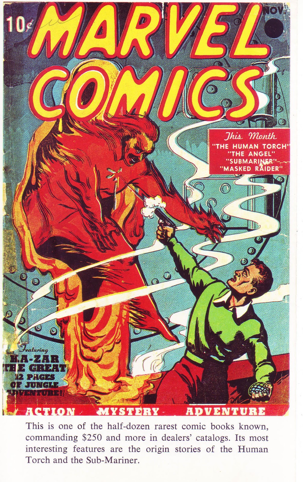
One of sixteen color pages included in the book was the cover to Marvel Comics # 1 by the then-unidentified Frank R. Paul.  

Don Thompson, who co-edited with Lupoff, wrote the chapter of Timely's "Big Three" (Human Torch, Sun-Mariner, Captain America) providing an overview of the Timely/Atlas/Marvel era. It was the first time I discovered characters such as the Young Allies or the name of Kirby's partner and co-creator of Captain America, Joe Simon. Thompson, together with his wife Maggie, produced one of the early fanzines, Comic Art, followed by Newfangles. The pair later became columnists and co-editors of the long running news/adzine The Buyers' Guide (later titled Comics' Buyers Guide).

         
 In "The Spawn of M. C. Gaines" Ted White wrote about the origins of Superman and Batman. There I learned the names of Superman creators Jerry Siegel and Joe Shuster and discovered how involved writer Bill Finger was in Batman's early stories. White has had a long and versatile career as writer/publisher of science fiction fanzines and editor of book compilations; author; musician and music critic.   


Roy Thomas wrote about the other Fawcett heroes, including Spy Smasher, Captain Midnight and Bulletman. The only image in the book of Captain Marvel (and his alter ego, Billy Batson) was a reproduction of a house ad for Gift Comics. Aside from his prolific career in comic books, Roy continues to contribute to my knowledge of comic book history in his long running fanzine, Alter Ego.


 One of my favorite chapters was “The First (Arf, Arf) Superhero of them All” by Bill Blackbeard. From my earliest days I was enraptured by the animated adventures of Popeye, watching him on Captain Jack McCarthy’s kid show on WPIX, Channel 11 every day. At a young age I didn’t distinguish between the Fleischer, Paramount or King Features cartoons, but later grew to appreciate the imaginative, surreal, urban Max Fleischer black and white Popeye shorts as being superior to the rest. I had seen and possibly had a copy or two of the Dell/Gold Key Popeye comic book, but had no knowledge of the comic strip. Blackbeard’s essay revealed the origins of Popeye and his creator, E. C. Segar. It was a revelation to me, opening an interest in the comic strip exploits of this offbeat and truly funny character whose malapropisms, basic good nature and love of “aminals” was translated in Fleischer’s animated cartoons.

Bill Blackbeard was an important figure in the study and preservation of comic strip art. His books, essays and, perhaps most importantly, herculean efforts in saving the comic strip from destruction cannot be understated. You can read more about Bill Blackbeard here: http://www.tcj.com/bill-blackbeard-1926-2011/


All in Color for a Dime was followed by an array of eye-opening publications. In the next few years my brother John’s Christmas and Birthday gifts to me included Superman from the 1930s to the 1970s; Batman from the 1930s to the 1970s and the Steranko History of Comics Vol’s one and two. In the pages of those books I discovered many names instrumental to the beginnings of comics including Bill Finger; Will Eisner; Jack Cole and Lou Fine, to name a very few. 


In 1971 Crown books published two hardcover books featuring reprints of classic material from National/DC's archives. The Batman collection included an introduction by E. Nelson Bridwell, editorial assistant, writer and editor at DC. The author noted Bill Finger's often hidden contributions to the genesis of Batman at a time when Bob Kane often received all the credit. Cover art by Carmine Infantino and Murphy Anderson.

      
The first fanzine I purchased was The Comic Reader # 92, dated December 1972. It featured news and information on Marvel, DC, Charlton, Gold Key and Warren (including cover reproductions and publication dates); movie and media news, fanzine reviews and articles. Editor Paul Levitz soon turned his talents to a long career at DC as writer/editor and later executive positions including a stint as president and publisher. Alan Kupperberg cover art.     

Two years later I discovered the world of fanzines when I noticed a small image in the window of a used bookstore in Ridgewood, Queens (where I had recently moved to). Back in those long ago days stores were not often covered with metal gates and you could actually view there wares. My brother John and I were familiar with its claustrophobic interior filled with books, records, magazines and, of course, old comics. We were also acquainted with the proprietor, Pat, having journeyed there from time to time in search of old treasures. It was a Sunday and the store was closed (in that period most stores were closed on sundays) but the following day I returned and bought The Comic Reader # 92, the first of what would be many fanzines I would buy over the decades. There I learned further information on comic books both old and new, read interviews with writers and artists and was hooked by a sense of youthful enthusiasm that was infectious.   


Flashback # 7 reprinted Pep Comics # 1 (January 1940). Published by Alan Light, who also spearheaded the news/adzine The Buyers Guide for Comics Fandom, these reprints consisted of thick cover stock and black and white interiors. Irv Novick cover art. From the collection of John Caputo.   

As I got a little older and could afford it I returned my brother’s generosity, buying him comic book related gifts (which, of course, I got to read too!). They included Alan Light’s Flashback series, which reprinted entire issues of golden age comics in black and white. In an era when there weren’t many reprints available this was a big deal. Still in my brother's collection, titles include Human Torch # 5 (reprinting the Torch-Sub-Mariner scuffle); Captain Marvel Jr. # 1; Special Comic # 1 (Hangman) and Pep Comics # 1 (featuring the Shield), the latter two Archie/MLJ titles; I may have picked them because none of the material had ever been reprinted. I recall John and I being amused by one of the back-up features, Sgt. Boyle. Accustomed to war heroes with rugged names like Sgt. FURY, Sgt, ROCK and Captain SAVAGE, Sgt. Boyle didn't quite compare. Other gifts included Horror Comics of the 1950’s, a sampling of EC comics' outstanding work, The Comics by Jerry Robinson and (I believe) The Smithsonian Collection of Newspaper Comics by the aforementioned Bill Blackbeard, a massive tome that included examples of many obscure comic strips.   

My exploration through comic book history is an ongoing and continually fascinating adventure. In the past few decades I’ve been able to write about comics and their creators in fanzines such as Comic Book Marketplace and Alter Ego, essays in Marvel Masterworks collections, captions in Taschen’s 75 Years of Marvel Comics book and, of course, here on this blog.

In his recent book If These Walls Could Talk major league pitcher and broadcaster Jim Kaat summed up his love of baseball history:        

“…I still consider myself a student of the game. I’ve never lost my curiosity or love of baseball. My eyes are always open to something new. A question is always poised on the tip of my tongue…”   

Kaat could just as easily have been speaking about film, art, music, poetry…or comic books. 

Friday, May 29, 2015

Don Heck's Pre-Superhero Art 1952-1962

Don Heck is recognized in fan circles for his contributions to Marvel's early superhero line, in particular "Iron-Man" (in Tales of Suspense) and The Avengers, but his style, greatly influenced by the craftsmanship of master cartoonist Milton Caniff (of Terry and the Pirates fame) was often at odds with the overwhelming, massive figures and fantastic stylizations of Jack Kirby, whose shadow loomed large.

A rare example of Heck drawing a superhero cover in the early Marvel era, which was usually Jack Kirby's domain. Nevertheless, when needed he came up to bat and hit it out of the park. This image is one of my earliest memories of Don's art. As a child I recall seeing the cover on my Grandmother's porch. It was probably my older brother (and fellow comics afficiando) John's copy. 

Heck held his own at Marvel in their early days, "batting" third in the lineup after Kirby and Ditko. Dick Ayers, the fourth player in that era, while corralled to draw superheros on occasion ("Giant-Man"; "Human Torch") became identified with the long running war title Sgt. Fury. By 1966 fellow Timely-Atlas veterans John Romita, Gene Colan and John Buscema returned to the fold, followed by newcomers Jim Steranko, Barry Smith and Neal Adams. These artists had a stronger feel for the dynamics of superhero fare, leaving Heck in the role of utility player, filling in wherever he was needed. This led to frustration for the talented artist, and his better efforts appeared (often unnoticed) in genres unrelated to superhero fare. Heck's virtues blossomed in more character driven situations, romance and mystery being two such examples. Heck's fluid line (particularly when he inked his own pencils), lush brushwork and superior pacing, coupled with a flair for drawing ordinary people served him well over the course of four decades.This post will focus on his seminal, pre-superhero work, circa 1952-1962. 


War Fury # 1, September 1952. Image from Comicbookplus, where you can view the entire story (and many other Don Heck covers and stories)  http://comicbookplus.com/?dlid=23814

Heck started out working in production for Harvey comics in 1949. It wasn't until 1952 that he had the opportunity to draw his first comic book story, working for editor Alan Hardy at Comic Media. "The Unconquered" is Heck's first published story, although he recalled "Harrigan's Hat", which appeared in the following issue, as the first story he drew. Due to scheduling issues it's possible the earlier story saw publication after this one. The art in Harrigan's Hat looks less assured than "The Unconquered". The splash page indicates real talent, and it's evident that Jack Davis (who was then drawing for the popular EC comics line) was an influence on Heck's faces and figures. 

                                         
"Hot Steel!", Danger # 4, July 1953. Image from comicbookplus  http://comicbookplus.com/?dlid=22860

While some of Heck's early art for Comic Media are journeymen efforts, he rapidly picked up the language of a comic book page, in particularly page composition, pacing, camera angles and characterization. The splash panel of "Hot Steel" is an example of Heck's powerful use of blacks; the two bottom panels focus on setting and people. One can also notice a very strong Caniff influence on his characters and brushwork. 


                            "Witch Girl!" Weird Terrors # 10, March 1954.


Heck drew primarily for Comic Media from 1952-54, focusing on genre stories in their crime, western, romance and horror titles. The splash to "Witch Girl" combines a mood drenched opening scene with four panels showcasing a bevy of beautiful women. 


"Crash in the Alps", Ken Fitch script; Danger # 8, March 1954. Image from comicbookplus. http://comicbookplus.com/?dlid=13826

Heck shows an affinity for presenting the elements as an integral part of the story, a talent that cartoonists as diverse as Chester Gould and Gene Colan mastered. The splash panel depicts blinding snow and places the antagonist (and in effect the reader) directly into the story. 


                                       Danger # 11, August 1954.


Heck's covers for Comic Media in the early 1950s were poster-like compositions, drawing the reader in and telling a story with startling simplicity. This is one of my personal early favorites.


       "Intrigue", Danger # 9, May 1954. Image from           comicbookplus: http://comicbookplus.com/?dlid=22852

An interesting group of characters, use of montage and a pretty woman to boot! While some of Heck's earliest attempts at drawing woman were unexceptional he soon became one of the best in the field at rendering attractive females, which was often noted by his fellow artists. It was a talent that served him well throughout his career.

After Comic Media closed its doors in 1954 Heck found work at other companies, including Toby, Charlton and - notably - for Martin Goodman's Atlas line. Under editor Stan Lee, Heck's illustrations and storytelling became more confident. His range and versatility was a boon to Lee; who put his talents to use across the line in war, western, crime, mystery, jungle and romance stories. Below are just a few examples of his unique artistry.


           "Rookie Cop" Police Badge # 479, issue # 5, September 1955. 

Despite the numbering (which was likely continued from a cancelled comic) Police Badge # 479 was a one-shot title that followed the exploits of rookie cop Jim Hudson. Heck illustrated two of the three stories featuring the policeman (the third story - and the cover - was drawn by artistic powerhouse Joe Maneely). Heck's ability to compose a page, particularly the middle tier sequence, is one of his great strengths. It would have been interesting to see Heck continue on this strip, but the exploits of patrolman Jim Hudson came to an abrupt end after this issue, never to be seen again (unless he HAS been revived and I'm unaware of it. If so, I'm sure someone more knowledgeable than I about post 80's Marvel will clue me in).


            "The Defeat of Colonel Yeng", Battle # 44, January 1956 

Heck drew a slew of war stories, lending his talents to the genre over the decades, from War Combat in the 50's, Captain Savage in the 60's and Weird War Tales in the 70's. Heck's portrayal of men in combat was peppered with personality. 


Page 3 of the untitled opening "Torpedo Taylor" story from Navy Combat # 7, June 1956. 


  "Get That Sub!", the second "Torpedo Taylor" story in Navy Combat # 7, June 1956.  

"Torpedo Taylor" headlined Navy Combat from 1953-57, a character Heck was assigned to and drew every story of. Almost. Heck completed the splash page of a Torpedo Taylor story he was working on but was informed to go no further - publisher Martin Goodman was not buying any new work for the foreseeable future. The story was later completed by Joe Maneely and appeared in Navy Combat #18 (August 1958). Heck, along with most creators, were laid off for a period of time, but was called back by Lee in July 1958 and became a Lee regular. Heck did exceptional work on Torpedo Taylor, adding detail and craft to the depiction of submarines and underwater adventures.   


          "Is There No Man for Me?", My Own Romance # 73, January 1960

The above panel depicting a couple walking down a quiet street is indicative of Heck's impeccable artist's "eye". Much like a set designer, his use of scenery such as the expansive tree and the picket fence creates a warm, romantic mood.


             "If Love Be Blind!", Love Romances # 85, January 1960

The little touches in Heck's romance stories are delightful. The woman walking the dog in panel two and the cheerful police officer add an impeccable sense of charm to the tale and highlight his outstanding feel for the ordinary.   

                             
             "Incident in the Rain!", Love Romances # 102, November 1962. 

Heck's use of silhouette in panel one perfectly compliments the woman's dialogue, emphasizing her loneliness. With sparse background details, Heck's emphasis is placed on the protagonist. Heck's romance art was always exceptional and he would return to the genre in the late 60s and early 70s for both Marvel and DC. 

    
"The Fastest Gun Alive!", Stan Lee script, Gunsmoke Western # 63, March 1961. 

                     
 "To The Last Man!", Stan Lee script, Gunsmoke Western # 68, January 1962.

Heck was very much attuned to the trappings of the western genre,blending all the elements with unerring ease: scenery, clothing, setting, "casting" - all add immensly to the tale. Although Heck was rarely given lead features to draw (Kid Colt, Outlaw; Rawhide Kid; Two-Gun Kid) his five page fillers were almost always worthwhile additions to the total package. 


"The Deep Freeze", Carl Wessler script, Journey into Mystery # 37, August 1956. 


                   "Rocket Ship X-200", Strange Tales # 69, June 1959.


                    "Nightmare!" Tales of Suspense # 16, April 1961.

Heck's pre-hero fantasy stories are often overshadowed by the towering monsters Jack Kirby created month after month, or the evocative, detailed renderings of Steve Ditko, but many of his mini-thrillers are imaginative efforts that deserve attention. Heck had the ability to use the tools of his trade - particularly black ink - to drench a tale in darkness and create a feeling of menace. Like many of the better artists of his era, Heck could effortlessly transition from the lighter tales of romance to the darker shadows of fantasy fare. 


              "I Can See Tomorrow!", Tales to Astonish # 5, September 1959. 

It was often the smaller moments in Heck's stories that pointed out how observant an artist he could be. The above panel is a perfect example. The protagonist is a small figure in a long shot that encompasses a city street. In the foreground are two women chatting on a stoop. Heck's superb composition enhanced what could have been an average close-up. While the two women are superfluous to the story (they have no dialogue balloons and were probably not even in the script directions) their presence adds a cadence of reality, evoking an urban setting where neighbor's would chat on their stoops.. 

While Heck's art in later years became looser, and was often weakened or mangled by unsympathetic or incompatible inkers, when given the chance Heck continued to do what he did best: bring everyday people - and a part of himself - to his cartooning.  


              "..I always liked regular stories. I like people." Don Heck