Sunday, May 6, 2012

Pencil and Ink

There is something of a very personal nature in the ability of an artist to take up pencil and brush and bring images to life on a piece of paper. It appeals to me a in way that superhero movies, with all their special effects and spectacle, as entertaining as some of them are, cannot compete with. The individual vision of those creators that particularly touched me growing up: Kirby, Ditko, Lee, Wood, Colan, Steranko, Thomas and many others, brought forth a world of imagination that I could explore in my living room, poring over the artwork and digesting the words. The colors and letters were also a part of that tactile experience. It is  unique and can't be duplicated in the midst of a crowded movie theatre. With a comic you have the ability to stop and admire a panel, concentrate on a scene and appreciate it in your own time. There are no interruptions, aside from ads that you can easily pass over.

When I look at the work of Jack Kirby, I see an individual with an imagination that constantly spread out to the stars and beyond, yet always had a human quality. His work drew me in through his characters, his storytelling and the unending enthusiasm and energy he brought to each page. Steve Ditko did the same in a decidedly different manner. He has the ability to present a world and characters more down to earth than Kirby's, yet, like Kirby, he can invent situations and develop stories that open the imagination. Ditko's characters were more flesh and blood than Kirby's, more vulnerable physically, although Kirby could make you sympathize with a guy made out of orange rocks. These pen and ink figures continue to fascinate me, but it is always because of the artists behind the pencil. Stan Lee contributed greatly by bringing a personality to the characters, by making them interesting and getting the reader to care about their problems. It was, again, a personal touch of the writer that connected very strongly with many people.

Fantastic Four # 8, Nov 1962. Jack Kirby pencils; Dick Ayers inks

Amazing Spider-Man # 1, Mar 1962, Steve Ditko art.


It is interesting to observe that the characters and themes of those early Marvel stories have attracted the consciouness of the public, although the comics themselves are of marginal interest. Will the children of today ever experience the joy of those Kirby and Ditko comics, and if they do, will they hold their attention? Perhaps, like the pulp heroes of the past, the only way they can survive will be through different mediums. In the 21st century movies, cartoons, video and computer games may be the primary venue where a trace of those characters will survive. Crumodgeon (or anachronism) that I am, I'll cling tenaciously to the images on paper. To me they remain a vital, creative and special form of expression.             

Thursday, April 19, 2012

Jonathan Frid 1924-2012

                             "Our Revels Now Are Ended..."


Dark Shadows # 2, August 1969

Like the comic books, music and movies of the 1960s, television was very much a part of my childhood, and Dark Shadows was one show that left a distinct and lasting impression on me. The series had a lot in common with the comic books I absorbed, mainly the serialized adventures of the Marvel heroes. The trials and tribulations of characters such as Peter Parker or Ben Grimm were not very different from the struggles of Barnabas Collins as portrayed by Jonathan Frid,. Like the Marvel heroes, Barnabas was given special "powers" but he didn't want to have them, and didn't revel in his vampire role. To him it was a curse and he only wanted to live like a normal person. These type of characters greatly appealed to me.


Stan Lee acknowledged the popularity of Dark Shadows by referencing Barnabas in Fantastic Four # 94, January 1970. Jack Kirby art-co-plot, Joe Sinnott inks, Sam Rosen lettering. 

The character of Barnabas Collins was never created to be an ongoing part of the gothic soap opera. He was only brought on as a ploy to elevate ratings. It turned out, though, that Frid's portrayal was more popular than producer Dan Curtis could have imagined, and the writers had to find a way to make an amoral killer part of a continuing series. This led to an origin and softening of the character, eventually curing him and turning him into a supernatural Sherlock Holmes and defender of the Collins family.


Photo of Frid filming a scene on the set of Dark Shadows. On the far left is actor John Karlen as Willy Loomis. 

Frid was not your typical leading man. He had a quirky nature that suited the character of a 175 year old vampire set loose in a world he didn't understand. He admitedly had a hard time learning lines, since the five day a week schedule was grueling, and the show was practically live, as it was then costly to reshoot  scenes, but the hesitancy of Frid the actor sometimes worked for the character of Barnabas, who was supposed to be trying to hide his true existence from the world around him. Barnabas was given to soliloquies and introspection, not unlike a number of Marvel heroes. He was a decidedly sympathetic character and was wildly popular for the shows five year period.


One can only imagine the incredulity low-keyed Jonathan Frid experienced when his image was plastered everywhere from magazines like Teen Beat to board games and trading cards!    

The show instilled a sense of imagination in me, with its time traveling (past, present and future) glimpses of parallel worlds, and houses with secret rooms and passageways. Around every corner there existed witches, warlocks, werewolves, mad scientists and ghosts. All in a never never land (or, as Frid often characterized it, "Brigadoon") somewhere in Maine.

Yes, the show could be deadly dull at times and had a number of poor actors and weak storylines, but at its best it featured offbeat characters and atypical situations. It was of its time, and most attempts to replicate its success have failed. The new movie very possibly may have the same problem.* 

**(Time traveling Nick here, from the year 2023. The Dark Shadows movie was indeed both a box office failure and a creative disaster.)


The premiere issue of Dark Shadows recapped the main elements of the series, but afterward the comic veered off in its own direction, utilizing a select few characters and creating its own " parallel time."  Dark Shadows # 1, March 1969. D.J. Arneson script; Joe Certa art; John Duffy lettering.   

For a while even the comic book version of Barnabas was cured! D.J. Arneson script; Joe Certa art; John Duffy letters. Dark Shadows # 5, May 1970

 Dark Shadows was translated to comics in 1969, when Gold Key bought the rights to the series. Since vampires were not allowed in a Comics Code approved  line such as Marvel or DC (even though kids could see vampires on TV every day in Dark Shadows and countless horror movies) Gold Key, which did not carry the Code seal, was able to cash in on the success of the show. Writers included Don Arneson, John Warner, Gerry Boudreau and Arnold Drake, and the book was drawn by veteran Joe Certa. From the late 1940s Certa worked at Lev Gleason, Fawcett, Novelty, with notable runs on The Durango Kid at Magazine Enterprises and at DC on "John Jones, Manhunter from Mars." In later years Certa worked primarily for Gold Key, illustrating many fantasy titles including The Twilight Zone and Ripley's Believe it or Not. Certa illustrated Dark Shadows for the entire 38 issue run. George Wilson painted the majority of covers after the initial use of photos. In 1971 a comic strip version appeared in major markets like the New York Daily News, drawn by Ken Bald, with assistance by talents including Wally Wood.


George Wilson provided many atmospheric painted covers for the Dark Shadows comics. Dark Shadows # 10, August 1971. 


Ken Bald's illustrative style captured the likeness of Jonathan Frid. The Dark Shadows comic strip ran for 52 weeks. The author's name is unfortunately unknown at this time. This example is from April 8, 1971. Ben Oda lettering.    

I had the pleasure of meeting Jonathan Frid at conventions a few times, and he was an affable and charming person, with a great sense of humor. At one con a fan asked where the famous Wolf's Head cane he used on the show came from. He answered "Sam the Umbrella Man on 57th St" very matter of factly, which made the audience laugh. And it was true. The store was still there in the 1980s, and they sold umbrellas and canes of all types, including the "famous" cane. Frid continued to do recitations and even had a website where he wrote about Dark Shadows, acting, his stage career and his current interests. Frid was always on the fringes of celebrity and never quite understood what all the fuss was about. He was a man thrust into the spotlight for a few short years, but was very much a regular guy.   

A lot has changed in the 40 years since Dark Shadows has left the air. Television, movies, music and comics are very different, often slicker and more sophisticated. Still, there was a special feeling in the air that fades with the passing of each individual who brought their own personal stamp to the work they produced.


Dark Shadows #6, August 1970, featuring images of David Henesy as David Collins and Jonathan Frid as Barnabas. A cover certain to frighten a few of their young fans! 
                    

Wednesday, April 18, 2012

Odds and Ends


This time around I thought I’d take a break from familiar ground and talk about some comics that are not Marvel/Atlas related. Although my main interests lie in the early Marvel age, over the years I've collected, and continue to collect, quite a bit of non-Marvel material. At the last New York con a few weeks ago, attending with the “legendary” Yancy Street Gang (legends in our mind anyway!), I was pleased to have acquired a batch of comics, most in the $2-4 dollar range. Often at cons there is little variety for sale, but this time around it was quite different. This led me to buy a load of different comics, some on my list, others purchased on impulse. While I did buy a batch of Marvel westerns, I'll focus on some of my other interesting purchases in the genres of romance, western and mystery.
I knew very little about the romance line published by DC Comics, and had none of their comics for a long time. Most of my romance collecting focused on Marvel’s late 1960s line, plus earlier work by Jack Kirby. Jacque Nodell educated me these past few years on her excellent site, Sequential Crush, where she discusses romance stories from a variety of publishers and shows samples of the art (look to my favorites section on the right for a link to her blog). I’ve learned that DC often dealt with more contemporary and controversial issues and presented some quite interesting stories. I've also noticed that many artists know for their Marvel Hero art, such as Don Heck, Werner Roth and George Tuska, were contemporaneously drawing stories for DC. Often some of their best work was in genres other than superheroes in the late 1960s and into the 1970s, much of it for DC. They also either inked their own pencils more often, or were provided better inkers. John Romita was able to make the leap to superheroes effortlessly, but his romance output for DC was prolific and attractive.

Girls' Love Stories # 85, March 1962, John Romita art

The cover to this issue was loose, and I discovered that inside was a different DC romance comic, Heart Throbs # 76, Feb-Mar 1962, which also featured a nice Romita story, likely inked by Joe Giella.

You’ll notice the trademark on the upper left corner, which heralded the National Romance Group. This differentiated the romance line and was used in ads of the period. It began in 1957 and lasted until 1962, when it reverted back to the normal Superman/DC Comics .

"Too Late For Tears!" Girls' Romances # 103, Sept 1964. Gene Colan art.
This issue cover features a Gene Colan story, “Too Late for Tears!” which may be inked by Gene as well. Gene’s storytelling, expressions and body language are excellent as always. There is also a Mike Sekowsky story, possibly inked by Joe Giella. The Julia Roberts Romance Counsellor Column is particularly interesting, as a letter is featured from a seventeen year old who discovered she was dating a married man asked for advice. I doubt if a story would have been allowed to illustrate such a situation due to Comics Code restrictions, but the column certainly addresses a serious issue.


Girls' Love Stories # 158, April 1971. Don Heck pencils, Dick Giordano inks 
Dick Giordano often mentioned that he loved inking Heck, and it shows on this cover, as it does on many romance covers of the period.
The opening story, “Perfect Match”  is drawn beautifully by Tony DeZuniga, with great use of zip-a-tone and wonderful coloring. This story also took me by surprise. While Comics Code restrictions were becoming looser, this tale of a woman engaged to one man while lusting after an often shirtless laborer was quite graphic in its choice of words and visuals. How a caption like “A cold shock went right through me from my head to my toes at the touch of his hard, bulging calf” got through the Code is pretty surprising.
Young Romance # 170, March 1971. Dick Giordano cover

Dick Giordano drew some stunning covers, not only at DC, for Charlton's romance line as well. The cover feature was actually a two-part story inside, "The Swinger" written by Bob Kanigher and drawn by Werner Roth and Vince Colletta. The story centers on Lily Martin, who is haunted by the death of her boyfriend, who drowned after he drove away from Lily after an argument. Lily is plauged by guilt and roams the highways searching for peace. The story was supposed to be continued in a future issue, but I've not discovered any other stories published. Was this storyline ever continued? The story by Kanigher is interesting and Roth's art is attractive, with fine inking by Colletta. Roth was very good at drawing young people, and his work stands out in this story.  

"Liars in Love" Young Romance vol 13, # 1 (103) Dec 1959-Jan 1960  Kirby art
While DC took over the publication of Young Romance in 1963, the comic originated at the Prize group in 1947, under the auspices of Simon and Kirby, the fathers of romance comics. Jack Kirby was drawing monsters and westerns at Pre-Hero Marvel, but he continued romance stories at Prize some 13 years later, and I was lucky to pick this issue up, which not only has a Kirby drawn and inked cover, but two stories inside. Both stories appear to be written, drawn, inked AND lettered by Kirby, and while his art is sparse, with the work likely rushed out, as some of his concurrent romance work appeared to be, Kirby puts enough in to make the stories interesting, such as the above splash to “Liars in Love”. There are also two nicely drawn stories by Bob Powell, another, versatile, underrated artist. 

All Star Western # 8, Nov 1971. Tony DeZuniga art
There were some fine stories and artwork even before Jonah Hex reared his ugly puss in All Star Western. Tony De Zuniga shows his versatility, drawing a gritty western feature, Billy the Kid, written by John Albano. The rest of the issue features reprints by the likes of Joe Kubert,  Carmine Infantino and John Prentice, as well as a short 3 pager by Gil Kane and DeZuniga. Not too shabby a group.
"Lend Me An Ear", House of Secrets # 104, Jan 1973. George Tuska art.


DC always had a diverse assortment of artists on their mystery line, especially during its heyday in the late 1960s and 1970s, from younger artists such as Neal Adams, Berni Wrightson and Mike Kaluta to old pros such as Frank Robbins, Alex Toth and Gray Morrow. “Lend me an Ear” is written by veteran Jack Oleck and drawn by George Tuska, and it illustrates how good Tuska could be when inked well (by himself here, I believe) and when working in a genre other than superheroes. So many underrated artists such as Heck, Tuska and Roth did superior work on romance, war, western and fantasy stories, although much of it is neglected. With the help of the GCD I'm determined to track down some of their more obscure work from the 1960s and 1970s, and I'm sure I'll discuss it here in the future. This is not to say that these gentlemen didn't do some fine work on superhero stories as well, bit often the combination of uninteresting stories and poor inkers made them look less than interesting. On a well writen story then can excel, and  Oleck's tale of a practical joker getting his just rewards is worthwhile.
Red Circle Sorcery # 10, Dec 1974. Gray Morrow art


The short lived Red Circle line, a division of Archie, produced some very attractive work in a short 2 year period. Edited by Gray Morrow who also drew many stories and covers, these mystery/horror comics have some interesting twists. Marvin Channing wrote most of the stories in this issue, with art by Frank Thorne, Howie Chaykin, Al McWilliams and Jack Able. Morrow shows his ability to capture likenesses in page one of a two page tribute to Universal's finest Horror stars.


"Demon Rider" Jack Abel pencils; Wally Wood inks
 The Abel tale, “Demon Riders”, is exquisitely inked by Wally Wood, and is another offbeat tales concerning a man's conscience and its consequences. It’s too bad this line didn’t last, as it had many worthwhile stories and art.
And there you have it. From time to time I’ll concentrate on other comics groups and genres. There is an abundance of material to enjoy, appreciate and discover, and I hope you have as much fun looking under the rocks as I do.   

Wednesday, April 4, 2012

Steve Ditko and The Lifting Sequence

For those of you who don't get enough of my musings here (there's no accounting for taste!), I have a guest post on Roy Rasmussen's excellent Comic Book Collectors Club site. I thank him and Barry Pearl for allowing me to revise my article on Amazing Spider-Man # 33, which originally appeared in Ditkomania # 76:

http://comicbookcollectorsclub.com/the-lifting-sequence-ditkos-defining-moment-on-the-amazing-spider-man/#comment-61

Sunday, April 1, 2012

Kirby Cover Discovery!

It's always wonderful to not only discover something new when looking through old comics, but actually get conformation from someone who was there. I've been lucky to meet some of the creators of the early Marvel period in person and occasionally go over their work. As a student of comic art I examine covers and interiors and find alterations by other artists, or uncredited pencils and inks from time to time. Some changes are pretty clear cut, others puzzling. Not every artist is aware of corrections, or is unable to identify uncredited inkers. Drawing so many pages, they sometimes have a hard time identifying their own work if it was inked by a strong hand, or perhaps rushed out. I've discovered that it never hurts to ask a question, and this weekend proved the point.

I attended the New York ComicCon with "The Yancy Street Gang", that group of scallywags that includes my brother John, Barry Pearl and Michael Vassallo (AKA Doc V). We always have a delightful time, and this excursion was no exception. Aside from getting some tremendous bargains, I was able to speak to some wonderful talents, including meeting Timely artist Allen Bellman and revisiting old pros Jim Steranko, Joe Sinnott and Stan Goldberg. These are not only fine artists and storytellers, but entertaining and thoughtful gentleman. They all have wonderful stories to tell and enjoy talking to fans. The greatest compliment I can pay them is that my resepect for them has grown considerably after I met them in person.  

As I was going through the dealers room I discovered some wonderful bargains, including many obsucre comics; westerns, romance, mystery. I bought a nice stack, and, since we had stopped by Stan Goldberg's table earlier, decided to let him sign a copy of Modeling with Millie that he drew (it also happened to be one of the earliest stories that then-newcomer Roy Thomas wrote). Although I never had a chance to examine the cover up close before, I always had a suspicion that the Millie figure was not by Stan, even though he signed the cover. The huge face of Millie looled very much like Jack Kirby's work. As I handed the cover to Stan to  sign, I asked him if Millie's face had been drawn by someone else. He immediately shouted "Jack Kirby!" drew that face! It is one of those moments that always thrills me. My suspicion was confirmed by the guy who drew the cover!


Modeling With Millie # 45, Feb 1966


Stan G noted that Stan Lee probably wanted a change in Millie's face or pose and asked Jack to make the correction. We discussed how important the covers were, and how different artists wold make corections. Stan G also mentioned that Jack Kirby once inked one of HIS drawings on a Stan Lee Golf book that featured photos, captions and cartoons. Doc V has that book, and I mentioned to him that Kirby may have done some of the cartoons. In the future we'll have to show the book to Stan G and have him identify the drawing. 

As Stan looked inside the book he explained to me that he only inked the fashion pages in that period. The inker was not always identified in the romance and teen humor titles. As I was looking at the interior along with him I mentioned John Tartaglione might be the unidentified inker on the rest of the book. He confirmed that it was indeed Tartaglione (another discovery). As a GCD indexer I added the information to their site.    

Stan G is not only a gentlemen, he is also a funny guy and still extremely prolific. At the con he was drawing sketch after sketch for fans, and we discussed his latest job. The funniest moment was when he told me: "You know, I was thinking of you guys  (the Yancy Street Gang) when I was drawing the Three Stooges." Well, aside from getting poked in the eye from Stan G, what more could we ask for?

Tuesday, March 27, 2012

Kirby Corrections

While most fans are aware that John Romita, Marie Severin, Herb Trimpe and others provided art corrections and alterations for Stan Lee, it is not common knowledge that Jack Kirby also contributed his share of corrections over other artists work in the early days of Marvel.

In the late, lamented Jack Kirby Quarterly # 12 (Spring 1999), I was intrigued by a column written by Nigel Kitching discussing Kirby's art corrections. Like myself, Nigel thrived on minute aspects of comics art, and his first discovery was one that had completely escaped my notice.

Splash to Amazing Spider-Man # 11, April 1964
This splash was the first image Nigel discussed, drawn by Steve Ditko. Notice anything unusual?


To quote Nigel:

"Spider-Man's head is clearly Ditko - the webbing is organized in typical Ditko fashion. But the body is nearly all Kirby. The webbing on Spider-Man's right hand has been hastily drawn as only a series of lines; Ditko never used this shorthand style. The feet are all wrong: Ditko drew a distinct arched instep." 

While I'm not completely certain that Kirby drew those hands, they may well be a quick attempt to copy Ditko as best he could.   

Nigel continues:

"If you look carefully, you can see the point where the correction artist took over from the original drawing. On the lower part of the torso, the webbing lines are much heavier. The horizontal webbing lines on the shoulder disappear on the arm where the correction artist had forgotton to draw them in..."      

Nigel goes on to explain how Kirby eliminated the groin area, how Spidey's thigh goes up practically to his waist and how differently Kirby draws the boots. Never had I seen anyone so meticulously dissect such work and I was greatly impressed. The remainder of Nigel's article point out corrections that Kirby made to early issues of Don Heck's Avengers. This led me to email Nigel, prasing him for his observations and explaining that I too liked to study art styles and had indeed noticed some of the corrections he discussed. I'll post most of them here, While Nigel and I didn't agree on every drawing, we were on the same page 99 % of the time.


Avengers # 9, Oct 1964. Spash page by Heck/Ayers/Kirby  

As Nigel pointed out, Kirby clearly draws the Cap figure in the center, and likely Thor as well. Nigel suspects Kirby also drew part of Iron-Man's left arm and I agree.   


Avengers # 9, page 10, panel 5

Nigel noted that the Executioner was by Kirby. The foreshortened arm and square fingers point to Kirby's involvement.


                          Avengers # 9, page 11, panel six

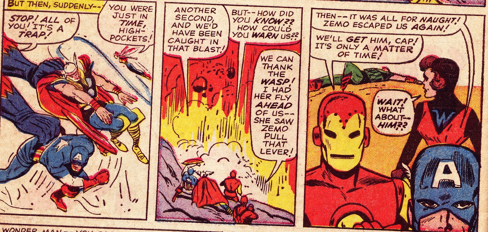
Nigel is certain that Cap is drawn by Kirby. I concur. Heck had a specific way of drawing Cap's face. This is also a typical Kirby pose. 


Avengers # 9, page 15

I suggested to Nigel that Kirby likely drew the Executioner figures in panels 1 and 5. Nigel was not totally convinced about panel 5, but agreed on panel 1, and suggested Kirby also drew the Executioners face in panel 4, which I agreed with. 


Avengers #9, page 20, panel 8

This is clearly a Kirby drawn Cap figure.


Avengers # 9, page 21

Nigel noted Panel 3 as Kirby drawn. The figures of Thor, Cap and Giant-Man's hands all have the Kirby look, with the exception of the wasp. I noted Kirby corrections on Cap's face in panel 5. Heck drew Cap's eye slots much bigger.      

Avengers # 10, page 8, panel 6

I suggested the Giant-Man figure to Nigel, who agreed with me, noticing the gloves and Kirby's stylized anatomy. 


Avengers # 10, page 18, panel 5
                                              
     Another very clear example of Kirby redrawing a panel.


Avengers # 11, page 9, panel 3.

In Avengers # 11, pencilled by Heck and inked by Chic Stone, we find a Kirby drawn Giant-Man figure. Note the boots and the typical Kirby pose.

Avengers # 11, panels 1 and 3.

I pointed out the Giant-Man figure in panel one as being drawn by Kirby. Note the difference in style from panel 2, which is drawn by Heck. Nigel agreed and pointed out panel 3 also being a G-M Kirby. It seems obvious to me now, and I wonder if Kirby didn't have a hand on the Spider-Man pose as well. 

                                 
                                Avengers # 11, page 14, panel one


This is one of the few panels Nigel and I disagreed on. Nigel believes this is a Kirby corrected Thor, but I feel this is likely Heck's work. Although the figure does have a Kirby-ish look, the pose, especially the left leg, looks more Heck than Kirby to my eyes. Also, note the hand which is touched up. Thor was clearly holding his hammer in his hand, but  in the previous scene Thor was without his hammer. Nigel was able to contact the great Chic Stone, who inked the issue. He had this important information to pass on:

" Jack did many "touch-ups" on other pencillers; work when Stan thought certain figures lacked dramatic impact."

Stone also belived that the Thor figure was "definitely pencilled by Jack" To Nigel's credit he admits that Stone's saying so doesn't make it positive. Artists sometimes are unable to discern styles, sometimes even their own after some 35 years had passed.  


Daredevil # 2 June 1964, page 2 -Orlando/Colletta/Kirby?

I'll close with a few possible Kirby corrections that I pointed to in my correspndence with Nigel way back in June of 1999. The above page from the second issue of Daredevil is interesting. Many artists struggled with  drawing the Thing, from Steve Ditko to Dick Ayers. This version looks a little too close to Kirby's, and very different from Orlando's style. Unless Orlando swiped from Kirby, I suspect this was Kirby redrawing or fixing up Orlando's figures. Further evidence points to someone else working on the Thing, as I don't see  Vince Colleta's fine line inking on the figure. I'm uncertain if this is Kirby inking though.     


DD # 2, page 3

Here are a few more figures from page 3. To my eye they look very much like Kirby Thing figures circa 1964, particularly panel 3. The remaining panels which featured the Thing on this page are too small to decipher, but are likely "pure Orlando/Colletta" figures (why bother to touch up such small figures)?. Am I 100% convinced Kirby drew these panels?  Nope, but the evidence points pretty strongly to Kirby.  


Strange Tales # 131, April 1965. Bob Powell pencils; Mike Esposito inks


Thing figure by Kirby?

The cover to Strange Tales is clearly drawn by Bob Powell, but the Thing's pose, his hands and his figure bear the mark of Kirby. Powell's Thing looked more ape-like, and this figure looks very much like Kirby's original. 


Strange Tales # 131, page 7, panel 5

Finally we have an interior panel from the same issue, drawn by Bob Powell, with inks by Dick Ayers. Again, the Thing's pose and figure have the Kirby look, although his features and poses in other panels drawn by Powell do not look the same. It is possible Kirby touched up a few other Thing figures in the story, but nothing jumped out at me like this panel did.    

And there you have it, an examination of some of Kirby's possible correction work at Marvel. While Sol Brodsky was the production man at the time, there were time constraints, and Stan would likely want the characters to look right. If Kirby were in the office it would be best to go to him to make the changes, since he designed most of them. Stan was also not above asking anyone who walked in the door to fix a page or panel, as we've seen in an earlier post with Ditko correcting a Kirby panel. I find this stuff to be of immense interest (at least to me and Nigel), so I hope a few others do as well. In the future I may point out some interesting art fixes by folks like Marie Severin, Herb Trimpe and Paul Reinman.      


My sincere appreciation to Nigel Kitching. I urge anyone interested in this post to seek out Jack Kirby Quarterly #  12 to read Nigel's complete article. The issue is filled with great artwork and features. The cover alone is worth the price, using Kirby's unpublished X-Men # 10 cover, nicely colored by Nigel himself.  

Tuesday, March 6, 2012

Ditko content worth exploring

Over the past few years I've been honored to write about the work of one of the most important, unique and distinctive artists in the world of comics - Mr. Steve Ditko - in DitkoMania. Rob Imes has been editing the revived publication, which was originated by Bill Hall. Rob's fanzine is a labor of love, and I like the fact that it is "home grown", put together the old fashioned way, with scissors, tape and tender loving care. Rob decides what to include, and his approach has been entertaining and thoughtful. While Rob has theme issues that often focus on Ditko's earlier work, he also reviews Ditko's latest output. I'm also in great company, sharing space with folks like Barry Pearl, Jason Sacks, Bruce Buchanan, Javier Hernandez, Dave Sim, Mort Todd, Batton Lash and Michael T. Gilbert (to name a few). DitkoMania has well thought out articles, wonderful artwork and a lively letters page. It's a real bargain, and I encourage anyone who enjoys the work of Steve Ditko to give it a try. You won't be disappointed.   

   http://www.ditko-fever.com/dmreturns.html

You can also read some reviews of earlier issues of DitkoMania at this site:

http://poopsheetfoundation.com/blog/2011/09/14/ditkomania-81-edited-by-rob-imes/

I think they're quite insightful.


Robin Snyder has been publishing a newsletter entitled The Comics for decades (yes, decades!), and it is always filled with interesting articles by pros (Ditko has contributed many essays over the years, detailing his involvement on Spider-Man. Essential reading for those interested in comics history), letters and artwork on all facets of comic books.  Robin produces a unique publication that centers on the positive aspects of the medium. Like Rob, his newsletter is a solo effort, and his output has been phenomenal. How he put together 12 issues a year, while also publishing the latest work of Mr. S. Ditko (lately on a Bi-Monthly basis) is beyond me. I would be remiss if I didn't add another important fact: Robin is one of the nicest people I've had the pleasure to correspond with. I salute him!  Try a sample issue, and tell him Nick Caputo sent you! You can also order Ditko's latest output from Robin, as well as much of the work he has produced with Robin over the years, including gems like Static and the Mocker.   


http://ditkocultist.com/periodicals/order-the-comics/


These are impressive, small press publications that deserve attention. They stand out in a sea of slick publications (although mags like Roy Thomas' Alter Ego, still has the same enthusiastic feel they began with, and Roy is another class act).  I hope fanzines such as Rob and Robin's continue to surprise and thrill me for many years to come.