Sunday, February 26, 2012

Unaltered Reprint covers

Ever since I can remember I've been fascinated by the process of comics: how they're put together. Pencils, inks, colors, lettering, editing, production. Early on I had an ability to notice alterations in artwork. I was a lad of 10 when Kirby moved to DC and Superman and Jimmy Olsen's redrawn faces stuck out like a sore thumb. Or, at Marvel, Romita faces were sometimes on Kirby's women, or a Marie Severin or Herb Trimpe face or figure would show up in a George Tuska or John Buscema story. I was particularly interested in comparing changes that occured in reprint titles such as Marvel Tales or Marvel Collector's Item Classics. I often took out the originals from my brothers collection and discovered that the entire story was often recolored, or there were sometimes changes in copy. Covers were particularly interesting, since the originals were often restructured in some form, either cropped, images flopped or copy added or deleted.

While many covers were new versions by different artists, especially in the 1970s, including Gil Kane, Sal Buscema, Marie Severin, Jim Starlin, John Buscema and Ron Wilson, the originals were also used, but sometimes there were subtle differences. Some of the covers, it turned out, were not the original publsihed covers, but stats of the covers before they were changed in production. There were changes big and small that occured, and I thought it might be interesting to doccument some of them.

Fantastic Four # 68, Nov 1967, Kirby/Sinnott


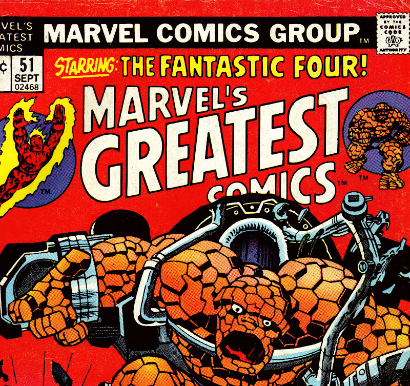
Detail to Marvel's Greatest Comics # 51, Sept 1974


The above example is one of the, um, minute changes that sometimes appeared and could easily escape detection. In the original published version the Thing's mouth is smaller than the stat that was published on the reprint. Why the change? Did someone think the Thing as originally depicted looked too frightening? The coloring on the reprint appears to obscure some of the machinery, but I don't think there are many alterations from the original, although on both versions Marie Severin may have touched up some of the machinery directly above the Thing's head.   

Fantastic Four # 70, Jan 1968 Kirby'Sinnott/Romita alterations


Marvel's Greatest Comics # 53, Nov 1974 

Kirby's original drawing reveals a number of differences from the printed cover. Sue's figure on FF # 70 was positioned to turn in the direction of the Android. Romita redrew parts of Sue's waist and leg's, as one can see from the way the lines on her skirt are drawn. Also, Johnny was originally drawn without the flames emanating from his body. Some of Sue's figure is covered on the reprint because the original copy was moved in order to add an additional caption on the upper left. In the 1970's editors often felt the need to add more captions or word baloons, making the covers cluttered and less dramatic.


Thor #129, June 1966 Kirby/Colletta


Marvel Spectacular # 2, Sept 1973
In the original Thor cover Stan decided to eliminate the architecture in order to focus on the three figures. This turned out to be a good idea, as the black background was more dramatic and attractive. The Marvel Spectacular cover had to crop the images a bit in order to fit the bigger logo. 


Fantastic Four # 71, Feb 1968, Kirby/Sinnott


Marvel's Greatest Comics # 54, Jan 1975 

As you can see, Marvel used quite a few unpublished stats in this period on their reprints. It is interesting to compare the two versions. In the published FF cover Stan again choose to simplify the background elements, eliminating most of the details on the left side of the cover (Reed and Johnny). Only the outline of a bulding appears by  Reed's figure, and Johnny's flame was altered so as not to cover the android's face. The burst in between the characters and the blurb was also cut out. The MGC cover cropped the Sue section in order for the logo to fit, but I find the composition of the burst more attractive  than the published cover version.
    
Thor # 133, Oct 1966, Kirby/Colletta/Romita alterations? 


Marvel Spectacular # 4, Nov 1973

The face of Ego was changed considerably on the published Thor cover, perhaps by John Romita, although I'm not certain. Stan must have felt that Ego's face looked too normal and wanted a more otherwordly look. I was comparing these covers with my brother John, who felt the published Thor cover looked better than the Marvel Spectacular stat. I believe minor alterations may have worked better, perhaps deleting the beard. I do like the way Kirby drew the eyes.


Captain America # 101, May 1968. Kirby/Shores/Romita alterations


Marvel Super Action # 2, July 1977 

Finally we come to a cover that was not not changed due to editorial choice, but by the demands of the Comics Code. Roy Thomas has explained that the Code was very touchy about the depiction of the Skull, and early on made it clear that the Skull's face should look like a mask, not a real skull. Kirby apparently forgot that demand when he was drawing the original cover, and John Romita was called on to make the Skull acceptable. By 1977 the Code had softened enough for the cover to appear on Marvel Super Action. The stat also has a few background elements that are a little different, and the title had to be relettered so that the UPC code could fit on the lower left hand corner.

Those are a few of the covers that were used on reprints in the 1970s. There are quite a few more, and I may detail some of those on a future blog post.   

Wednesday, February 15, 2012

John Powers Severin - An Appreciaton

"I've always been interested in people's faces. I've tried to study the types you see in various occupations or in the differences that show up with racial groups. Yes, I reckon the face is the best way to show character, but there's plenty of other things that go along with it. The hands - for example -- the way a man uses his hands shows how his mind is really working.  You can control an expression on the face, but the hands give it away. Then there's the way a character is dressed or his way of posturing."    

John Severin interview with John Benson, Graphic Story Magazine # 13, spring 1971

Beginning in 1947, and only ending recently with his passing (February 12th, 2012), John Severin had been drawing comics - and drawing them with distinctive finesse - for over sixty years. Quite an accomplishment by any standard.

"Dien Bien Phu", Two Fisted Tales # 40, January 1955. 
Severin was an artist who didn't get a lot of attention, perhaps because he was never too involved or interested in super-heroes, preferring genres rooted in a realistic background: western, war and period pieces.  Severin also spent many years working on humor strips for Cracked, and was never associated with a single character for long.  Nevertheless, Severin was one of those artists, like Russ Heath and Joe Kubert, who turned out superior work year after year.
Kid Colt, Outlaw # 84, May 1959. Severin draws you  into the scene. Severin, along with Joe Maneely, Russ Heath and Bill Everett, drew some of the most exciting covers for Atlas.


Caught # 4, Feb 1957. Severin contributed a  number of spectacular covers for Atlas' crime titles, which deserve to be collected in a Masterworks edition (you listening, Cory??)


I probably first took notice of Severin's work when he took over the artistic chores from Dick Ayers on Sgt. Fury for three issues (#'s 44-46).   


Sgt. Fury # 45, August, 1967. The expressions and body language on the characters speak volumes.

Severin continued on Sgt. Fury for a long run, inking Dick Ayers pencils, adding authenticity and detail. Severin's inks were exquisite on everyone, from Herb Trimpe to Ross Andru. Of special note is his collaboration with sister Marie on Kull.


Two-Gun Kid # 103, March 1972; Gil Kane pencils. 

Captain Savage # 16, September, 1969. Don Heck pencils. The only time Severin inked Heck.


I began to fully appreciate Severin when I discovered his earlier work, in reprints of his EC war and humor stories for Mad. As I became interested in collecting pre-hero Marvel's in the 1980s I bought many westerns at conventions, attracted by Severin's exceptional covers. All the while Severin continued to work for companies such as Warren, the short-lived Atlas/Seaboard line (in the magazine Thrilling Adventure Stories), and DC, on "the Losers", "Unknown Soldier" and "Enemy Ace" to the recent Bat Lash series. It was always worth checking out anything Severin drew since the quality of his art continued to remain high.


Western Gunfighters # 9, May 1972. Severin produced many covers for Marvel's western reprints on the 1970s and they are well worth seeking out. Severin also drew the sidebar characters.


John Severin was a rare breed that turned in exceptional work day in and day out. Never flashy, his art had a quiet integrity which stands the test of time


Tuesday, February 7, 2012

Stan Goldberg – Prince of the Palette

Stan G., as he became popularly known at Marvel in the 1960s, was both proficient and highly skilled, coloring covers and interiors, and inventing the color schemes for the Marvel Super-Heroes, including Fantastic Four, Spider-Man, the Hulk, Thor, X-Men, Daredevil, Iron-Man and Dr. Strange. Goldberg was not only a stunning colorist, but also a solid artist in the teen-humor/romance line, including a long run on Millie the Model. Goldberg used his limited palette to produce a distinctive look for the Pre-Hero Marvel and Marvel Age line-up. His use of solid colors, gradations and "knock-outs" (a term used to describe the use of a single solid color in a panel) was exceptional, and Editor Lee had a trusted and professional staffer to rely on.


The "Knock-Out" from "The Clock Maker" Strange Tales # 96, May 1962, Ditko Art

Kid Colt Outlaw # 97, March 1961 - Kirby-Ayers Art. Goldbergs's coloring of the prisoners in the foreground in solid gray, along with white space, adds emphasis to the hero, Kid Colt.
Goldberg began working for Timely as a teenager, drawing stories and coloring. He soon took over the coloring department and remained with Marvel until 1968, when he moved over to drawing for Archie and DC. At Marvel, Goldberg added a quality of mood that suited the line. Very different from DC’s primary colors, Goldberg used grays, purples and dark greens to great effect, especially in the monster and fantasy stories of the late 1950's and early 1960's. His monsters all followed similar color schemes; oranges, grays, browns - making them stand out (as can be seen in my post Monster's at my Window) . 

This sense of mood continued with the Marvel heroes, fashioning a distinctive company look. Goldberg's work followed a pattern: the villains were adorned in greens and purples (Dr. Doom, The Mandarin, Loki, Mysterio, the Frightful Four); the heroes in blues, reds and yellows. Lee's Marvel line-up developed a consistent look, down to the lettering and coloring. Goldberg, like Artie Simek and Sam Rosen (see my previous post for more on both men), were professionals who created a body of work than can be admired and appreciated, especially since it was done on a deadline.
Amazing Spider-Man # 23, Apr 1965, Ditko art. Notice how Goldberg did not color Spider-Man's costume in solid red or blue, instead using shading to provide depth, as he did on many of the Marvel characters .
Avengers # 23, Dec 1965, Kirby-Romita Art. Goldberg's coloring of Kang adds dimension to the cover and contrasts with the colorful Avengers.


FF # 47, Feb 1966. Kirby-Sinnott Art. Beautiful use of grays to emphasise the heroes, with the red of the Torch standing out. 
X-Men # 16, Jan 1966, Kirby-Ayers cover. Kirby's 3-D art is enhanced by Goldberg's reds and yellows. The purple logo stands out. 
Tales of Suspense # 80, Aug 1966. Kirby-Heck cover. Another beautiful combination of colors, especially the yellows and greens.

Sgt. Fury # 16, March 1965, Kirby-Stone art. Goldberg's use of yellow in various gradations makes the reader literally feel the heat and exhaustion that Kirby vividly depicts on the Howlers.

Stan Goldberg is one of a kind. Versatile, inventive and charming in person, he is part of a special era in comics, when a few very intelligent and talented people got together and made comic books that are worth revisiting. While comic book production has changed and improved over time, and coloring is now done on computer, with endless choices, the old school of Goldberg and his peers were able to do more with less, and often accomplish much despite the drawbacks. They tower above the rest as examples of some of the best in the field.          

Amazing Spider-Man # 39, Aug '66, Romita cover. One of my earliest memories of a comic book I  took notice of on the comics rack, the brilliant gradations of light blue to purple immediately caught my attention and remains a favorite. 


Saturday, January 28, 2012

Journey Into Minutiae - Undocumented Ditko Thor

Every once in a while its nice to write something deserving of the "Minutiae" title, and this post achieves that. A few months back my brother John, who often sends me emails when there is a question of identifying art, forwarded me something that was being advertised on Heritage Auctions. It was page 13 of Journey into Mystery # 88, an early Thor story, drawn by Kirby and inked by Dick Ayers. It's always a treat to look at original art pages, especially (for me) studying the border notes by Kirby and others, as well as Stan's production notes to Sol Brodsky. This page was particularly intriguing because it includes a panel that was changed before publication.


Original art to Journey into Mystery # 88, Jan 1963, Kirby pencils;Ayers inks

Close-up of Thor panel by Kirby


There have been numerous instances where Stan requested art corrections or alterations, so that was no big surprise. I put the page away and intended to compare it to the original, to see why it was altered and what Kirby redrew. I never got around to comparing the page, having completely forgotten about it, but the other day I found it mixed in with other papers and decided to check out the original comic. That's when I was in for a surprise.

When I took a close look at the panel I realized the alteration was not by Kirby, or production man Sol Brodsky, but Steve Ditko! The distinct inking on Thor's arms and the depiction of earth was a clear giveaway.


Published panel by Steve Ditko. Note the linework on Thor's arms and the Earth

After comparing the printed panel to the replacement, it was obvious that Stan wanted it to be clear that Thor was flying away from earth. The simple reason Stan didn't have Kirby make the change was probably because Ditko happened to be in the office when it was needed. This was not the first time that Ditko fixed a Kirby panel; he did the same in FF # 20, which was discovered, I believe, by Nigel Kitching, who has pointed out many corrections by Ditko and Kirby in this early period to me many years ago.


Page 17, panel 3 of Fantastic Four # 20, Nov 1963

It's also interesting to note that Ditko inked the cover, which he may have picked up when he made the correction.


Journey into Mystery # 88, Kirby pencils; Ditko inks
It's always a thrill to discover - and share - the little surprises that continue to crop up. It's part of the adventure of investigating the ongoing history of comics.


Monday, January 23, 2012

Attention Paid: The Lettering skills of Artie Simek and Sam Rosen

An essential component of Marvel Comics’ distinctive appearance in the 1960s was the interior and cover lettering of Artie Simek and Sam Rosen - two of the finest craftsman employed by Stan Lee. Both men had worked in the business for decades: In the 1940s Rosen lettered for Will Eisner on his seminal Spirit comic strip and produced much work for Quality comics (Blackhawk); Simek worked on staff at Timely comics, the precursor to Marvel, where he crafted many logos. He also lettered for DC in the 1950s, where his work can be seen in Tales of the Unexpected and early issues of Challengers of the Unknown. Both men brought bombast and personality to Marvel's 1960s output. Guided by Editor/Art Director Stan Lee, who helped design the different bursts, balloons, captions and sound effects that Simek and Rosen brought to life, the Marvel letterers, through Lee’s promotional extravagances, began to gain unprecedented recognition, even if they were often the punch line to countless jokes in the credits.


Simek's name can be seen on a billboard, possibly added by artist John Severin, "A Dude There Was!" Stan Lee story. Two-Gun Kid # 50, Oct 1959.  

Sam Rosen's bold title lettering, splash from Amazing Spider-Man # 17, Oct 1964, Steve Ditko art.

Artie Simek's clean, attractive lettering (note the signature scallop style on "The Search for the...") Fantastic Four # 27, June 1964. Jack Kirby pencils; Chic Stone inks and Stan Goldberg coloring. All professionals at the top of their game. 
Besides contributing to a skillful product at Marvel for over a decade, Simek and Rosen designed eye-catching and attractive logos that drew the attention of those browsing the neighborhood newsstands.  The Fantastic Four, said to be designed by Sol Brodsky, with assistance from Artie Simek, had a fanciful, circus like style that was unlike more serious logos, the Amazing Spider-Man, possibly with the help of Steve Ditko, created a motif that held the lettering in an intricate web; Thor and Sgt. Fury had scalloped edges that were the motif of Artie Simek. The ragged, rough-edged look made the line stand out. Stan Lee, as art director, oversaw the finished product, as did publisher Martin Goodman. 

Sam Rosen lettered the cover of Tales of Suspense # 51, March 1965, Jack Kirby pencils; George Roussos inks. Stan Lee sometimes wrote directly on the penciled art, setting the balloon placement and style he wanted (i.e. the arrow, burst) that Rosen skillfully rendered.   

Artie Simek lettering, splash to Journey into Mystery # 125, Feb 1965, Jack Kirby pencils; Vince Colletta inks.
While other letterers were employed by Marvel in the 1960s, some quite good, especially the work of John Duffy, Ray Holloway (who is often credited as using the pen name "Sherigail." It is actually production assistant Morrie Kuramoto, who used an amalgam of his wife and daughters names), Jon D'Agosyino and Terry Szenics (whose husband Zoltan also worked in the industry as a letterer and occasional artist).Simek and Rosen were the workhorses, though. Their presence was anticipated almost as much as Lee, Kirby, Ditko, Colan or Romita. Simek worked for Marvel until he died in 1975; Rosen’s last work appeared in 1972; he reportedly had a nervous breakdown and passed away in 1992. His talented brother, Joe, another prolific letterer for various companies, including Harvey, went on to work for Marvel into the 1990s.

John Duffy's earliest lettering credits date back to the late 1940s. He worked for a great many companies in the 1950s, including Hillman, St. John, Chalrton, Dell, Archie and DC, to name just a few. Duffy likely started freelancing for Marvel in the late 1950s. He worked on a few fantasy stories and on early issues of The Fantastic Four and other hero titles. His attractive, low-keyed lettering gave a distinctive ambiance to Ditko's Spider-Man. The above example is from issue # 3, July 1963. Since this blog is entitled "Marvel Mysteries and Comics Minutia," I'd be neglectful if I didn't note that Duffy was paired with Ditko again in the mid-1970s, when he inked some of his Atlas/Seaboard stories (The Destructor; Tiger Man). 

Ray Holloway's splash to Journey into Mystery # 89, Feb 1963; Jack Kirby pencils; Dick Ayers inks, featuring one of my favorite titles: "The Thunder God and the Thug!". Holloway worked on staff at Timely/Atlas, I'm unsure of exactly when he began lettering, although examples likely occur in the late 1950s "monster era". He crafted quite a few of the early superhero stories in the 1960s and also worked for DC on many titles. His last known work appeared at Marvel in the mid-1970s in Spidey Super Stories.  

Terry Szenics was an both an inker and letterer; her art appeared primarily in MLJ/Archie comics titles from the 1940s into the 1960s. She worked for Marvel in the 1960s as well, particularly early fantasy and superhero features. Her attractive, subdued lettering was a perfect fit for Ditko's mood-drenched "Doctor Strange". Splash page from  Strange Tales # 111, August 1963. 
Although rarely discussed in conjunction with the period of 1960s Marvel, Simek and Rosen’s talents were sorely missed by the mid-1970s, when quite a few less talented letterers were employed. Those less skilled at calligraphy made the finished package considerably weaker in appearance.Thankfully, a number of exceptional letterers continued to grace the Marvel line, notably Tom Orzechowski and John Costanza, but the professionalism of Simek and Rosen was a cut above, ranking highly with the best in the field such as Ben Oda, Joe Letterese, Howard Ferguson, Gaspar Saladino and Ira Schnapp, to name a few. Along with the coloring skills of Stan Goldberg (who rates his own blogpost, coming soon) Simek and Rosen gave the Marvel comics of the 1960s a distinctive and attractive look.     

For an informative study on Marvel's logo's (as well as other companies) go to lettering pro Todd Klein's blog:
http://kleinletters.com/Blog/?page_id=2709

Tuesday, January 17, 2012

Monsters at my Window or Why Pre-Hero Marvel's Matter

Since the Marvel Masterworks –Atlas Era Tales To Astonish Vol 4 comes out this week, which includes my essay on those stories (I hope you’ll all go out and buy it, since it’s a worthwhile book. I've included a link to the Marvel Masterworks site for a better look):
I thought it would be a good time to discuss the importance of what some consider “silly monster stories”, with little meaning in the scheme of things to the Marvel Superhero explosion. Having studied and collected these comics for many years, including the original comics in their sequential order, I’ve concluded that they very much affect the future Marvel Comics Group. In terms of plotting, creative teams and concepts they became the clay which would slowly mold itself into a new era, one that took not only elements of the monster story, but those of romance, westerns and teen humor. What Lee, Lieber, Kirby, Ditko and the rest did was transform bits and pieces of their stories into another format. With the formation of the Fantastic Four in 1961 the scientist hero of the monster stories, as well as the monster, became integral to the new superhero tales.
"Vandoom", Tales to Astonish # 17, Mar '61, Lee/Lieber story; Kirby pencils; Ayers inks. The hulking monster with the enormous mouth might look like the Cookie Monster on steroids, but Kirby's creatures were distinctive and had a charm all their own.      

The “sympathetic monster” was not a new idea. It had appeared in literature for a long time, in tales of the Frankenstein monster, Dr. Jekyll and Mr. Hyde and the Hunchback of Notre Dame, later becoming fodder for countless movies, where a larger audience consumed them. The creation of the Thing might be considered an act of either genius or desperation, but this crossover character, reminiscent of the monsters that stampeded through the pages of Strange Tales, Tales to Astonish, Tales of Suspense and Journey into Mystery, struck a nerve with its audience and became the most popular character in the Fantastic Four.  While most of the Pre-Hero monsters were amoral fiends, there were a few stories that spotlighted a creature that was feared or misunderstood, and sometimes blindly hated due to his appearance. The Hulk was another direct descendant of this scenario, and although the monster-hero took a while to find its footing, the Hulk eventually achieved lasting popularity and became a pop culture icon.
"Zuttak" Strange Tales # 88, Sept '61; Lee/Lieber story; Kirby pencils;Ditko inks. Another unusual looking Kirby monster, with the meticulous inks of Steve Ditko adding definition and atmosphere to Kirby's pencils. 

As a company Marvel took time to develop. They were not an overnight success, although the Fantastic Four became one of their top selling titles. All the early strips were outgrowths of the pre-hero monsters and held a great debt to them. Henry Pym began life as a scientist-hero in a one-shot monster story, but went on to develop a costumed identity as the Astonishing Ant-Man. Scientists played an important function in the early Marvel Hero era. Reed Richards, Henry Pym, Bruce Banner, Tony Stark, even Peter Parker (who was a science major), were all invested with knowledge that they used to further their goals, or the goals of society.  Scientists in the pre-hero era were either involved in the creation of a monster, or helped to destroy them. Many were outsiders, scoffed at or mocked, and often unheralded by the public. At best, their girlfriend's had a greater respect for them. In the Marvel age many of the heroes also quietly performed their deeds with little recognition, or often outright distrust and anger. Spider-Man exemplifies this attitude.   
"Goom!" Tales of Suspense #15, Mar '61; Lee/Lieber story; Kirby pencil; Ayers inks. Another orange-skinned creature with a huge mouth, but his skull like face, small eyes and bat wings differentiate him from others of his ilk.

The inventiveness and imagination of Jack Kirby and Steve Ditko were very much in the forefront of the Pre-Hero era. In radically different ways both men imbued their stories with a personal drive that few matched. Kirby, with his massive, overwhelming, destructive monsters, and Ditko, with his more intense and personalized vignettes, achieved a balance. Backing them up were craftsman such as Don Heck, Joe Sinnott, Dick Ayers and Paul Reinman.
"Something Lurks Inside", Tales to Astonish # 10, July '60. Steve Ditko's nightmarish creatures and anxiety stricken characters achieve a striking mood reminiscent of Rod Serling's Twilight Zone TV series (1959-1964) which was then on the air. 

While reading many of these stories in one sitting betrays a repetition in style, tone and plotting, it is important to realize they were produced on a deadline and meant to entertain a young audience that gobbled up monster stories, especially in the movie theaters and on TV. They were not designed to be consumed in one gulp, or analyzed over 50 years later. It is all the more intriguing that these tales of monsters and heroes continue to hold their own in terms of craft and charm. One of the reasons is the visceral joy that Kirby put into his figures. One can’t help but smile at some of the outlandish monsters he conceived month after month, story after story. While some repetition was to be expected, given the nature of a monthly publication schedule, more often than not Kirby batting average was phenomenal. 
"X", Tales To Astonish # 20, June '61; Lee/Lieber story, Kirby pencils; Ayers inks. Innocent bystanders running in fear through the streets was a standard, although restrictions by the Comics Code Authority kept violence to a minimum.     
 Lee, plotting and editing, with brother Lieber scripting, came up with offbeat, goofy and weird names that held the reader’s attention, from Spragg to Zuttak. This enthusiasm made its way into the superhero tales, with an added layer of personalities, characterization and ongoing story lines. .

Mister Morgan's Monster, Strange Tales # 99, Aug '62. Lee/Leiber script; Kirby pencils; Ayers inks. An example of the misunderstood, heroic character that would typify the later Marvel costumed heroes.
I was first attracted to these stories as a child when they were reprinted first in the pages of Fantasy Masterpieces, and later in titles such as Where Monsters Dwell and Where Creatures Roam. This eventually led to my quest of collecting the original issues. I've always found the monster era to be a source of fascination - the stepping stone to the Marvel heroes - and a fun place to visit from time to time.   
"Spragg, the Living Hill", Journey into Mystery #68, May '61. Lee/Lieber story; Kirby pencils; Ayers inks. I close out with a sentimental favorite. I envision Spragg as a claymation movie, destined to put the box office numbers of Avengers, X-Men and Thor to shame! (and I'm probably the only one who feels that way!)


Wednesday, January 4, 2012

NOW IT CAN BE TOLD! MY AFFAIR WITH ROMANCE COMICS! ("As Told to Nick Caputo")

I don’t recall when I purchased my first romance comic book; it might have been Our Love Story # 5, with a Steranko story, at a convention, but eventually the stigma of a male buying romance comics dimmed, and, like my interest in other genres; western, crime, mystery - I gained an appreciation for this neglected and demeaned genre . While it often suffers from repetitive plots, that is also the case in many genres, including the beloved superhero. Romance is important in the context of superheroes, specifically the melding of those elements into the 1960's story lines. Stan Lee incorporated aspects of the romance strip, as he did with humor and teen strips, fashioning a "new" superhero formula in the process.
Young Brides # 25, Nov-Dec 1955, Prize. Kirby pencils; Simon inks, alterations? The dog in the background adds the perfect touch to the cover!
­­Romance comics have a rich history, again tied to superheroes, due to Joe Simon and Jack Kirby's involvement. The team that created Captain America and a plethora of superheros took  notice of what magazines girls were buying, and turned out comics of a similar bent. When their romance comics became an overwhelming success, other companies jumped on the bandwagon. Romance comics flourished during its heyday of the 1950's, including Timely-Atlas, National, Avon, Fawcett and Charlton, to name a few. Some stood out due to the distinguished artwork of craftsman like Alex Toth, Matt Baker, Don Heck and many others. Vince Colletta was one of the best in this genre, even though he later became associated with superhero comics as an inker. 

Sales slowed down considerably in the 1960's, but romance comics held on, especially at DC and Charlton. John Romita, who penciled many romance features for DC, put his ability to draw attractive women to great advantage when he moved to Marvel in 1966, turning Spider-Man into a strip that emphasized romantic angst, as did Gene Colan. By the 1970's romance was dying out, perhaps due to changing tastes and stagnation. There were a few experiments, such as full-length Gothic romance stories at DC, but nothing lasted.
I grew interested in romance comics when I began researching Marvel’s 1960's output for my book, since I believed it was important to look not only at the superhero material, but all the concurrent titles, including western , teen-humor and romance. With the help of Timely-Atlas scholar Michael Vassallo I was able to pore through many titles, including Teen-Age Romance, My Own Romance and Love Romances , which continued into the early years of Marvel’s hero line. I eventually began to track down some of the issues on my own, adding them to my collection, especially the Kirby drawn stories that were concurrent with his  western, monster and superhero output.
My Own Romance # 75, May 1960, Kirby pencils, Vince Colletta inks
While Marvel’s romance line ended in the early 1960's, replaced by superheroes, there was a return to the genre in 1969, when Marvel launched Our Love Story and My Love , featuring new stories and artwork by the same folks that toiled on the superheroes, including Stan Lee, John Romita, Don Heck, Gene Colan and John Buscema. I suspect some of the stories were prepared from old scripts, redrawn (and edited), a system which cut down on the work load (this also occurred on some of the concurrent mystery stories), but it was a thrill to see “new” work from those familiar artists. Some, like Don Heck, were more comfortable here than in the costumed hero arena (and graced with better inkers, like Frank Giacoia and John Romita), but the storytelling skills, ability to draw attractive women and attention to clothing and hair styles pointed to the versatility of all the artists.

I was pleasantly surprised by the combination of artists and inkers paired together, many who never worked together on superheroes. Young artists were given a chance to learn their craft on romance stories, including Jim Starlin, Alan Weiss and Steve Engelhart - as both a writer (under the name “Anne Spencer”) AND an artist, inked by pros John Romita and Jack Abel. Engelhart, who began his career drawing for Warren, soon found his niche as a distinctive writer, turning out some of the better superhero fare for Marvel in the early-mid 1970's.


"Must I Live Without Love?" Stan Lee story?; John Buscema pencils; Sal Buscema inks? My Love # 1, Sept 1969 

"I Dream of Romance" Stan Lee script?; John Romita art, My Love # 1, Sept 1969. Romita's eye for design is in evidence on this page. In the early issues there were no credits, so this may be a Lee script, or a revision of an earlier Atlas story.    


"Jilted!" Stan Lee story?; Don Heck pencils; John Romita inks, My Love # 2, Nov'69.
Heck's storytelling skills excel in realistic settins, and Romita's inks add lustre.
My Love # 14, Nov 1971. Gray Morrow cover and colors? Marvel exploited contemporary events with this cover and interior story taking place at Woodstock. 
As Time Goes By!", Gary Freidrich script, Gene Colan pencils, Dick Giordano inks, My Love # 16, Mar 1972
Colan was excellent as facial expressions and body language, and here we get to see his interpretation of Bogie!
"Puppet on a String!" Gary Freidrich,script, Steve Englehart pencils, John Romita inks, My Love # 16, Mar 1972
"One Day a Week!", Author unknown; Jim Starlin pencils; Jack Abel inks, My Love # 20, Nov '72, as reprinted in Our Love Story # 33, Apr '75 


"How Do We Know When It's Really Love?", Stan Lee story, Gene Colan pencils; Sal Buscema inks,Our Love Story # 4, Apr 1970

I'm surprised that Sal never inked Gene anywhere else, since he did an excellent job on this story.  


"As Good As Any Man!" Holli Resnicoff story, Alan Weiss art; Our Love Story # 16, Apr 1972 


"The Game of Triangles!", Joy Hartle script, George Tuska pencils; Paul Reinman inks; Our Love Story # 20, Dec 1972.
I find Reinman's inking more appealing than Mike Esposito, Tuska's frequent inker.  
I’ve been lucky enough to acquire all the new material Marvel issues, a number of earlier Atlas material, and assorted work by companies like DC and Charlton. DC had wonderful covers by Nick Cardy and Dick Giordano, as well as interior work by Don Heck, Mike Sekowsky, Creig Flessel, Tony DeZuniga, Werner Roth, George Tuska and Alex Toth; Charlton featured early work by Jose Luis Garcia Lopez, and, surprisingly, a few stories by Steve Ditko, some only recently discovered (I can only hope a few more exist in the plethora of Charlton romance titles, but it’s doubtful).
"Surfing, Fishing and Kissing", Joe Gill script ?; Steve Ditko artwork, Time for Love # 13, Nov 1969. While Ditko is not known for his romance art his skills are evident on this page, particularly on the face of the father in the last panel.
I’ve learned much more about romance comics, mainly through my pal Jacque Nodell:  http://sequentialcrush.blogspot.com/                          

Her blog is a mixture of information, cultural history and just plain fun. Jacque is a historian that has developed her own style in discussing romance comics of every time and era.  You can’t go wrong checking out her blog, its the best of its kind. Another excellent resource is the Grand Comicbook Database:  http://www.comics.org/  where you can view covers from all the companies. It's wonderful to see the variety of styles and some truly beautiful artwork. I've also contributed by identifying quite a few cover artists. 
Over the years I’ve learned that the romance genre is just as rich and interesting as any other, and though I (like most boys in that time-period) steered clear of them, I’m glad that I've matured - a bit - since then, and can truly appreciate the quality and variety that romance comics have brought to the field.  
Special thanks to the queen of romance comics, Jacque Nodell, for her time, knowledge and friendship.