Saturday, November 23, 2019

Why I Like Steve Ditko

Note: The following is a blog post that was originally presented on July, 28th, 2011.  Some of the content has been updated but the general tone has been retained and I've left some of the topical comments as is. (More on Ditko, indeed!) 

One of my earliest forays as a blogger finds me spotlighting Steve Ditko's contributions to comics. I believe it's entirely justified, and even incumbent upon me, for such an oversight would be comparable to chronicling the history of the New York Yankees and ignoring the achievements of Babe Ruth or Mariano Rivera. I encountered Ditko's art at a very young age and was captivated by it virtually from the start. Why did his particular style resonate with me on such a visceral level? While searching through my memories one image surfaced with vivid clarity: an Amazing Spider-Man panel where a gang of criminals are fleeing. Ditko's composition was brilliant in its simplicity, showing the miscreants from the waist down, clearly startled by the Spider-Signal illuminating the pavement. I observed how their trousers swayed rhythmically, with a sense of bone and sinew underneath (that's how MY clothes moved when I walked!). Even a six or seven year old recognized that the artist drawing these pictures had done his homework, providing an underpinning of authenticity alongside the fantastic elements.
       
Amazing Spider-Man # 19, Dec 1964
Ditko's work is distinguished by an understanding of what makes a comic book work. Following the lead of artists he admired (Will Eisner, Jerry Robinson, Mort Meskin) Ditko was able to delineate figures, forms, settings and people with a knowledge of the real world. Ditko studied how clothing flowed against a body in motion and innately grasped the complexity of hands and muscle structure. Like master cartoonist Alex Toth, Ditko was able to make the complex simple by knowing what to include and what to excise. 


                                   Amazing Spider-Man # 15, August 1964. 

Ditko brought a sense of realism to his characters by not turning them into superhuman powerhouses (not that there's anything wrong with that - but more on Jack Kirby in future posts). Another early recollection is the cover to Amazing Spider-Man # 15, the elements of which Ditko orchestrated with masterful precision. Every piece of information adds to the excitement: Spider-Man in the foreground, struggling to free himself as his pursuer approaches. The park setting is established by trees and rocks, capped off by a city landscape in the background. Unlike DC characters, who often faced absurd or gimmick-laden situations, Ditko's heroes were vulnerable and their predicaments transpired (as in this example) on the borderline of possibility. The curiosity of prospective buyers was probably aroused considerably in trying to guess HOW Spider-Man would escape. I know I was completely captivated by it.    


Rarely did a hero get a beating like this in comic books! Spider-Man's rouges gallery, including the Scorpion, were a distinct threat - more like the maniacal Richard Widmark in Kiss of Death (1947) than Superman's Lex Luthor. Ditko made this clear by Spider-Man's crumpled posture and with little touches such as his torn costume. It also made a strong point; that doing the right thing had consequences. Amazing Spider-Man # 20, January 1965, Dialogue/co-plot? by Stan Lee; lettering by Artie Simek; coloring likely by Stan Goldberg.      

Ditko imbued his pen and ink creations with a palpable sense of fragility. They could get bruised and battered (although, due to Comics Code restrictions they could not bleed, certainly not in 1965) and had to use their intelligence to outwit opponents. Ditko plotted out stories with a level of thought and deliberation that was rarely reflected by his peers. Revisiting his work invites new observations and further analysis in much the same way one studies the oeuvre of Alfred Hitchcock or Miles Davis.


The above page encapsulates Ditko's ability to relay information and distinguish each character with distinctive personalities, often refining them over time. Two examples that would be appropriate here include Aunt May, originally drawn as a heavyset woman and Jonah Jameson, whose mustache was trimmed to the extent that it gave him a Hitlerian appearance. Amazing Spider-Man # 17, October 1964.

Another aspect of Ditko's art that immediately appealed to me was his whimsical nature, accentuated by an almost silent movie clarity through facial expressions and body language, most notably the use of hands as a tool to depict emotions. Some of these techniques were no doubt mastered by studying the industry's greatest storytellers (including newspaper strips such as Chester Gould's Dick Tracy and Harold Gray's Little Orphan Annnie, which were likely a strong influence on Ditko's artistic formation.) With the dexterity of a trapeze artist Ditko balanced fantasy elements essential to superhero comics alongside more down-to-earth situations. Whether it was Peter Parker frantically attempting to avoid a blind date, or, at the other end of the spectrum, plagued by doubts and fears that seemed insurmountable to a teenager, Ditko undoubtedly raised the bar in his chosen field.      

Ditko is an original. Unique, offbeat, compelling. Now in his 80s, he continues to draw comics. There are those who chose to denigrate the man on a personal level, criticizing his choices or seeking to invade his personal space. I've read too many articles, blogs and essays filled with distortions, inaccuracies and outright lies about the man which have nothing to do with constructive discussions about his work. I intend to pursue a more positive direction here.


Ditko's final panel to the Dr. Strange story in Strange Tales # 134, July 1965, is an excellent example of the artist's skill at composition. The reader's eye is directed to the solitary figure of the hero walking the dark, lonely streets of Manhattan. Much like his own distinctive characters, Ditko has always followed his own path.  


More on Ditko soon...

(I hope my efforts over the years investigating the world of comics and the creators who have made it endlessly fascinating continue to be worthy of attention and I thank so many of you who have offered comments and criticism.)  
                  

Saturday, September 14, 2019

Bill Schelly: In Tribute

It will take a long time for me to get used to speaking about Bill Schelly in the past tense. His passion for comics took him on a journey throughout his life, from teenage publisher to author of countless books, chronicling both his experiences and shining a light on many important - and some often neglected - creative juggernauts. And it all began when a wide-eyed eight year old began reading a Superman Annual. 

When Schelly learned Richard Shields, a fellow classmate, also collected comics, a friendship began, which led to his discovery of fanzines, amateur publications that, for the price of a stamp and a few coins could be purchased through the mail. This opened a whole new world for him: as recounted in his book Sense of Wonder A Life in Comic Fandom (2001, revised in 2018).


"What's This?" I asked Richard, pointing to the sheet with the Eye character. "Some kind of comic book?" "Yeah." "Where do you buy it? I've never seen this character on the racks." I wondered if there were regional comic book companies that didn't distribute their wares in Pittsburgh. "Idiot!"  He said, laughing. "It's not like a regular comic book. You have to send away for it. It's probably printed like Rocket's Blast-Comiccollector." We looked through the copy of RB-CC which was duplicated by the same printing method our school teachers used for pop quizzes  and worksheets.  I didn't know the name of the process, but the print was purple.  We were captivated by page after page of advertisements for old comic books, some dating back to the 1940s. Shields let out a long whistle. "Look at this! Someone wants fifteen bucks for Captain America # 1!" "That's nuts!" I replied, shaking my head. "Who would pay that much?" "I don't know, but a lot of the other old stuff is only three or four bucks. I think I'll get some of 'em, if I can figure out which ones are the best." "That's too much for me, but here's a copy of Spider-Man # 1 for a buck-fifty. I think I'll send for that." Although the ads for much-sought-after back issues were fascinating, I was equally interested in the fanzines that promised information about comics of the past. Just the idea that you could buy a bunch of different magazines about comics fascinated me. What a momentous, mind-boggling development this was! My joy know no bounds!      
This soon led to the 12 year old Schelly crafting his own fanzine, in tandem with Shields, whose father had access to an early Xerox machine. The boys first effort was Super Heroes Anonymous. 

  Super Heroes Anonymous # 1, published in January 1965, was Schelly's crude but ambitious debut effort, which included a character he created: The Immortal Corpse. The cover was marred by a technical glitch; early Xerox machines were unable to reproduce solid blacks.

After the second edition Schelly devised a more impressive title, Incognito, which ran for two more issues (# 4 and Incognito Extra # 1). In this period he became friends with fellow fan/collector Marshall Lanz and produced two issues of a new fanzine, Fantasy Forum.  

Schelly's next endeavor was a concerted effort to up his game. He achieved that goal with the publication of Sense of Wonder # 1 (May 1967), which had better quality printing and a more impressive presentation. He and other talented fans wrote prose stories, comic strips and articles. Contributors included Ron Foss, Dick Trageser, Alan Hanley, D. Bruce Berry, Larry Herndon and John Fantuccio.  

 Steve Ditko's cover art to Sense of Wonder # 6, 1968. In his editorial Bill wrote: "Steve Ditko's Mr. A frontal piece is no doubt our finest cover; hope you enjoy it as much as we do. Thanks for taking time out from your various projects, Steve." When Ditko saw the published cover he wrote Schelly, sternly criticizing him for using color on a drawing he expected to be reproduced in black and white. Schelly felt Ditko had a valid point, and his words stung all the more deeply because a few years earlier he used, without Ditko's permission, a drawing of Dr. Strange in Super Heroes Anonymous # 2.          


A sign of things to come, Schelly wrote a six page overview of Alfred Hitchcock's career in Sense of Wonder # 6. Ditko and Hitchcock in the same issue. Quite a combination!  


SOW # 6 also included biographical info on the 17 year old Schelly.* It reveals a self-deprecating sense of humor ("Bill is 'known' for his advertising of fanzines that never come out") and quite a bit of wisdom. One of his ambitions was achieved with impressive results: writing books.  

* (An historical aside for those born in the past few decades. Technology in the early 1960s was limited. Making multiple copies of an original typed manuscript often meant using a spirit duplicating machine, a device that had a drum and ink which one put paper through. Schools and churches employed this device, and while the first few dozen  copies were usually clear, repeated use led to blurry, smudged and often unreadable results. For some kids producing fanzines on a limited budget it was their only option).        


As noted in his bio piece, Schelly was a huge Batman fan/collector, as evidenced by the above letter that appeared in Batman # 222, June 1970.  
                         Robert Sanborn's cover to Sense of Wonder # 11, Spring 1972

Larry Herndon's long-running fanzine Star-Studded Comics was scheduled to publish Ditko's Mr. A strip, but as recounted in Sense of Wonder, A Life in Comic Fandom, Herndon was going to discontinue his fanzine and asked Schelly if he had an interest in publishing it, noting that Ditko wanted to see it in print as soon as possible. Schelly was enthused and asked if Herndon had the original art. He replied: "No, and he won't send it either. He said he's had a problem with some fanzine editors keeping his originals, so he said to tell him when and where to send the original art when you're submitting the remainder of the issue to the printer, and he'll send it to him directly. " Schelly added: "I have Larry Herndon to thank for giving me the opportunity to debut the six-page Mr. A strip titled "The Defenders." Sense of Wonder # 11, Spring 1972. 

Schelly's review of the EC hardcover reprint Horror Comics of  the 1950s also appeared in Sense of Wonder # 11 


Fan artist Don Newton, who soon graduated to professional comic illustrator, crafted the cover to Sense of Wonder # 12, Summer/Fall 1972. 


  This impressive profile of Jack Kirby, photographed by Vincent Davis, accompanied Bob Cosgrove's essay: Jack Kirby, Modern Mythologist, in Sense of Wonder # 12. 

 Will Eisner, another master in the field of comic art, was featured in Sense of Wonder # 12. "Eisner and Co. by John T. Ryan, corrected and added information on Eisner's career following Raymond Miller's earlier essay on the artist. 

Sense of Wonder # 12 was to be Schelly's last issue. After a failed attempt to get a job as a professional artist in comics Schelly dropped out of fandom and comic collecting for a period of time. In 1982 his first book was published, a biography of silent film comedian Harry Langdon. He briefly became part-owner of a comic book specialty store, and rejoined CAPA-alpha (a publication which included contributions from each member which were then collated and mailed out to participants) in 1991. Schelly's first exploration of fanzines occurred in The Golden Age of Comic Fandom (1995) followed by an array of related books, most notable being his personal experiences in Sense of Wonder A Life in Comic Fandom. Schelly then turned his attention to crafting a superb series of scholarly tomes covering an eclectic assortment of creative personnel, from the revered (Joe Kubert, Harvey Kurtzman) to the more obscure (Otto Binder, James Warren, John Stanley). Bill Schelly's attention went beyond artists, and included writers, editors and publishers, whose contributions to comics are all too often glossed over. His body of work will stand the test of time and be a valuable resource for future historians. 

Bill's memoir first appeared in 2001 and was greatly revised and expanded in 2018. Cover art by Schelly and Dick Giordano.  

On a personal note I was proud to have corresponded with Bill these past few years, discussing his many extraordinary books. I was honored when he asked if I could transcribe the Point of View discussions on Marvel and DC from the 1963 fanzine Hero which I had scanned and posted on my blog for publication in his Alter Ego column. He was a complete pleasure to work with and a true gentleman. Bill Schelly was an important part of comic book fandom, a true historian and a class act. Rest in Peace, Bill. 


Wednesday, June 26, 2019

Marvel’s Annuals and the Endless Summer


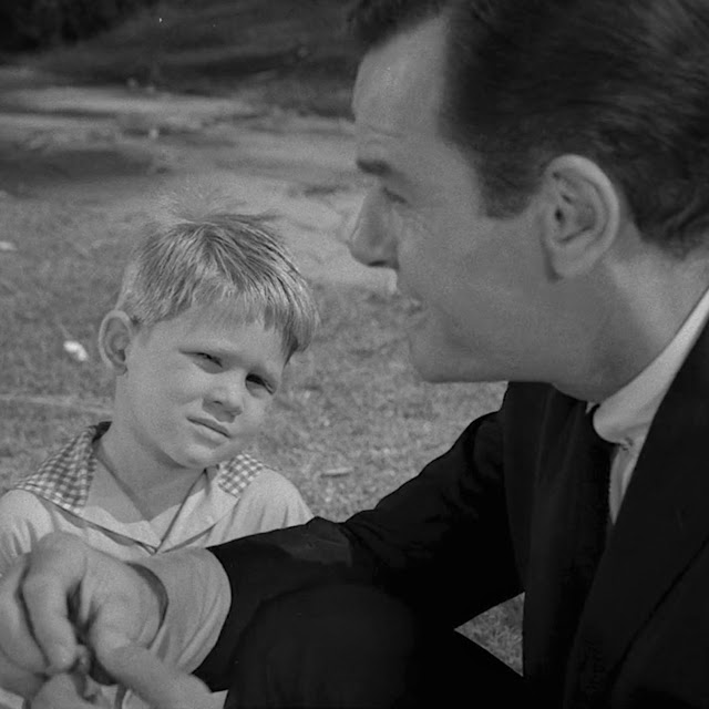
"There isn't anything quite as good ever. Nothing quite as good as summer and being a kid." Martin Sloan, as portrayed by actor Gig Young in "Walking Distance" an episode of The Twilight Zone, written by series creator Rod Serling and originally aired on October 30th, 1959.     
Those words echo through my mind whenever I think back to my childhood in the mid-1960s; a moment when school was on hiatus and a seemingly endless summer stretched before me. The days were long and lazy, with plenty of time to explore back yards, enjoy neighborhood parks, go to the movies, play with friends and saunter off to candy stores for baseball cards, snacks and, of course, comics. It was around this time of the year, especially in the months of July and August, that Marvel released the majority of their Annuals*;  although dictated by the industry's awareness that most youngsters were off from school and theoretically had more coins to dispense with, it was nevertheless a fortuitous circumstance from a kid's perspective, as these were double-sized books starring their most popular characters. The Bullpen Bulletins page, which appeared in every comic, heralded their impending publication, and to an ever-growing and fanatical following (with yours truly being one of them), anticipation was high. Depending on their schedules, Marvel’s Annuals offered either all new material or a combination of original and reprint stories.

* From 1966-1971 they were called King-Size Specials, or simply "Specials", but everyone I know referred to them as Annuals no matter the cover designation. Nitpick Nick.    


This house ad for a quartet of Annuals saw publication in Fantastic Four # 43 and other October-1965 dated comics. The "On Sale Now!" banner wasn't exactly accurate, since some titles might show up two to three weeks later. In those pre-internet days fans often had no way of knowing WHEN these comics would surface at their local candy store!     

The first “King-Size Specials” I recall my older brother John buying off the stands at our local candy store* occurred in the summer of 1966. I was six years old, and the sounds of the Beatles' “Paperback Writer,” Sinatra’s “Strangers in the Night,” and The Loving Spoonful’s “Summer in the City” wafted through transistor radios.

* For a detailed account of my childhood adventures collecting comics and other miscellany on the streets of Brooklyn you won't want to miss this monumental post! https://nick-caputo.blogspot.com/2019/02/the-corner-candy-store.html  Ostentatious Nick.
Amazing Spider-Man King-Size Special # 3, Summer 1966. John Romita pencils; Mike Esposito inks, Sam Rosen lettering. Bottom portion panels from interior reprint by Steve Ditko.  The Avengers, Spider-Man and the Hulk. A little bit of Heaven to a six year old!
Amazing Spider-Man Special # 3 had the wall-crawling hero attempting to join the Avengers. In truth it was a formula story by Stan Lee, John Romita and Don Heck (inking by Mike Esposito) and wasn’t comparable to Steve Ditko's earlier efforts, and, clocking in at twenty-one pages lacked even a sense of gravitas. Another drawback was the lack of special features that populated earlier Annuals, likely omitted due to deadline problems more than anything else. One highlight was a reprinting of Amazing Spider-Man #’s 11 & 12, a Lee and Ditko extravaganza that centered on the villainous Dr. Octopus. It was probably the first time I was able to fully enjoy that tale, as my brother only had issue # 12 in his collection. Ditko’s art and storytelling were riveting as always and Lee's dialogue was equal to the task.
FF Special # 4; Jack Kirby pencils; Joe Sinnott inks; Sam Rosen lettering. The two Torch's meet and the battle of the century is reprinted!  
Fantastic Four Special # 4 re-introduced the Original Human Torch, who ostensibly began the Marvel Age back in 1939 when Martin Goodman entered the business as Timely comics with his initial publication, Marvel Comics. Carl Burgos' creation headlined the '39 title and would go on to become one of his best-selling characters. Like Spider-Man, the story was again abbreviated in length and apparently crafted because Goodman wanted to protect his copyright on the character. The reprinting of FF #’s 25-26, featuring the first real confrontation between the Thing and the Hulk, Marvel's two powerhouse monster-heroes, was a bonus story for the many fans who had missed it on the first go-around. This despite George Roussos' heavy-handed inking (in one panel the Hulk actually looks like comedian Buddy Hackett. Perhaps he was watching one of Hackett's many appearances on The Tonight Show when he was working on that page!)  
Other specials that summer included Sgt. Fury # 2 and Journey into Mystery # 2 (featuring Thor), both of which followed the same format; Marvel Super Heroes # 1, reprinting a golden age Sub-Mariner-Human Torch clash, along with early Avengers and Daredevil material, and, of course, there were titles that most boys wouldn't be caught dead buying, Millie the Model being one such example!


Millie the Model was an extremely popular long running title that starred in a total of 12 Annuals from 1962-1975. Stan Goldberg art and (likely) coloring, Sam Rosen lettering. Millie Queen-Size Annual # 4, 1965. 
The 1966 Marvel Super-Heroes King-Size Special represented a few Timely-era artifacts; a Bill Everett-Carl Burgos Torch-Sub-Mariner collaboration and Stan Lee's first Captain America text story.      

1967 was a return of sorts to earlier standards of quality. The Marvel corner box, which employed visual representations of their characters for easy reader recognition, was instead utilized with copy that emphasized: “All New – Not A Single Reprint!.” Perhaps editor Stan Lee took heed of fan complaints from the previous year, or there might simply have been more time before pending deadlines. Whatever the case, FF, Spider-Man, Sgt. Fury and Millie the Model returned, although Journey into Mystery (Thor) was sadly missing. New entries included Daredevil and the Avengers. While some of the headline material was weaker than previous efforts (the introduction of Psycho-Man and revelations of Sue’s pregnancy in Fantastic Four were exceptions), the special features, which included pin-up pages, “inside info” and humorous vignettes, offered material that was often missing from the monthly publications and appreciated by fans.  


Lee and Kirby make a most surprising announcement in FF Special # 5, inks by Frank Giacoia; lettering by Artie Simek. 
Stan Lee adds a dose of humor to accompany the masterful pencils of Gene Colan. Inks by John Tartaglione; lettering by Sam Rosen, Daredevil Special # 1, Summer 1967.

The 1968 Annuals included quite a few extravaganzas; the FF headlined the birth of Sue and Reed’s son (by Lee, Kirby and Sinnott); Spider-Man featured the mystery of Peter Parker's parents (by Lee, Larry Lieber and Mike Esposito); the Battle of the Bulge was re-imagined in (where else?) Sgt. Fury. (by Gary Friedrich, Dick Ayers and John Severin, whose superlative inking was always special) and the current Avengers encountered the original members (by Roy Thomas, Don Heck, Werner Roth and Vince Colletta. Daredevil was noticeably missing from the schedule (likely due to the previous years unimpressive sales figures), replaced by the more-popular Hulk, in a rather weak entry by Gary Friedrich, Marie Severin, Syd Shores and company, but overall the product was substantial. The following year, however, would institute unfortunate changes.


Larry Lieber's composition adds drama to this page, in particular the "camera angle" of Peter in the last panel. Inks by Mike Esposito, lettering by Artie Simek. Amazing Spider-Man King-Size Special # 5.  

A touching moment in the pages of Fantastic Four King-Size Special  # 6 by Lee, Kirby and Sinnott.  
Due either to lack of time or cost saving measures, the 1969 Specials were almost entirely reprints. It was a disappointment not to see extra length tales by Lee, Kirby, Thomas or Colan. Some of the material I had never seen before, particularly the first FF story and a reprint of Amazing Spider-Man # 2, both examples of Marvel's intriguing early efforts . A few pages of new material by Friedrich, Ayers and Severin surfaced in the Sgt Fury Special, which was a welcome addition, but it was only a taste of the glorious past.  

One of the few pages featuring new material that appeared in 1969, from Sgt. Fury Special # 5. Dick Ayers pencils; John Severin inks; Artie Simek lettering. Script likely by Gary Freidrich. 
The institution of reprints remained the norm, and after 1971 the specials themselves were discontinued; a lack of time and personnel is the most logical reason. In that period Marvel was expanding their line at a hectic pace, and while it would have been wonderful to see Annuals produced by the likes of Gil Kane, John Buscema, Neal Adams, Jim Steranko or Barry Smith, it was not to be.
Annuals returned on a regular schedule in the mid 1970's, but with few exceptions they weren't very special anymore. Page counts were down, special features were sparse, and top talent was uncommon. Once crafted with thought and care, they became little more than over-sized issues of the regular monthly comics.

  Steve Ditko's powerful staging and meticulous inking made his pin-up illustrations stand-out.
Lee, Ditko and Kirby understood that an Annual was a special event and often took pains to give the fans their money's worth. Although I didn't read them off the stands, FF Annual #’s 1-3 and Amazing Spider-Man Annuals # 1-2 remain benchmarks of what an Annual should be. The extra length Sub-Mariner tale and the origin of Dr. Doom were unique stories (a villain appearing in a starring feature was rare). FF Special # 3 was marred by its page length. While it was fun to see practically the entire Marvel line of heroes and villains in one story, the drama of Reed and Sue's wedding was largely neglected. The two Ditko-plotted and drawn Spider-Man Annuals were crafted with special care and is hard to top. 

Occasionally, on a azure-blue summer day, my mind drifts back to those childhood afternoons, when for only 25 cents I was transported into a world of fantasy and imagination. I suspect Rod Serling would have understood.    

If you found this entry of interest here are links to some of my earlier Annual-related posts: https://nick-caputo.blogspot.com/2014/06/51-summers-ago-fantastic-four-annual-1.html

https://nick-caputo.blogspot.com/2014/07/50-summers-ago-amazing-spider-man.html

https://nick-caputo.blogspot.com/2015/07/50-summers-ago-amazing-spider-man.html

https://nick-caputo.blogspot.com/2014/06/50-summers-ago-marvel-tales-annual-1.html

https://nick-caputo.blogspot.com/2013/08/marvels-most-unusual-1960s-annual.html

...and for even more insightful discussion on Annuals go to Barry Pearl's Blog:

http://forbushman.blogspot.com/

And Don Alsafi's Marvel Genesis:

http://www.marvelgenesis.com/


Tuesday, May 7, 2019

Joe Sinnott's Unknown Charlton Work

You never know what you'll find when rummaging through old comics. My brother John and I recently visited our friend Barry Pearl, who had acquired a collection comprised of titles from various publishing houses. Barry allowed me to take several 1970s-era Charlton comics, aware of my fascination with the oft-ignored company. A perusal of the contents in Fightin' Army and Haunted Love revealed the usual contingent of talented freelancers: Don Newton, Pete Morisi, Sanho Kim, Charles Nicholas, Wayne Howard, Jack Keller, Vince Alascia, and, of course, prolific writer Joe Gill, but when I took a closer look at the cover of Career Girl Romances # 63 (June  1971) I was puzzled. I suspected the pencils were by Art Cappello, a long-time member of Vince Colleta's studio, who specialized in illustrating stories for Charlton's numerous love-themed publications. No surprise there, but it was the inking that threw me. The rich, precise line was indicative of Joe Sinnott's handiwork; renowned by both fans and professionals as one of the industry's finest talents. For years Sinnott added luster to Jack Kirby's pencils on the Fantastic Four. When Kirby left Marvel he continued on the FF, and was also assigned to The Mighty Thor (John Buscema, one of Marvel's top artists, replaced Kirby on both titles). 


(An aside for those of you unacquainted with the details of comic book production, and I know of at least ONE person out there! The rest of you can move on to the next paragraph! In order for pencil art to reproduce clearly it must be completed in black (or more commonly called india) ink, using tools such as a brush, quill or radiograph pen.The artist who draws the story may also ink it, but often, due to time constraints, a different hand completes the job. Depending on his skill set and compatibility with the penciler, an inker can either compliment or weaken the finished product. An excellent example of the former is this page from Fantastic Four # 49, April 1966. Jack Kirby's powerful pencils above and Joe Sinnott's exquisite inks below.)   


Career Girl Romances # 63 appeared on the stands concurrently with his Marvel assignments. Many fans were largely unaware that Sinnott was also a prolific artist for Treasure Chest of Fun and Fact (a comic produced for Catholic schools and published bi-weekly during the school year) at the same time he freelanced for both companies in the 1960s. As far as I knew his last work for Charton had occurred a decade earlier, penciling romance stories and several issues of Gorgo by way of Vince Colletta's studio.  

The cover that started the investigation. Sinnott's crisp inking is evident in both foreground figures and background foliage. 

I meticulously examined the details employed on trees, clothing and shrubbery. True, there were other professionals with similar styles, but this looked "exactly" like the best aspects of Sinnott's signature work as evidenced in Fantastic Four, Thor, Captain America and other Marvel titles in the early 1970s. I put on my Sherlock Holmes cap and began the search for an answer.

I first sought out one of the top experts in identifying comic art, my buddy Michael J. Vassallo (aka Doc V). In an instant message I detailed the info and sent a scan of the cover. Mike replied that he actually SAW Joe Sinnott and his son Mark that very day at a Convention in White Plains and was in agreement with my analysis. I mentioned that I was going to email Mark, who I had met on numerous occasions. I also inquired if he was on Facebook. Mike notified me in the affirmative and suggested I contact him there. I did both and waited patiently. A day later Mark replied to my email, confirming Joe's involvement. He explained:   

"My dad did a couple of covers with Art Cappello for Charlton in the early 70s. That is one of them. Art and my dad were very good friends."

Mark was aware of Career Girl Romance, and knew that Joe inked at least one other Cappello-drawn cover, Romantic Story # 111, and possibly more. All were signed "Art Cappello", leading many to assume he completed the artwork without assistance, but as I've discovered, a sole signature does not guarantee a one-man operation. With the likelihood of further undocumented contributions by Sinnott, my next step was to check every Charlton romance cover, beginning in late 1970 and into the entirety of 1971.

Charlton Press was the largest purveyor of romance comics in this period with DC in second place (Marvel's foray into the market at this time was minimal; only Our Love Story and My Love contended for sales). My first area of research was Mike's Amazing World of Comics, a website where you can search for practically every title published by either month or date of publication. The Grand Comic Book Database was my next destination; there I could study covers that were not in my collection. Alternate sites such as Ebay were also an invaluable resource tool due to the many dealers who provide enlarged photos for potential customers. This led to the discovery of eight more covers signed by Cappello in which Sinnott made contributions (with a ninth brought to light by Dennis F. Rogers). 

Listed below are the results of my findings, followed by some observations and commentary. If further unknown Sinnott embellishment surfaces I'll be sure to update the information here. All images are from the invaluable Grand Comic Book Database.


Mark Sinnott confirmed Joe's inks on Career Girl Romances # 63 and was aware of his involvement on the above cover from Romantic Story # 111, February 1971. He also noted that there might be others, so the search was on. 


The distinctive Sinnott style is most noticeable on hair and faces, particularly the man's ear. Teen-Age Love # 74, January 1971.


An awkwardly arranged layout doesn't give Joe much to work on, but his style is still apparent on faces and clothing. Love Diary # 70, January 1971. 


Thanks to the astute eye of Dennis F. Rogers, who pointed out this cover in the comments section. After finding a large scan to study on Ebay I agreed with him that Sinnott was the inker. There is very little to go by on the main figures, but the background sea, beach and sand have patterns that identify Sinnott's involvement. I Love You # 70, January 1971.   


Career Girl Romances # 61, February 1971. Charlotte Jetter lettering.


Just Married # 75, February 1971. The woman's jacket with its fluid lines, coupled with the building details confirms Sinnott's participation. Joe inked a total of four romance covers in this month.


Sinnott's details on buildings and trees display his craftsmanship. Teen Confessions # 66, February 1971.


One of Cappello's better efforts, it includes a soldier in the foreground, providing Sinnott with a figure he can embellish with gusto. Sweethearts # 115, March 1971.


With a title like "The Hippy and the Cop" what more needs to be said? Except that Cappello also drew the interior story, which was inked by Vince Alascia. Charlton should have assigned the art to Pete Morisi, who actually WAS a cop and moonlighted as a freelancer for the company! Just Married # 77, June 1971.


Cappello swiped other artists from time to time, such as the two background figures, whose poses are taken from a John Buscema panel or cover (possibly one inked by Joe!). Secret Romance # 13, June 1971

In a six month period (January-June 1971 publication dates) Joe Sinnott inked Cappello on a total of ten covers. After that period Cappello either did the inking on his own, or was assisted by Sal Gentile, who, in addition to being an artist, was also editor of the Charlton line.

One of the pleasures in researching comics is accidentally discovering something that has been staring back at you all along. Romance comics are often ignored by the superhero-based fan mentality, although historians such as Jacque Nodell on her Sequential Crush blog (highly recommended. Hi Jacque!) https://www.sequentialcrush.com/ have focused a sharper light in that direction. While comic book aficionados admire Joe Sinnott for his embellishment of Jack Kirby's Fantastic Four and
Captain America, along with enhancing the work of craftsmen such as John Buscema, Gene Colan, Gil Kane, Neal Adams, Barry Windsor-Smith and many others, and deservedly so, they often overlook his solid work as an artist going back to the Atlas era, on titles such as Kent Blake of the Secret Service, Arrowhead and countless war, western, crime, horror and fantasy fillers. Another area of Sinnott's oeuvre that escapes notice is his contributions to the pages of Treasure Chest. In an interview in Comic Crusader # 9, circa 1970, he explained: "I've also done the life stories of notables such as J.F.K. - Eisenhower - MacArthur - Pope John - Babe Ruth - Gene Tunney - Wright Brothers , and many others for Treasure Chest." Stories which he is justly proud of. 


Sinnott's beautifully rendered cover art to Treasure Chest of Fun and Fact Vol 25, #16, May 14, 1970. This was Joe's last cover for the comic, although he continued to illustrate interior stories until the company ended its 24-year run in 1972. While inking Fantastic Four, Captain America and other titles for Stan Lee at Marvel Comics from 1965 onward, Joe's true passion was in doing the complete pencil and ink job when crafting the "straight stuff," as he calls it. He was able to fulfill that ambition in the pages of Treasure Chest.

Joe's acclaim at Marvel comics is certainly justified, but his efforts go beyond the pages of superheroes. On a personal note, as anyone who has met him knows, Joe is one of the most sincere and humble professionals I've had the pleasure of spending time with; his warmth and charm is genuine. He is a man who truly loves his work.


Joltin' Joe Sinnott with Michael J, Vassallo at the White Plains Con, May 4th, 2019. Photo courtesy of Mike. With thanks to Mark Sinnott and Barry Pearl.

Friday, February 15, 2019

The Corner Candy Store

Thor stops to ponder the latest headlines. Or perhaps he's reading Dick Tracy. The newsstand includes reproductions of Marvel comics on sale at the time, a subtle form of self-promotion. Take notice of the bound bundle on the ground, to be discussed later. Jack Kirby sold newspapers as a kid, so it should come as no surprise that he would remember such details. Journey into Mystery # 124, January 1966.  

During the 1960s and 1970s (and indeed several decades beforehand) candy stores and newsstands were a mecca for children who lived in Brooklyn and other New York City neighborhoods. Comparable to a modern day Starbucks or CVS, you could literally find one on every block. From what I've gleaned through reading accounts from people in my age group, this trend was echoed throughout cities and towns across the United States, and had worldwide counterparts. These establishments drew kids in for many reasons, not the least of which included candy, soda and baseball cards, but for me, and quite a few other youngsters, the product I was most obsessed with (which should be absolutely NO surprise to those who have read this blog in the past) were comic books. 

Every week my older brother John and I, either together or separately, would saunter the streets of Bushwick (a borough of Brooklyn), pursuing our twelve-cent treasures. John bought every Marvel superhero comic, along with a smattering of DC, Tower, Archie/Mighty Comics, Dell and Gold Key titles, whenever finances allowed (I'd be remiss if I didn't point out that John actually paid for the comics. Being the younger sibling by seven years, I benefited from his purchasing power, which he acquired by selling pretzels). While we went to a variety of stores, the closest, and most convenient -just a block away from my house -was owned and operated by a gentleman named Angelo.


The Central Avenue station in recent days. Angelo's store was on the right, somewhere near or before the gate, in the shadow of the elevated M train, which connected residents to Coney Island and Manhattan. On trips with my Mom or brother, either before our departure or upon our return, it was routine to stop in and check out the latest comics. 

I'll attempt to recreate the interior from memory (with help from my brother John), interspersed with other observations and recollections, in hopes of capturing the flavor of those days. The store was long and narrow. Newspapers were placed outside on a makeshift stand and customers could pay through a window-slot. When you entered the register was to the right; a metal display rack prominently showcased TV Guide on the counter, which was a guaranteed point-of-purchase seller, since practically everyone who owned a television bought the weekly periodical. 


TV Guide for the week of August 19-25, 1967. As Jack Doyle opines in his essay Lucy and TV Guide 1953-2013: "By the 1960s TV Guide was the most read and circulated magazine in the United States." You can read the entire piece here: https://www.pophistorydig.com/topics/lucy-tv-guide-1953-2013/

I'm pretty sure all the assorted candy, chocolate bars and sugary substances, which included Tootsie Rolls, Good and Plenty, Mallo Cups, Mary Jane, Candy Cigarettes, Wax Lips, Sugar Dots (all guaranteed to land you a trip to the dentist), along with cough drops, trading cards and the popular Bazooka Joe Bubble Gum (for the price of one cent!) were below the counter. 


Bazooka Joe was an inexpensive treat and kids loved the comic strip that came with it. I learned about inflation when Topps raised the price from one to two cents (and comics increased from 12 to 15 cents in 1969, an astonishing financial hurdle) Image from the Topps archive blog: http://toppsarchives.blogspot.com/2014/05/premium-time.html  

Topps baseball cards were essential items for almost every child, but "non-sport" cards were also commonplace. It was addictive to buy a pack of cards, often at the cost of a nickel a pop, which consisted of 5 cards and a stick of rock-hard gum. Since cards were randomly inserted it sometimes took a while to complete a collection, although trading with friends helped. A few of my favorites included Batman (at the height of the ABC-TV show in 1966), Marvel Super-Heroes (the Grantray-Lawrence cartoon was then in syndication), the Monkees, Dark Shadows and Planet of the Apes. 


A 1966 Topps Batman card with art by Norman Saunders and Bob Powell. A prolific and talented comic book artist, Powell provided layouts which Saunders completed in paint. Quite a few familiar artists plied their trade at Topps, including Jack Davis, Tom Sutton and Wally Wood.   


Like many kids my age, I raced home from school to watch Dark Shadows, the supernatural soap opera which initially aired weekdays at 3:30. Of course I collected the card set and even had the display box that I asked for at a newsstand. That's long gone, unfortunately.  


  The November 28th, 1970 edition of the Sunday News featuring Dick Tracy by Chester Gould. The Sunday edition was usually bought after attending church. Image courtesy of Michael J. Vassallo.   

In my household The New York Daily News was required reading for my father (also named Angelo). My brother John has often recounted that he had to scour the neighborhood for the paper when Angelo's was sold out (don't come home without it!). I always loved the comic strips and read many of them every day, but Sunday was particularly special, since they were in color and consisted of either half or full pages. Candy stores received the "guts" of the Sunday paper three or four days in advance (minus the main news section, which was inserted on either Saturday nights - the "Night Owl" edition - or Sunday mornings). The comics section was in effect the "cover" of the Sunday paper, with each component placed inside it; this gave me a sneak peek at the latest Dick Tracy adventure, which I anxiously anticipated. For years Dick Tracy was the headlined feature and the first thing consumers saw, an indication of just how popular comic strips were for all ages. Waiting for Sunday to arrive, not only to read the latest exploits of my favorite detective, but also the serialized adventures of Little Orphan Annie and Dondi, often felt like an eternity!

Segueing back to Angelo's store... Located towards the rear was a counter with a few swivel seats, where customers sat down for a snack and perused the latest headlines or sports scores. I'm not certain, but Angelo may have had a fountain and perhaps fresh Ice Cream. In those days small establishments did not have refrigeration units (it was solely the providence of supermarkets if I recall correctly); instead they sold bottled soda in a cooler filled with ice. You had to dip your hand into it and fish out the selected item, which placed you in a state of ecstasy on oppressively hot summer days. 
           

This scene is perhaps SLIGHTLY exaggerated by Lee and Kirby, but since the entrance bears a resemblance to Angelo's I think it fits perfectly here. Fantastic Four # 11, February 1963. 

The wall along the left side had wooden racks that housed the latest comic books. That area of the store piqued my interest the most. Comics were distributed to stores on a Tuesday, packaged in a wire-bound bundle which often included TV Guide and an invoice on top, obscuring all but the corners for identification. A major point of contention for anxious youths, who had no understanding - or concern - for business operations, was that the proprietors, or their help, had to inspect the contents and check everything off before the product was placed on sale. When they were busy, or just didn't care, we were told to come back later; instead we usually headed off to the competition, hoping for a more efficient outcome. One of our least favorite owners was a cantankerous old man (everyone was old to us back then!) who seemed to take perverse pleasure in berating us, proclaiming: "You went to the other store first, didn't you?" He was the only person I knew who kept comics behind the counter, which meant that he had to take the extra time to hold up each individual title and ask us: "You want THIS one?," which we would either accept or reject. The only visible comics were those placed high above our heads, hanging on a wire. In retrospect his behavior may have been completely justified. Perhaps too many comics were pilfered by hooligans in the past. 

From what John and I recall Angelo was pretty good at putting the comics out quickly. In later years I was given the ultimate honor: allowed to cut open the fabled bound wire and put the comics on display. Angelo even dubbed me "The Comic Book Kid!"


Angelo's likeness is unclear after all these years; I originally thought this image of the gruff-looking newsstand vendor with the stogie, as illustrated by Carmine Infantino and Murphy Anderson, was similar, but my brother John offers a description which rings true "I remember more of a fairly good looking tough Italian gentleman in his late 40's to early 50s, who had a mustache." Batman # 199, February 1968. Image from the Grand Comic Book Database. 

Metal shelves took up the rear, populated with a multitude of magazines; Time, Newsweek, Popular Mechanics, Esquire, along with the forbidden Playboy and other "girlie" titles. There were also plenty of Men's Adventure mags, quite a few which were published by Martin Goodman, who ran Marvel comics. Some famous names got a start writing for those publications, including Mario Puzo, before he became acclaimed as author of The Godfather. We ventured into this area to check out Mad, Creepy, Eerie or Famous Monsters of Filmland.


Male, August 1969, previewing Mario Puzo's bestseller The Godfather, which would gain further notoriety when it was adapted into film by director Francis Ford Coppola in 1972. Cover painting by Mort Kunstler. Image from http://www.menspulpmags.com/2015/08/  where you can read much more about this and other pulp mags.  

Like every candy store, Angelo's also sold wooden airplanes, spinning tops, rubber balls, (Spalding, pronounced "spaul-deen" by New Yawkers, or Pensie Pinkie) and other inexpensive toys. In those days we didn't have hand-held devices or computer games to play with; they were far in the future. On the other hand you didn't need much money to have fun. 


EVERY kid had a Spaldeen or Pensie Pinkie in his possession! Which one was better continues to be a point of contention to Brookynites. Pensie Pinkies were cheaper, but both were used to play stickball, punchball, stoop ball or just plain bouncing. 

While Angelo's candy store was our primary source for comic book purchases, many similar shops populated Bushwick. We often went elsewhere to track down comics Angelo didn't carry, particularly Gold Key titles. The one company that was absent from almost every store in my neighborhood were the line of  Charlton comics. 


While this photo was taken in 1940, the store on the corner of Knickerbocker Avenue and Starr Street remained in business at least into the early 1970s. This was another candy store that my brother and friends bought comics at, since it was conveniently located across the street from the park and close to my school. Image from Brooklyn's Bushwick and East Williamsburg Communities by Brian Merlis and Riccardo Gomes, an excellent history of the neighborhood. Thanks also to my friend Sunita Shiwdin, who gifted me with the book. As owner of Mahalo New York Bakery, Sue's store evokes the best aspects of the Mom and Pop stores of the past. If you live nearby, or are traveling to Queens, stop by her shop for delicious cupcakes and extraordinary treats, all freshly baked. Her made-to-order cakes are truly out of this world. And while Sue doesn't SELL comics, she does have a mini-library with donations from yours truly and my buddy Barry Pearl, including books, fanzines and comics to enjoy while you're having a snack. You can learn more about her store here: http://www.mahalonewyorkbakery.com/ (End of free plug. Now can I have a cup of Coffee?)


Yours truly at Mahalo New York Bakery, reading a copy of Ghosts # 92, September 1980, sporting a Don Heck cover. Coffee, Cupcakes and comics. Who could ask for more?    


 One fine day in June, 1971, Steve Ditko's cover to Haunted # 1 appeared out of the blue in Angelo's store. Charlton comics finally began to receive distribution in Bushwick. I was familiar with the company from issues of Captain Atom and Thunderbolt in my brothers  collection, possibly purchased at a discount store on Knickerbocker Avenue (the main shopping thoroughfare). The comics were often stacked in piles and consisted primarily of old Hot Rod titles, which I had no interest in. A copy of Ghostly Tales surfaced at my Barbershop and the local used bookstores sold a few. Even at a young age I was a devotee of Ditko's work and immediately snatched this comic off the rack!   

Luncheonettes also often carried comics, magazines and paperbacks. I discovered All in Color for a Dime when I stopped with my Mom at a huge luncheonette on the corner of Knickerbocker and Myrtle Avenue. Somehow I managed to coerce her to part with the $1.50 to buy the book. A treasured item, it remains in my collection to this day. 


My beat-up copy of All in Color for A Dime, the book that propelled my interest in comic book history.  

 Once we moved out of Bushwick into Ridgewood, Queens I lost track of Angelo's. In the 1970s, and into the early 1980s I frequented a candy store located about seven blocks from my apartment. The owner was a pleasant man named Walter, who treated me (and everyone) with kindness. Whenever I came in for new comics he would bring the stack out from the back and read each title out loud. I would tell him what I wanted and sometimes put books out for him. Walter told me he originally tended bar just a few doors down from the candy store where I met him; he became the owner (I believe) in the early 1960s. Walter lived only a block or two away from me and I sometimes saw him and his wife when they walked home. When my brother started to work in Manhattan he discovered that new comics were sold two weeks in advance and bought them regularly on his trip home. We also found out about a store that specialized in comics and related ephemera, the Little Nemo Shop on Ascan Avenue in Forest Hills. 


The site of Walter's store as it stands today on the corner of Woodard Avenue and Woodbine Street in Ridgewood. I believe it has been a grocery store since he closed up but the physical structure outside is pretty much the same as I remember it, without the 7 Up, Coke and other signs that were displayed.  When you walked in a metal rack several rows long was directly on the left side. On the right was another section that held some of the higher priced and over-sized comics (Marvel Treasury Editions and DC Dollar titles). To the right of the comics was a section that had newspapers and magazines. The store also had a huge candy counter and a few swivel seats where you could sit (in earlier years he made egg creams and sold fresh ice cream). There was no such thing as hand-held devices back then, so people actually had to use a phone booth when they needed to call someone. Like many stores in that period Walter had one in his store. I also recall that Walter had a few older paperbacks for sale, such as the Man From Uncle.     

In my teenage years I began collecting my own comics, and despite other options I made it a point to stop by Walter's store, often buying a few westerns or reprint titles. One day I learned Walter was robbed and assaulted. Shaken up by the event, he closed the business and sold the store. I never encountered either him or his wife afterward; he most likely moved out of the neighborhood. I often thought about Walter and hoped the remainder of his days were peaceful. He was a good man.  


I bought this copy of Marvel Tales # 137 (March 1982) in Walter's candy store, explaining to him that it was a reprint of Amazing Fantasy # 15, the original which he probably had for sale back in 1962. If only he had kept a few for resale 20 years later. Jack Kirby pencils; Steve Ditko inks.       


Eddie's News Stand, located on Forest and Putnam Avenue in Ridgewood, was one of the last neighborhood candy stores I frequented. It remained in business, I believe, until a few years ago, but I took this recent photo (February 2019) to preserve its memory, since it may soon be gone.


I clearly recall buying this issue of Sgt. Fury at Eddie's, the final issue of an 18 year run. In a nice touch, the last issue reprinted the first issue. Jack Kirby pencils; Dick Ayers inks, Sgt. Fury and his Howling Commandos # 167, December 1981.     

 Walter's closing symbolized the end of an era for me. Into the late 1980s there were a few neighborhood candy stores that still carried comics, but they were rapidly dwindling away. Not as profitable as they once were - and taking  up valuable rack space - comic books were largely discarded from newsstands. The growth of the direct sales market, where publishers sold comics to specialty stores on a non-returnable basis, escalated in the 1980s, but It also meant that comics were becoming marginalized. Children in particular found other interests and were often ignored by the publishers. Less places to sell magazines eventually affected all periodicals to a large extent. In Manhattan, where newsstands were once ubiquitous, they now are barely part of the landscape (and many only sell soda, candy and Lotto). In my Glendale, Queens neighborhood I can canvas Fresh Pond Road or Myrtle Avenue and find hardly a trace of magazines, let alone comics (only a few large stores, such as CVS or Stop and Shop supermarket carry a small selection of periodicals, and the Archie digests are the sole comics item). It is indeed a different world.  


The candy stores I frequented in those bygone days were populated with distinct characters that embodied their surroundings. Comic books were part of that landscape, one magical fragment that has stood the test of time. I hope I've provided a glimpse into that era, when a candy store was more than just a place to buy comics: it was a gathering of friends on their way to a movie, the park or after a game of stick-ball. Like Judy Garland singing "Over the Rainbow" with great longing and beautiful simplicity, there was at times a truthfulness to those childhood days that I continue to cherish.   


One of the last times I may have bought a new comic book in my neighborhood was at a stationary store on Eliott Avenue in Maspeth, accompanied by my friend Frank. As we perused the spinner rack I noticed one of Charlton's new titles. Perhaps it was prophetic that a comic book from this company, which relied on sales by the average consumer, often boys and girls reading westerns,war, mystery, romance, hot rod and other genre material, would have their final titles sold in the waning days of the candy store. Charlton Action # 11, October 1985, Steve Ditko art. 


Special thanks to my brother, John Caputo and my cousin, Jack Sanzone, for their recollections.