Monday, June 8, 2015

A Journey Begins

Memory is often unreliable, and piecing together a moment from forty five years ago can be a struggle. I'm confident that it was a weekday when I stopped in a luncheonette with my Mother after shopping on Knickerbocker Avenue. I grew up in the Bushwick section of Brooklyn and candy stores, newsstands and luncheonette's were familiar sights. Staring at me from a spinner rack filled with paperbacks was a brightly colored book sporting a Superman logo, bat-symbol and familiar comic book "sound effects" lettering, the title in bold red: All In Color For a Dime

I don’t recall the particulars, maybe I had recently received money from relatives, since I find it hard to believe I cajoled my Mother to part with a whopping one dollar and fifty cents – a considerable sum to give a 10 year old – especially since finances were tight in our household. Somehow or other I left that store with a book that I still have in my possession – one which began my lifelong interest in the history of comics.  


 My copy, with loose front and back covers and inset pages has survived numerous moves for 45 years. I didn't see the original hardcover edition until many years later, but at $ 11.95 I doubt even my older brother John would have been able to afford it!

All in Color for A Dime was my first real introduction to the “golden age” of comics. I had some concept of an earlier era, dating back to the first time I saw one back in 1966. Marvel began reprinting the early Simon and Kirby Captain America stories beginning in Fantasy Masterpieces # 3 (June 1966). I was with my brother John when he picked up the following issue in a candy store down the block from my Grandparents house in the Bedford-Stuyvesant section of Brooklyn.


 Fantasy Masterpieces # 4, August 1966. Jack Kirby penciled and inked the main image, surrounded by scenes from the interior stories. This comic book was one of the earliest I recall seeing on the newsstand. Marvel Tales # 4 was probably bought that same day by my brother John. Fantasy Masterpieces also included my introduction to pre-hero Marvel monster/fantasy fare.   


In comparison to Kirby's then current output on Fantastic Four, Thor and “Captain America” his 1940s art had an archaic, unpolished feel, pointing to a long ago, mythical time. In those days remnants of previous decades were all around us; television regularly showed movies from the 1930s and 40’s including the Universal monsters; radio and vaudeville showmen such as Jack Benny, Bob Hope, Jimmy Durante, George Burns, Groucho Marx, George Jessel and many others appeared on talk and variety shows; children were entertained by the comedy of Laurel and Hardy, the Little Rascals, Abbott and Costello; serials appeared every day on children’s programs such as Chuck McCann (Flash Gordon; King of the Rocket Men; The Crimson Ghost)  along with decades old black and white cartoons: Bugs Bunny, Daffy Duck, Woody Woodpecker, Popeye, Mighty Mouse, Heckle and Jeckle, Betty Boop, Farmer Alfalfa, Ko Ko the Clown, Scrappy. The sights and sounds of the 1960s were intermingled with the fascination for an earlier era.   


Singer, pianist and master of Malaprop Jimmy Durante. His career dated back to vaudeville, Durante was a perennial on radio and a familiar face on television in the 1960s, appearing on talk shows, guesting on variety programs like Hollywood Palace and even headlining a musical/comedy series.

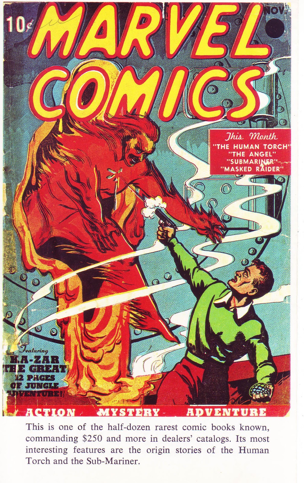
While Marvel reprinted the adventures of Sub-Mariner, Captain America and the Human Torch, National Periodical Publications (DC) occasionally presented an early tale of Superman and Batman in their 80 page giants. Even Archie, under their Mighty Comics imprint, often made reference of their earlier superhero era, reviving some characters in Mighty Crusaders, Fly Man and Mighty Comics Presents. The majority of interest, though, was in the present era. 

    The introductory page whets the readers appetite for what is to come.

All in Color for a Dime opened a door to a fascinating era when comic books were just beginning, revealing many of the field's pioneers. I learned more about both familiar characters (Superman, Batman, Captain America, Spider-Man) and complete mysteries such as Captain Marvel; companies including Fawcett, Hillman and EC and background on psychiatrist Fredric Wertham and the 1950s Senate investigation that changed the industry. Eleven chapters focused on costumed heroes and the people behind them, written by an array of enthusiastic, articulate and noteworthy authors including Ted White, Bill Blackbeard, Don Thompson, Dick Lupoff, Ron Goulart, Harlan Ellison, Richard Ellington, Tom Fagan, Jim Harmon, Chris Steinbrunner, and a name even I was familiar with from his scripts for Marvel, Roy Thomas. 


Each chapter began with an introduction to the author. Many were known in the fan community, or would become prominent in later years. Co-editor Dick Lupoff wrote a chapter detailing the fascinating story of Fawcett comics and the origins of Captain Marvel, which, at one point, was the best selling comic book in the 1940s (his chapter, like many in the book, originally appeared in the science-fiction fanzine Xero). Lupoff's essay revealed that Captain Marvel was no longer published due to a lawsuit instituted by National over the Captain's perceived plagiarism of Superman. The sprawling court drama ended with Fawcett eventually losing and settling out of court. Captain Marvel and his assorted titles would cease publication. The real world was a little more complicated than the clear cut good and evil exploits of Captain Marvel.     


One of sixteen color pages included in the book was the cover to Marvel Comics # 1 by the then-unidentified Frank R. Paul.  

Don Thompson, who co-edited with Lupoff, wrote the chapter of Timely's "Big Three" (Human Torch, Sun-Mariner, Captain America) providing an overview of the Timely/Atlas/Marvel era. It was the first time I discovered characters such as the Young Allies or the name of Kirby's partner and co-creator of Captain America, Joe Simon. Thompson, together with his wife Maggie, produced one of the early fanzines, Comic Art, followed by Newfangles. The pair later became columnists and co-editors of the long running news/adzine The Buyers' Guide (later titled Comics' Buyers Guide).

         
 In "The Spawn of M. C. Gaines" Ted White wrote about the origins of Superman and Batman. There I learned the names of Superman creators Jerry Siegel and Joe Shuster and discovered how involved writer Bill Finger was in Batman's early stories. White has had a long and versatile career as writer/publisher of science fiction fanzines and editor of book compilations; author; musician and music critic.   


Roy Thomas wrote about the other Fawcett heroes, including Spy Smasher, Captain Midnight and Bulletman. The only image in the book of Captain Marvel (and his alter ego, Billy Batson) was a reproduction of a house ad for Gift Comics. Aside from his prolific career in comic books, Roy continues to contribute to my knowledge of comic book history in his long running fanzine, Alter Ego.


 One of my favorite chapters was “The First (Arf, Arf) Superhero of them All” by Bill Blackbeard. From my earliest days I was enraptured by the animated adventures of Popeye, watching him on Captain Jack McCarthy’s kid show on WPIX, Channel 11 every day. At a young age I didn’t distinguish between the Fleischer, Paramount or King Features cartoons, but later grew to appreciate the imaginative, surreal, urban Max Fleischer black and white Popeye shorts as being superior to the rest. I had seen and possibly had a copy or two of the Dell/Gold Key Popeye comic book, but had no knowledge of the comic strip. Blackbeard’s essay revealed the origins of Popeye and his creator, E. C. Segar. It was a revelation to me, opening an interest in the comic strip exploits of this offbeat and truly funny character whose malapropisms, basic good nature and love of “aminals” was translated in Fleischer’s animated cartoons.

Bill Blackbeard was an important figure in the study and preservation of comic strip art. His books, essays and, perhaps most importantly, herculean efforts in saving the comic strip from destruction cannot be understated. You can read more about Bill Blackbeard here: http://www.tcj.com/bill-blackbeard-1926-2011/


All in Color for a Dime was followed by an array of eye-opening publications. In the next few years my brother John’s Christmas and Birthday gifts to me included Superman from the 1930s to the 1970s; Batman from the 1930s to the 1970s and the Steranko History of Comics Vol’s one and two. In the pages of those books I discovered many names instrumental to the beginnings of comics including Bill Finger; Will Eisner; Jack Cole and Lou Fine, to name a very few. 


In 1971 Crown books published two hardcover books featuring reprints of classic material from National/DC's archives. The Batman collection included an introduction by E. Nelson Bridwell, editorial assistant, writer and editor at DC. The author noted Bill Finger's often hidden contributions to the genesis of Batman at a time when Bob Kane often received all the credit. Cover art by Carmine Infantino and Murphy Anderson.

      
The first fanzine I purchased was The Comic Reader # 92, dated December 1972. It featured news and information on Marvel, DC, Charlton, Gold Key and Warren (including cover reproductions and publication dates); movie and media news, fanzine reviews and articles. Editor Paul Levitz soon turned his talents to a long career at DC as writer/editor and later executive positions including a stint as president and publisher. Alan Kupperberg cover art.     

Two years later I discovered the world of fanzines when I noticed a small image in the window of a used bookstore in Ridgewood, Queens (where I had recently moved to). Back in those long ago days stores were not often covered with metal gates and you could actually view there wares. My brother John and I were familiar with its claustrophobic interior filled with books, records, magazines and, of course, old comics. We were also acquainted with the proprietor, Pat, having journeyed there from time to time in search of old treasures. It was a Sunday and the store was closed (in that period most stores were closed on sundays) but the following day I returned and bought The Comic Reader # 92, the first of what would be many fanzines I would buy over the decades. There I learned further information on comic books both old and new, read interviews with writers and artists and was hooked by a sense of youthful enthusiasm that was infectious.   


Flashback # 7 reprinted Pep Comics # 1 (January 1940). Published by Alan Light, who also spearheaded the news/adzine The Buyers Guide for Comics Fandom, these reprints consisted of thick cover stock and black and white interiors. Irv Novick cover art. From the collection of John Caputo.   

As I got a little older and could afford it I returned my brother’s generosity, buying him comic book related gifts (which, of course, I got to read too!). They included Alan Light’s Flashback series, which reprinted entire issues of golden age comics in black and white. In an era when there weren’t many reprints available this was a big deal. Still in my brother's collection, titles include Human Torch # 5 (reprinting the Torch-Sub-Mariner scuffle); Captain Marvel Jr. # 1; Special Comic # 1 (Hangman) and Pep Comics # 1 (featuring the Shield), the latter two Archie/MLJ titles; I may have picked them because none of the material had ever been reprinted. I recall John and I being amused by one of the back-up features, Sgt. Boyle. Accustomed to war heroes with rugged names like Sgt. FURY, Sgt, ROCK and Captain SAVAGE, Sgt. Boyle didn't quite compare. Other gifts included Horror Comics of the 1950’s, a sampling of EC comics' outstanding work, The Comics by Jerry Robinson and (I believe) The Smithsonian Collection of Newspaper Comics by the aforementioned Bill Blackbeard, a massive tome that included examples of many obscure comic strips.   

My exploration through comic book history is an ongoing and continually fascinating adventure. In the past few decades I’ve been able to write about comics and their creators in fanzines such as Comic Book Marketplace and Alter Ego, essays in Marvel Masterworks collections, captions in Taschen’s 75 Years of Marvel Comics book and, of course, here on this blog.

In his recent book If These Walls Could Talk major league pitcher and broadcaster Jim Kaat summed up his love of baseball history:        

“…I still consider myself a student of the game. I’ve never lost my curiosity or love of baseball. My eyes are always open to something new. A question is always poised on the tip of my tongue…”   

Kaat could just as easily have been speaking about film, art, music, poetry…or comic books. 

Friday, May 29, 2015

Don Heck's Pre-Superhero Art 1952-1962

Don Heck is recognized in fan circles for his contributions to Marvel's early superhero line, in particular "Iron-Man" (in Tales of Suspense) and The Avengers, but his style, greatly influenced by the craftsmanship of master cartoonist Milton Caniff (of Terry and the Pirates fame) was often at odds with the overwhelming, massive figures and fantastic stylizations of Jack Kirby, whose shadow loomed large.

A rare example of Heck drawing a superhero cover in the early Marvel era, which was usually Jack Kirby's domain. Nevertheless, when needed he came up to bat and hit it out of the park. This image is one of my earliest memories of Don's art. As a child I recall seeing the cover on my Grandmother's porch. It was probably my older brother (and fellow comics afficiando) John's copy. 

Heck held his own at Marvel in their early days, "batting" third in the lineup after Kirby and Ditko. Dick Ayers, the fourth player in that era, while corralled to draw superheros on occasion ("Giant-Man"; "Human Torch") became identified with the long running war title Sgt. Fury. By 1966 fellow Timely-Atlas veterans John Romita, Gene Colan and John Buscema returned to the fold, followed by newcomers Jim Steranko, Barry Smith and Neal Adams. These artists had a stronger feel for the dynamics of superhero fare, leaving Heck in the role of utility player, filling in wherever he was needed. This led to frustration for the talented artist, and his better efforts appeared (often unnoticed) in genres unrelated to superhero fare. Heck's virtues blossomed in more character driven situations, romance and mystery being two such examples. Heck's fluid line (particularly when he inked his own pencils), lush brushwork and superior pacing, coupled with a flair for drawing ordinary people served him well over the course of four decades.This post will focus on his seminal, pre-superhero work, circa 1952-1962. 


War Fury # 1, September 1952. Image from Comicbookplus, where you can view the entire story (and many other Don Heck covers and stories)  http://comicbookplus.com/?dlid=23814

Heck started out working in production for Harvey comics in 1949. It wasn't until 1952 that he had the opportunity to draw his first comic book story, working for editor Alan Hardy at Comic Media. "The Unconquered" is Heck's first published story, although he recalled "Harrigan's Hat", which appeared in the following issue, as the first story he drew. Due to scheduling issues it's possible the earlier story saw publication after this one. The art in Harrigan's Hat looks less assured than "The Unconquered". The splash page indicates real talent, and it's evident that Jack Davis (who was then drawing for the popular EC comics line) was an influence on Heck's faces and figures. 

                                         
"Hot Steel!", Danger # 4, July 1953. Image from comicbookplus  http://comicbookplus.com/?dlid=22860

While some of Heck's early art for Comic Media are journeymen efforts, he rapidly picked up the language of a comic book page, in particularly page composition, pacing, camera angles and characterization. The splash panel of "Hot Steel" is an example of Heck's powerful use of blacks; the two bottom panels focus on setting and people. One can also notice a very strong Caniff influence on his characters and brushwork. 


                            "Witch Girl!" Weird Terrors # 10, March 1954.


Heck drew primarily for Comic Media from 1952-54, focusing on genre stories in their crime, western, romance and horror titles. The splash to "Witch Girl" combines a mood drenched opening scene with four panels showcasing a bevy of beautiful women. 


"Crash in the Alps", Ken Fitch script; Danger # 8, March 1954. Image from comicbookplus. http://comicbookplus.com/?dlid=13826

Heck shows an affinity for presenting the elements as an integral part of the story, a talent that cartoonists as diverse as Chester Gould and Gene Colan mastered. The splash panel depicts blinding snow and places the antagonist (and in effect the reader) directly into the story. 


                                       Danger # 11, August 1954.


Heck's covers for Comic Media in the early 1950s were poster-like compositions, drawing the reader in and telling a story with startling simplicity. This is one of my personal early favorites.


       "Intrigue", Danger # 9, May 1954. Image from           comicbookplus: http://comicbookplus.com/?dlid=22852

An interesting group of characters, use of montage and a pretty woman to boot! While some of Heck's earliest attempts at drawing woman were unexceptional he soon became one of the best in the field at rendering attractive females, which was often noted by his fellow artists. It was a talent that served him well throughout his career.

After Comic Media closed its doors in 1954 Heck found work at other companies, including Toby, Charlton and - notably - for Martin Goodman's Atlas line. Under editor Stan Lee, Heck's illustrations and storytelling became more confident. His range and versatility was a boon to Lee; who put his talents to use across the line in war, western, crime, mystery, jungle and romance stories. Below are just a few examples of his unique artistry.


           "Rookie Cop" Police Badge # 479, issue # 5, September 1955. 

Despite the numbering (which was likely continued from a cancelled comic) Police Badge # 479 was a one-shot title that followed the exploits of rookie cop Jim Hudson. Heck illustrated two of the three stories featuring the policeman (the third story - and the cover - was drawn by artistic powerhouse Joe Maneely). Heck's ability to compose a page, particularly the middle tier sequence, is one of his great strengths. It would have been interesting to see Heck continue on this strip, but the exploits of patrolman Jim Hudson came to an abrupt end after this issue, never to be seen again (unless he HAS been revived and I'm unaware of it. If so, I'm sure someone more knowledgeable than I about post 80's Marvel will clue me in).


            "The Defeat of Colonel Yeng", Battle # 44, January 1956 

Heck drew a slew of war stories, lending his talents to the genre over the decades, from War Combat in the 50's, Captain Savage in the 60's and Weird War Tales in the 70's. Heck's portrayal of men in combat was peppered with personality. 


Page 3 of the untitled opening "Torpedo Taylor" story from Navy Combat # 7, June 1956. 


  "Get That Sub!", the second "Torpedo Taylor" story in Navy Combat # 7, June 1956.  

"Torpedo Taylor" headlined Navy Combat from 1953-57, a character Heck was assigned to and drew every story of. Almost. Heck completed the splash page of a Torpedo Taylor story he was working on but was informed to go no further - publisher Martin Goodman was not buying any new work for the foreseeable future. The story was later completed by Joe Maneely and appeared in Navy Combat #18 (August 1958). Heck, along with most creators, were laid off for a period of time, but was called back by Lee in July 1958 and became a Lee regular. Heck did exceptional work on Torpedo Taylor, adding detail and craft to the depiction of submarines and underwater adventures.   


          "Is There No Man for Me?", My Own Romance # 73, January 1960

The above panel depicting a couple walking down a quiet street is indicative of Heck's impeccable artist's "eye". Much like a set designer, his use of scenery such as the expansive tree and the picket fence creates a warm, romantic mood.


             "If Love Be Blind!", Love Romances # 85, January 1960

The little touches in Heck's romance stories are delightful. The woman walking the dog in panel two and the cheerful police officer add an impeccable sense of charm to the tale and highlight his outstanding feel for the ordinary.   

                             
             "Incident in the Rain!", Love Romances # 102, November 1962. 

Heck's use of silhouette in panel one perfectly compliments the woman's dialogue, emphasizing her loneliness. With sparse background details, Heck's emphasis is placed on the protagonist. Heck's romance art was always exceptional and he would return to the genre in the late 60s and early 70s for both Marvel and DC. 

    
"The Fastest Gun Alive!", Stan Lee script, Gunsmoke Western # 63, March 1961. 

                     
 "To The Last Man!", Stan Lee script, Gunsmoke Western # 68, January 1962.

Heck was very much attuned to the trappings of the western genre,blending all the elements with unerring ease: scenery, clothing, setting, "casting" - all add immensly to the tale. Although Heck was rarely given lead features to draw (Kid Colt, Outlaw; Rawhide Kid; Two-Gun Kid) his five page fillers were almost always worthwhile additions to the total package. 


"The Deep Freeze", Carl Wessler script, Journey into Mystery # 37, August 1956. 


                   "Rocket Ship X-200", Strange Tales # 69, June 1959.


                    "Nightmare!" Tales of Suspense # 16, April 1961.

Heck's pre-hero fantasy stories are often overshadowed by the towering monsters Jack Kirby created month after month, or the evocative, detailed renderings of Steve Ditko, but many of his mini-thrillers are imaginative efforts that deserve attention. Heck had the ability to use the tools of his trade - particularly black ink - to drench a tale in darkness and create a feeling of menace. Like many of the better artists of his era, Heck could effortlessly transition from the lighter tales of romance to the darker shadows of fantasy fare. 


              "I Can See Tomorrow!", Tales to Astonish # 5, September 1959. 

It was often the smaller moments in Heck's stories that pointed out how observant an artist he could be. The above panel is a perfect example. The protagonist is a small figure in a long shot that encompasses a city street. In the foreground are two women chatting on a stoop. Heck's superb composition enhanced what could have been an average close-up. While the two women are superfluous to the story (they have no dialogue balloons and were probably not even in the script directions) their presence adds a cadence of reality, evoking an urban setting where neighbor's would chat on their stoops.. 

While Heck's art in later years became looser, and was often weakened or mangled by unsympathetic or incompatible inkers, when given the chance Heck continued to do what he did best: bring everyday people - and a part of himself - to his cartooning.  


              "..I always liked regular stories. I like people." Don Heck 


Sunday, February 15, 2015

Unknown Herb Trimpe Art

In 1970 Herb Trimpe was artist/co-plotter on The Incredible Hulk, a title he had taken over two years earlier, following in the footsteps of many exceptional talents including Marie Severin, Gil Kane, Bill Everett, Steve Ditko and, of course, co creator Jack Kirby. Trimpe had a coarse, gritty style perfectly suited for the exploits of a rampaging monster; he continues to be associated with the character decades after his tenure on the title ceased. In addition to his duties on The Hulk, Trimpe also worked in the production department at Marvel, assisting John Romita and Marie Severin on various chores, including drawing covers, primarily for the western titles, (Kid Colt Outlaw, Two-Gun Kid, Ringo Kid, Mighty Marvel Western, Rawhide Kid and Western Gunfighters) and making corrections on interior panels and pages. In this post I'll point out a few I've recently discovered.


 Herb Trimpe's uncredited splash page art to "The Beast from the Bog!," Chamber of Darkness # 5, June 1970. 

 While the splash page to "The Beast in the Bog!" is credited to Paul Reinman, a careful examination reveals that it is actually the work of Herb Trimpe. To the best of my knowledge Reinman's original page has never turned up, so I can only speculate as to why it was replaced. One possibility is that Reinman drew the creature on the splash and Stan Lee wanted his image to be a surprise to the reader. 

Editor Stan Lee had a history of being picky about splash pages dating back to the Timely/Atlas era. There are numerous instances of Lee using a different artist to redraw a splash, usually because he felt a more powerful image was needed to pull the reader in. When there was time and the original artist was available they produced the new art (examples include Joe Sinnott and Dick Ayers) but when deadlines were pressing he usually had a staff artist handle the re-do. In the 1950s it was often Joe Maneely, his talented and versatile right hand man, who made the alterations; later Lee usually turned to Jack Kirby, John Romita, Marie Severin or Herb Trimpe. 


Another clue that this is an alternative splash is by observing the lettering. While Jean Izzo was credited, and her style is evident by its stylistic resemblance to her father, Artie Simek, the splash (and any corrections in the story) was lettered by staffer Morrie Kuramoto, who tended to be far less precise and attractive than Marvel's main calligraphers, Sam Rosen and Artie Simek.   


For comparison here is page two of the story, drawn by Paul Reinman. Note the difference in the way Reinman draws trees, using a scratchier line than Trimpe, and how the hand in panel 6 echoes the splash page, likely due to Trimpe copying the image.


Seven months earlier Herb Trimpe drew his own swamp-related monster in the pages of The Incredible Hulk # 121, November 1969. Notice Trimpe's depiction of foliage, overhanging trees and the swamp, particularly the final panel, which has a hand rising from the bog. Both pages point to Trimpe's distinctive style.   


 Uncredited Trimpe splash to the "Gunhawk" feature from Western Gunfighters # 1, August 1970. Note that Jerry Siegel, the co creator of Superman, was the author of this tale.  

Two months after providing the new splash in Chamber of Darkness # 5, Trimpe again does the honors, as seen by the pose and facial expression on Gunhawk, and the wispy, almost coloring book style backgrounds. Western Gunfighters was a oversized, 25 cent title that included mostly new material. The interior story is penciled by Werner Roth and inked by Sal Buscema. Roth's experience on westerns dated back to the 1950s, on titles including The Apache Kid and Matt Slade. Trimpe drew (and probably lettered the title) to Gunhawk's introductory page, a new western hero who was prominently featured on the cover.


                            Gunhawk Pin-Up from Kid Colt Outlaw # 227, December 1978

In this instance I believe I've discovered the original splash page, which found its way into print 8 years later in the back of a western reprint title. While the pencils are incorrectly credited to Al Hartley, they are actually the work of Werner Roth, who drew the original story. Aside from the faces, figures and poses that point to Roth's involvement, other factors are evident. Sal Buscema is credited as inker of this drawing as he was on the original story. Werner Roth had passed away in 1973, which eliminates the possibility that this was a new pin-ups, of which quite a few appeared in this period. Finally, the open space above Gunhawk would have been where the copy and story title originally appeared. In both splashes Gunhawk is posed center stage, holding his guns, but Trimpe's version has Gunhawk as the central figure, eliminating the fleeing townsfolk and buildings that appear in Roth's version. The addition of the Hawk in the foreground and the mountains in the background direct the readers eye directly to lead character.    


                      Herb Trimpe at work. Photograph from the 1970 Marvelmania Portfolio.   

 In a case of serendipity I wound up discovering this photo of Herb Trimpe making art corrections AFTER I noticed his splash in Chamber of Darkness # 5. Since I had been researching Marvel's late 1960s/early 1970s mystery-anthology titles (Chamber of Darkness and Tower of Shadows) I looked closely at the page Trimpe was working on and realized it was one of Barry Smith's stories. Smith was relatively new to comics, his earliest work consisted of pin-ups for the British based company Odhams Press in the mid-1960s, which reprinted Marvel's superheroes on a weekly schedule. You can view some of these on Kid Robson's highly entertaining blog:

http://kidr77.blogspot.com/2012/06/part-seven-of-terrific-cover-gallery.html

A short time later Smith was given the opportunity to contribute to Marvel directly, drawing X-Men # 53 (January, 1969) followed by fill-ins on Daredevil, The Avengers and a host of mystery shorts. His early efforts, which combined Jack Kirby's dynamism with Jim Steranko's contemporary look, had an amateurish appearance, but his enthusiasm and sense of pacing showed real confidence. Smith's first ongoing title was Conan the Barbarian, teamed with writer Roy Thomas, where he had the opportunity to expand his abilities, adding meticulous detail and becoming a recognized fan favorite.


Zooming in on the page I noticed the panel Trimpe was working on and checked through my issues of Tower of Shadows and Chamber of Darkness. I could tell that this story was inked by Vince Colletta, and if I recalled correctly he only inked one of Smith's mystery tales.


 I soon found the story, "The Scream of Things", scripted by Allyn Brodsky, which appeared in Tower of Shadows # 7, September 1970. Looking closely I observed a few lettering corrections (which were likely rendered by Morrie Kuramoto) and also noticed the figure of the woman in panel four was reversed in the published version, presumably because the powers that be thought the panel to panel progression flowed more smoothly. 


Here is a close-up of the final panel. Trimpe's alterations include the addition of a statue on the upper left side, a more decorative style to replace the traditional brick work Smith drew on the terrace and "faces" on the trees, which were originally normal looking. I assume the trees were changed to make the scene look eerie (it only looks silly to me!). What I find fascinating is the production process, and how each comic was closely examined before final publication. It's also wonderful to have evidence of Trimpe working on an actual page of original art.

While the work Herb Trimpe did in a production capacity for Marvel may not be as noteworthy as his overall contribution to as a storyteller, I believe the "little" details give us a better understanding of what it takes to put a comic book together.


I wanted to briefly make note of my 100th post and express my gratitude, not only to family, friends and online colleagues, but in particular those strangers who shared information, corrected an error or took the time to write a comment. I've piqued the interest of more people than I ever expected in my exploration through comics esoterica, and the response has been rewarding. My goal has been to search the back alleys and side streets of the industry, even when discussing the work of giants like Kirby and Ditko. Think of this as the equivalent of an old bookstore that offers a surprise or two on its shelves. I don't know what my next 100 posts will be about (or if I even get that far), but I'll do my best to keep the wheels rolling and hope you come along for the ride.        

Friday, January 16, 2015

Fade Out:Ghostly Tales 1973-1986

Ghostly Tales entered its eight year of publication in 1973, obviously a healthy selling title, one which spawned a slew of similar Charlton fare over the years.


Charlton's 1973 ghost line-up included the above titles, most of which had long runs. One exception was Haunted Love, a comic that combined romance stories with mystery/horror. Although this genre reached a primarily female audience, particularly in paperbacks, it failed when applied to comics, both at Charlton and DC. Ad from Ghostly Tales # 105, July, 1973  

Nick Cuti was editorial assistant for Charlton's line in this period. In an interview with Jon B. Cooke (Comic Book Artist # 12, March 2001) Cuti had this observation: 

"...instead of combining our two audiences, we wound up alienating both audiences. So the boys wouldn't touch it because of the romance aspect and the girls wouldn't touch it because of the horror aspect." 


Managing editor George Wildman gave his artists the opportunity to experiment with novel ideas and formats. Unlike Marvel, DC or even the well-respected EC line of the 1950s, stories did not always have to fit into a regimented seven or eight page format. Sanho Kim took advantage of this freedom to write, draw and letter a 16 page story, "The Promise" cover-billed as "A Korean Folk Tale told in English and Korean". Creating a story in two languages was an unusual and possibly unprecedented idea and Kim's expressive storytelling predated the Manga (or in Korea, Manhwa) explosion that invaded the states a decade later and continues to be a huge seller in both comics shops and bookstores. Ghostly Tales # 101, January 1973.  


The letters section was replaced for this issue with an editorial by Kim which included a photo of the artist. Kim provided background on the genesis of his story and a request for feedback from the readers. 


Ghostly Tales # 101 concluded with a delightful tale written by Bhob Stewart and illustrated with relish by Steve Ditko. The story revolved around a famous cartoonist and his envious assistant. You can read about the background to this story from the author, who sadly passed away in 2014:

http://potrzebie.blogspot.com/2010/02/ghost-artist.html


Warren Sattler had a divers career in the comic art field. He assisted on comic strips, including Barnaby, and produced two of his own strips (Grubby and Swamp Brats). Sattler's art and illustrations also appeared in Harvey Kurtzman's humor magazine Help!, National Lampoon and Playboy. Most of his comic book assignments were at Charlton on Billy the Kid, Fightin' Marines, Ghost Manor and Yang. While Sattler's neat, cartoony style may not have been a perfect fit for the mystery/horror genre, the man's face in panel two and Mr. Dedd in panel three have a Ditkoesque influence. "The Condemned," Ghostly Tales # 102, February 1974. 

                 Note: Scripts not specifically credited may be the work of Joe Gill.


As seen in my previous post, "the evil eye" was a recurring theme in numerous Gill scripted tales. Pete Morisi does his take on this "sub-genre" entitled (what else?) "The Eye of Evil," Ghostly Tales # 102, February 1973.


 Steve Ditko's entry in issue # 102, "Who is Next?" was a weaker effort than some of his earlier stories. At this point Ditko departed from his elaborate inking, employing a sketchier technique. Nevertheless his work shines in places, as exemplified by his effective use of lighting in panel 5.

   
In the post 1972 era Ditko produced less cover art for Ghostly Tales, with Tom Sutton and Pat Boyette taking up the slack, but this effort is a stunner. The staging is brilliant, directing the reader's eye to the skeleton, his gun and the hand opening the door. With the effortless simplicity of a master craftsman Ditko creates one of the most powerful cover images of the entire run. What kid seeing this comic on a candy store rack could resist purchasing it? 

 Ghostly Tales cover design began to be tinkered with a month earlier. The sub-title "From the Haunted House" was enlarged and turned into an attractive icon as seen above, although it only lasted four issues. With issue # 112 the surname was completely eliminated, becoming simply Ghostly Tales. Other cosmetic changes included a new corner trademark (which occurred throughout the line); a circular "bullseye" replacing the square corner red "C" (Ghostly Tales # 109) and a Steve Ditko drawn Mr. Dedd figure appearing on the upper left side (Ghostly Tales # 110).   


The "new look" design debuted on Charlton covers gradually over a four month period, starting with October 1973 cover dated titles and on all covers by February 1974. Ditko, who drew the corner image figure of Mr. Dedd, did similar duties on all the ghost titles. It's worth noting that Ditko came up with the idea for the Marvel Comics Group corner box and character image years earlier and may have had a hand in suggesting the idea at Charlton (editor George Wildman designed the Charlton circular "bullet").  

   
Jack Abel contributed to many Charlton comics dating back to the late 1950s. His earliest recorded work appears in 1950. Abel' worked for a slew of publishers, including ACG, Fawcett, Fiction House, National/DC and Timely/Atlas/Marvel, sometimes penciling but primarily inking. His slick, shiny style was compatible with some artists more than others, including Bill Benulis, Mike Sekowsky, Dick Ayers, Herb Trimpe and Gene Colan; his delineation on Colan's "Iron-Man "stories in Tales of Suspense stood out as a noteworthy combination.  "The Non-Believer," Abel pencils, inks and probably letters, Ghostly Tales # 103, April 1973.


In 1973 Charlton began commissioning painted covers from many of their artists, often with strong and distinctive results. Pat Boyette produced some outstanding examples in this vein. The above example has Boyette fashioning a strong scene with a simple palette. To complete the picture Boyette also lettered and created a new (and one time only) logo. Ghostly Tales # 104, May 1973. 


Perhaps Joe Gill was a fan of Edgar Allen Poe's "The Tell-Tale Heart" or had read of the superstitions that pervaded Italian folklore with the "Malocchio" (Mal = Bad; Occhio = Eye), the look one gave to someone they wished harm onWhatever the case, here is yet ANOTHER story centering on a twisted man with a deformed eyeball. Ditko's art continues to be sparser than his earlier efforts but is a solid effort nonetheless. Note that a credit box including the editor, writer and artist has been instituted. Making its first appearance in the previous issue, it would remain (fairly) consistent in the years ahead. Ghostly Tales # 105, July 1973.       


"The Moon Beast" opens with a couple watching a movie inspired by the classic Universal monster films. This story includes a Ditko movie producer type and features an actor who plays a Wolf Man, apparently based on Lon Chaney, Jr. who played Lawrence Talbot, the haunted protagonist who turned into a Werewolf in a series of 1940's thrillers. Joe Gill script; Steve Ditko art; Charlotte Jetter, lettering, Ghostly Tales # 106, August 1973.


 Ditko continues the action with a suspenseful chase scene. I won't give anything away, but for a change the woman is not a helpless victim.


In "Love Thy Neighbor!" Pat Boyette decided to illustrate the Joe Gill script horizontally instead of with traditional vertical panels. Editor Wildman was open to just about anything the artists fancied, and we'll see more examples forthcoming. Ghostly Tales # 106, August 1973.


Issue # 106's letters page includes a long, thoughtful missive by Brad Cunningham commenting on the entire Charlton ghost line, praising many of their artists and criticizing the letters from kids recounting ghost stories. Cunningham got his wish, as most future columns focused on a discussion of the stories, art and pros and cons of Charlton's line. One could argue, though, that the spooky stories written by the younger set have a charm of their own.


The Warren Sattler illustrated story includes a protagonist likely based on actor William Conrad, then starring in the popular TV series Cannon. Ghostly Tales # 107, October 1973.

    
 Tom Sutton puts the finishing touches on Wally Wood layouts in "The Anywhere Machine!" written by Nick Cuti. Sutton was a big Wood fan, as was Cuti, who worked as his assistant for a period of time. In an interview with Mark Burbey (Rocket's Blast-Comicollector # 135, April 1977) Sutton recounted how he became involved with the assignment: 

"..he [Wood] got a friend of his from the old days to ink the thing and it was a mess, probably because the guy, who shall remain nameless, had spent such a long time out of comics, he'd just lost his bag of comic tricks. Nick sent me the pages and asked me to do it over. You could see Woody's strong neat figures and compositions through the mish-mash of inept inking, so I simply reworked Woody's drawings, penciling them all over again onto new page-paper and inking the stuff in as clean a line as I could manage, though my way of inking is really not suitable for Wood either."     


In addition to his chores as assistant editor, Nick Cuti wrote many stories throughout Charlton's line. He also created and drew The Weirdlings, a humorous feature which appeared as one page  fillers in Charton's ghost line. Ghostly Haunts # 33, July 1973.


Wayne Howard's inking adds Wally Wood style luster to Charles Nicholas' pencils in "Dearly Departed" Ghostly Tales # 108, November 1973.

Letter writer Brad Cunningham returns with another articulate missive, commenting on GT # 104. Unlike other companies Charlton had no problem with fans mentioning the competition. Cunningham gives a critical accounting of issue # 104; from the new look painted covers and editorial content to a focus on writers and artists, particularly the work of Steve Ditko.


Bill Molno was a Charlton regular whose artwork appeared throughout the line for decades. His later period 1970s art has a looser look but the same quirky figures and storytelling that I've grown to appreciate. "One Night in the Bayou.." Joe Gill story, Molno art, Charlotte Jetter, letters, Ghostly Tales # 110, February 1974.


Lee Hartsfeld is the premiere Bill Molno fan/expert and his blog is worth seeking out for a thorough examination of Molno and other comics related esoterica:  http://leescomicrack.blogspot.com/2014/10/fast-forward-to-1958-bill-molno-and.html  


"El Tigre Lives" Joe Gill script, Murray Postell art, Charlotte Jetter letters, Ghostly Tales # 110, February 1974. Murray Postell worked at Timely/Atlas from 1945-49 and drew stories for Charlton beginning in 1966, mainly on the ghost-related titles. Postell employed a highly distinctive woodcut style as seen on the above page. By the mid-1970s Postell left comics and became a portrait artist. In 1978 his drawing of the president of RCA was the first to be transmitted between nations via high-speed Facsimile machine. Some of the celebrity portraits Postell worked on include James Cagney, Frank Sinatra, Jimi Hendrix and the Three Stooges. You can see his portrait of Sylvester Stallone here: 


From information I was able to gather Postell passed away in 2011. 


Ditko drew frightening rats in this story, which somehow escaped the scrutiny of the Comics Code Authority. The Code was often squeamish about depicting the ugly critters and often demanded alterations to make them less frightening. "The Man Who Hated Cats" Joe Gill script, Steve Ditko art, Charlotte Jetter letters, Ghostly Tales # 110, February 1974.


A paper shortage affected the comic book industry in 1973, creating delays in publication for many companies. Charlton's line was strongly affected, with no new titles appearing for many months. There was a seven month hiatus between Ghostly Tales #'s 110 and 111, and a price increase from twenty to twenty five cents. This news item was detailed in The Comic Reader # 102, December 1973:


After seven months Ghostly Tales sailed again! Joe Gill's stories often gave Ditko the opportunity to draw different locales, as this tale which included boats, seagulls and an island  setting. "Make My Dreams Come True," Ghostly Tales # 111, September 1974.


Tom Sutton illustrated a rare two-part, fifteen page story which included pirates, voodoo and underwater intrigue. "The Treasure," Joe Gill script, Ray Burzon lettering, Ghostly Tales # 112, December 1974. 


Tom Sutton's delightfully bizarre painting graces the cover to Ghostly Tales # 113, February 1975. 


Tom Sutton wrote and drew the cover featured story,"Curiosity Shop," an offbeat tale fueled by the artists fevered imagination and printed in black and white. Some confused fans later wrote in asking if this was a printing error. 

 "Despite the reputation Charlton earned, I liked some of my stuff done for them better than anything; I guess it must have been the freedom. There was a time when you could do a six or seven or even ten pager off the top of your head, just do it and send it in and get the check. That was fun and usually allowed for a freedom of working, an attitude quite different from other jobs." 

Tom Sutton interview, The Rocket's-Blast Comicollector # 135, April 1977.    


Sanho Kim crafts an atmospheric scene in this tale of vampires. "The House Guest," Joe Gill script, Kim art and lettering, Ghostly Tales # 113, February 1975.


The letters pages often provided information and discussion on the merits of Charlton's line and replies were often frank, such as the reasons why they chose not to concentrate on superheroes. In 1975 Gold Key and Charlton continued to publish a line of  comics that traversed many genres and tastes: mystery, romance, war, western, humor and children's titles. As the years passed and both companies closed shop, only Archie thrived with their teen-humor line, while DC and Marvel catered almost exclusively to a smaller fan base that immersed themselves in superhero fantasies. Diversity in mainstream comics is virtually nonexistent in the present day. 

      
Illustrating monsters in the classic style was something Ditko could do quite well, as evidenced on this page featuring a menacing Mummy. "Night of the Mummy" Joe Molloy script, Ghostly Tales # 114, April 1975.

Tom Sutton brings a decorative line to this story."There's Life in the Old Girl Yet!" Joe Gill script, Ghostly Tales # 114, April 1975.

    
Like Sutton, Pat Boyette would sometimes write, pencil, ink and letter an entire story. Many artists were pleased to turn in a complete job for publication, with little or no interference. Ghostly Tales # 114, April 1975.


Created by Nick Cuti and designed by Don Newton, Baron Weirwulf  was featured in one page vignettes in Ghostly Tales before graduating to his own title. On this promo page he is greeted by  fellow Charlton hosts. Nick Cuti likely wrote the copy (his name appears on the book spines) . Ghostly Tales # 114, April 1975.

      
While his inking lacks the sharp line of previous years, Ditko could still pack a punch in both visuals and pacing. Each panel tells a story and moves the reader's eye with precision. "Wings of Death" Ghostly Tales # 115, May 1975.


Winnie the Witch was the voluptuous hostess for this story, replacing Mr. L. Dedd. The character narrated Ghostly Haunts, where this story was likely scheduled to appear, but was mistakenly published in Ghostly Tales instead.


Ditko opens this story with a four panel sequence. A sinister character walks the streets, with his satanic visage revealed in the final panel. Ghostly Tales # 116, July 1975.


Rich Larson was a young artist breaking into comics; his earliest work appeared in various Charlton ghost titles. Larson's humorous style was reminiscent of Joe Staton's work and displays a strong sense of storytelling. "Timely Conclusion", Charles T. Smith story, Larsen art and lettering, Ghostly Tales # 117, September 1975.    


Interesting stylized art from the usually pedestrian team of  Bill Fraccio and Tony Tallarico. Could they perhaps have been inspired by the earlier work of Murray Postell? "Solemn Oath," Joe Gill script, Ghostly Tales # 118, November 1975.


Larry Englehart's comic book credits are minimal; they include stints at Gilberton and Warren in the 1960s and romance work for Charlton. While his figures are rigid, his characters faces are interesting. Ghostly Tales # 120, March 1976.


Paul Kupperberg wrote the script for this Charles Nicholas pencilled, Vince Alascia inked story. Kupperberg started out in fanzines, working on Etcetera and The Comic Reader. His first published comic book stories appeared in 1975-76 in Charlton's ghost line. Kupperberg moved to DC comics, where he wrote and edited many features over the years, including Flash, Green Lantern, Batman, Doom Patrol, Firestorm, Superman, Wonder Woman and Star Trek. Kupperberg has also written comic strips and Young Adult books. "That Personal Touch," Ghostly Tales # 120, March 1976.


Even in some of Ditko's weaker efforts (and Gill's weaker scripts) the artist often finds something in the story that inspires him. While the Mardi Gras setting and plot featuring the Devil was standard fare Ditko's facial expressions on the obsessed murderer heightens the drama. "Satan's Night Out" Joe Gill script, Ghostly Tales # 120, March 1976.   


Frank Bolle did a fine job on this period piece, even though his prettier style is more suitable to less lurid fare. While writer/artist/editor credits appeared consistently for months, they suddenly vanished without explanation."Eternal Honeymoon," Joe Gill script, Ghostly Tales # 121, June 1976.

   
Don Perlin's tale of witchcraft is an effective one page filler appearing in Ghostly Tales # 121, June 1976. Unfortunately "Letters to the Haunted House" was apparently put to rest after this issue, replaced with text stories. The Charlton letters pages provided a distinct personality and were greatly missed. 


Enrique Nieto drew a variety of stories for Charlton in the 1970s, including romance and war. His stylized art , scratchy inking and intense faces were a good fit with horror related themes, including killer bees! "The Stinger," Ghostly Tales # 122, August, 1976.   


Mike Zeck was another newcomer who got his first break at Charlton. A comics fan, Zeck drew spot illustrations for animated titles but was soon given the chance to work on the ghost line. His dynamic style is evident on this cover. Zeck penciled, inked and lettered his stories (and even colored his covers). After work dried up at Charlton Zeck made a name for himself at Marvel, drawing Captain America, Spider-Man, the Punisher and a critically acclaimed run with writer Doug Moench on Master of Kung Fu. Ghostly Tales # 123, October 1976. 


Bad news for Charlton was reported in the news section of The Comic Reader # 136, October 1976. Although the announcement of Charlton abandoning their comics line was premature, the account of the staff layoff was, unfortunately, accurate. 

In an interview with Jim Amash in Charlton Spotlight # 5, Fall 2006, Joe Gill recounted:

"I wrote comics until 1976. I was doing a full schedule, and I was making seven or eight hundred bucks a week, and that was good at the time. All of us went out to lunch, and when we came back from lunch, Greta, George Wildman's secretary, was at her desk. I said, Hi Greata, blah, blah, blah,  and she says, 'you're fired'. No warning, no inkling, not a hint...everybody in the place was fired." 

The word was given by publisher John Santangelo, Jr. to eliminate new material, thus saving on costs, although Gill continued to work in the magazine division until 1990.    


In the following issue of The Comic Reader there was further clarification by editor George Wildman on Charlton's future plans; some of their titles returned after a few months, using up inventory material before going all-reprint. After a nine month break Ghostly Tales returned on a bi-monthly schedule with # 125.


Steve Ditko drew his final new cover for Ghostly Tales, featuring an image based on an interior story. Ditko takes the main elements of artist Salvador Martinez's splash page, including the look of the characters, clothing and the totem, creating a dramatic cover scene. Nick Cuti story, Ghostly Tales # 125, September 1977.   


Ghostly Tales # 126 (October, 1977) was the final issue to include all-new stories, consisting of inventory purchased before Charlton dismissed their freelancers. Executive editor George Wildman and assistant Bill Pearson stayed on to package the comics line, using material culled from Charlton's archives. Steve Ditko's last new Ghostly Tales art appears, "Forever Pharaoh," written by Edward Webber; regulars Charles Nicholas, Vince Alascia and Joe Gill contribute, as do Nick Cuti and Enrique Nieto. Issues # 127-130 include a single unpublished story in each issue. Research indicates that "Throne of Power" was the last inventory story, probably prepared  for the cancelled Ghostly Haunts and published in Ghostly Tales # 135, May 1979.  


The last new artwork to appear in Ghostly Tales after 1977 were two fan commissioned covers: # 152, December 1981, drawn by Wes Crumm and # 158, December 1982, with art by Mitch O'Connell. O'Connell went on to a successful career working for DC, Marvel and First Comics. His illustrations have appeared in Time, Playboy and the New Yorker. In addition O'Connell has had several books published and is a tattoo designer. Both images from the Grand Comic Book Database.

After sixteen years and one hundred fourteen issues Ghostly Tales faded into obscurity. Issue # 169, dated October 1984 was the final issue, but the talent who toiled away month after month will not be forgotten. In 1985 Charlton made a last attempt to revive their comics line, including some new material by Steve Ditko (a revival of Tales of the Mysterious Traveler and Charlton Action starring Static, which was copyrighted in Ditko's name) but they soon closed their doors for good. While some of the creators may not light up the firmament of comics fandom, they too deserve a moment of appreciation, as does the little comic book company that couldn't run as fast as the big guys, but stood in the race for a hell of a long time.