Monday, December 11, 2023

EC and the Legacy of Roger Hill

Perhaps the greatest tribute I can pay Roger Hill is that I didn't immediately draw a connection to the name when my pal, Timely/Atlas historian Michael J. Vassallo, announced the news of his passing on Facebook. This may sound like a back-handed compliment, but it's exactly the opposite. Although Hill's contributions to the world of comic book scholarship in general - and the EC comic book line in particular - spans six decades, I struggled for a few moments to recollect the exact nature of his studies. I suspect this was due to Hill's relentless love of the medium and the creative giants he celebrated, with the spotlight always placed directly on their contributions. From his earliest fanzine efforts to the latest book project, Hill's focus was always on the subjects he covered, and that passion translated to an almost subliminal response from like-minded fans and students of the medium. While an author's talents can be appreciated and recognized, they should never overshadow their subject matter. And Hill captured the essence of that sensibility in all his endeavors.    

The debut issue of Squa Tront, the preeminent EC fanzine which began publication in 1967, included several illustrations by Roger Hill. His cover was inspired by the immensely talented Wally Wood, a favorite artist of Hill's, and one I'd place on a Mount Rushmore of comics creators.


While not a professional artist, strictly speaking, Hill's efforts had a distinctive quality and charm. Inside the first issue of Squa Tront he designed the table of contents logo and illustrated the acknowledgements page (where publisher Jerry Weist noted his contributions), as well as the back cover, channeling EC's master of the grotesque, "Ghastly" Ghaham Ingles . 
,
In addition to Hill's artwork, Squa Tront # 1 included an early example of  his writing skills: an essay on the aforementioned Graham Ingles. He also supplied the title design.  

From the beginning of his collecting days Hill was enamored by the EC comics of the 1950s. The combination of solid storytelling, exceptional artistic talent and editorial savvy was a winner. In addition, Publisher Bill Gains engaged fans in editorials and letters pages, displaying sardonic humor and showing respect for the intelligence of his readers, which helped infuse further interest. The quality of the material has enthused comic book aficionados for decades - and will surely continue into the future - as EC's line of horror, crime, science-fiction, war and humor* is preserved in a plethora of high quality formats. 

*For those not in the know Mad started out as a standard comic, conceived by masterful editor-writer-artist Harvey Kurtzman, and was later transformed into a magazine. Running continuously until 2018, MAD has been relegated to a (mostly) reprint title sold in specialty shops, but it was EC's most successful (and influential) publication.     

Squa Tront # 13, 2012.


Squa Tront # 14 (2022) (possibly the last issue - but don't count on it!)

Squa Tront continued sporadically for a staggering 55 years, from 1967-2022, with Roger Hill remaining a primary contributor. After overseeing four issues Jerry Weist passed on the editorial reigns to John Benson, and, In 2002, Fantagraphics took over the publishing end (ST # 10). Hill's last two pieces for the fanzine included a focus on Basil Wolverton, acclaimed for his bizarre renderings, most notably at Mad, and a deep dive into Charlton's Yellowjacket title. While EC comics was an ongoing study for Hill, to his credit his curiosity for other unexplored roads in the comic book firmament continued unabated.   

(Special thanks to Dan Schlissel for the info on ST # 14. This one escaped my notice but its now on order!) 

Hill also published his own EC fanzine, which debuted in 2004. Above is the current issue, released in November, 2023. A posthumous 6th edition has been announced for 2024. Jack Davis cover art.      

Hill was involved in preserving comic book history on multiple levels: as writer, editor and researcher, with a specific skill-set for distinguishing artists' styles. In addition to Squa Tront and his own EC Fan-Addict fanzine, his articles and essays could be found in Comic Book Marketplace and Alter Ego

And onward he soared. Some of his recent offerings included books on a quartet of astonishing craftsman, including the science fiction illustrations of Wally Wood; acclaimed Quality comics and Blackhawk artist Reed Crandall; a biography of the superbly talented Mac Raboy, and, debuting just a few months ago, his final published project, a study of the life and art of Matt Fox, whose quirky, bizarre and largely forgotten stylings appeared in horror-oriented pulp magazines such as Weird Tales. Fox's art would later be found throughout the comics pages of Youthful and Atlas/Marvel, where, in the 1963-4 period he delineated the pencils of Larry Lieber in a detailed woodcut-style. Hill again delved into his subject matter with great alacrity and brought this obscure artist to life. I recently purchased the book and praised it on several Facebook pages. Hill was reportedly working on other book projects, so with any luck they may have reached completion and will see the light of day. 


                              Wally Wood Galaxy Art and Beyond, 2016

                                    Reed Crandall Illustrator of the Comics, 2017. Interior page
 
                                Mac Raboy Master of the Comics, 2019.  


Hill's book on Matt Fox was published only a few short months ago. I urge you to track it down. You won't be disappointed. All four of the above books were published by TwoMorrows and should be part of any fan's library.  

I don't believe I ever met Roger Hill. I may have corresponded with him via email at some point or perhaps exchanged words on online forums, but I can't recall offhand. I hope he read my enthusiastic reviews of his Matt Fox Book. In the scheme of things, though, it's not important. Of paramount importance is the scholarship Roger Hill left behind. His writings add to the rich history of the medium and remind us that the focal point should always be about the material we are dissecting. That is what really counts. 


The above You Tube video from several years ago spotlights several fans/historians discussing the importance of EC, including Roger Hill.  
         
Roger Hill passed away on December 6, 2023. He was 75 years old.            


Wednesday, August 9, 2023

58 Summers Ago: Amazing Spider-Man Annual # 2

Note: This post was originally published on July 20th, 2015. It has been revised and expanded with new content and information, so even if you read it all those years ago, take another look. You won't be disappointed!  

Fifty eight years ago comic book specialty stores didn’t exist. Instead, you had to saunter over to the neighborhood newsstand, candy store or luncheonette to purchase the latest comics (if none of those establishments sound familiar to you I suspect you're under thirty!). The Marvel Comics Group was in full swing in 1965, with superstar artists/creators Jack Kirby, Wally Wood and Steve Ditko producing superior work under editor/writer Stan Lee. If you were an aficionado who followed any of Marvel’s output, letters pages and house ads would have announced the upcoming Annuals which were published every spring and summer, a time chosen specifically to coincide with kids being off from school. The reasoning being they'd have a few extra quarters to spend (often attained by doing extra chores around the house or selling pretzels on street corners - which was how my older brother John and cousin Jack paid for their comics!), while taking a family vacation or sitting under a tree with a coke on a lazy afternoon. In that long ago summer of '65 Amazing Spider-Man Annual # 2 leaped off the racks, falling into the hands and back pockets of many a youth. 


The understated simplicity of Ditko’s cover included what would become an iconic Spider-Man image; the full-figure pose was used as the corner symbol on the monthly Amazing Spider-Man title for years after Ditko had parted ways with Marvel. The bold coloring, likely by Stan Goldberg, compliments Ditko’s images. Spider-Man’s red/blue costume contrasts perfectly with the yellow background, purple logo and red/orange/white captions and corner box. Sam Rosen’s attractive lettering completes the picture.   

 In “The Wondrous Worlds of Dr. Strange!” Steve Ditko brought together two of his signature characters. Although this was a Ditko plotted tale (with Stan Lee dialogue and editing) it is possible the Annual may have been discussed months in advance, when Lee and Ditko were still communicating with each other (according to Ditko sometime before Amazing Spider-Man # 25 Lee stopped talking to him. To learn more about Ditko's side of the story I urge everyone to purchase The Four Page Series # 9, which can be ordered here):


But in a letter by Ditko written to fan Glen Johnson in 1965, as seen in The Hero # 37, Summer 2023 (published by Robin Snyder) Ditko wrote: 

"It's a little difficult to give you the coming spider adventures because it's a continued story and the major villain's identity is not revealed in the beginning. I was going to use this for the Annual but when Marvel planned so many reprints and only 20 pages or so available for a new spider adventure and that not being enough to tell the whole story I decided to revise it and use it over a 3 issue spread because it would fit in very well with the issue where Pete goes to College."    

                                         Amazing Spider-Man # 31, December 1965

This could have been the splash page to Amazing Spider-Man Annual # 2, but when Ditko discovered he didn't have 40-odd pages to play with he wisely scrapped that idea and expanded it into one of the most acclaimed storylines, spanning over three issues of the monthly title (#'s 31-33). As comics fan/analyst Joe Frank noted in the letters section of The Hero # 37, "This way may have worked out better giving readers a full month to worry between episodes." I agree wholeheartedly, Joe!   

To read more of Ditko's letter on his future plans for Spider-Man and Doctor Strange, further commentary from the erudite Joe Frank, and other surprises, I once again direct you to this site: http://ditko.blogspot.com/p/ditko-book-in-print.html   

With one avenue closed Ditko rethought his options and explored another direction; one that would work to greater advantage with a shorter page count. In retrospect, the choice seems odd, since Ditko often stated his dislike of using guest stars, contending that it undercut the individuality of a superhero:

Everyone used from another hero’s story-world prevented us from focusing on, creating and developing our own unique story-world of characters and villains like Dr. Octopus, Electro, Kraven, etc. And it affected S-m’s own cast—JJJ, Betty, Flash, Aunt May—such as Johnny Storm’s (HT) relationship with Peter and his classmates, etc. All outside, other inclusions robbed us of our unique potentials.”

Steve Ditko, A Mini-History “Guest-Stars: Heroes and Villains,” The Comics, Vol 14, No. 7 July 2003 

Ditko avoided this problem by choosing not to use any of the supporting characters (even Spider-Man fails to appear in his civilian identity of Peter Parker) setting the tale apart from the monthly continuity. Ditko explained his reasoning, speaking specifically about the Annual:

“A line has to be drawn for what is acceptable and not acceptable for a character. (I even had magic limits on Dr. Strange. Amazing Spider-Man Annual # 2 (1965) featuring Dr. Strange, was, as an annual should be, a special event. It does not necessarily have to connect with the monthly adventures. And Spider-Man was already long undercut with space aliens.” 

Steve Ditko, A Mini-History 1 “The Green Goblin,” The Comics Vol 12, No. 7, July 2001. 


Ditko's compositional skills, cityscape and seedy characters come to life on this page. The use of a vertical panel positions Spider-Man front and center as pedestrians go about their business on the street below.  


 Spider-Man enters the wildly imaginative dimensions Ditko created in Dr. Strange. A historical aside for any youngsters in the audience, please note that there was a time when you could ride a bus or subway for 15 cents, but you had to have change or a token - and Metro Cards didn't exist! (who says a blog on comics can't be educational?)

The plot centers on a sorcerer named Xandu, who seeks power by acquiring a magic wand, one half of which is owned by Dr. Strange. Two dimwitted thugs fall under Xandu's spell and assist him in his quest (what better way to involve Spider-Man?). Despite the odd nature of the tale, Spider-Man remained in character, cracking jokes while being flung into another dimension (one of Lee’s best lines: "It's gonna take more than a 15 cent bus ride to get me back to Forest Hills in New York!"). 


Dr. Strange discovers Spider-Man's presence during his mystic battle with Xandu in the last panel of page 15, building up the story's drama.   


The more mature Dr. Strange leads the confrontation, with Spider-Man backing him up.   

Ditko set parameters. Throughout most of the story Spider-Man and Dr. Strange were unaware of each other, fighting on different fronts. The heroes did not “meet” until the final panel of page 15 and appeared in only 13 panels together. They combined forces against Xandu in the final confrontation, the older, wiser Dr. Strange leading the fray. This would make sense following Ditko’s logic of what makes a successful team, citing Sherlock Holmes and Dr. Watson.    

“The more the unequal status is perceived and valid, the better the results as a team operation.” 

Steve Ditko, A Mini-History 6, "Spider-Woman/Spider-Girl”, The Comics Vol  13, No. 5 May 2002. 


Ditko's two unique heroes have a brief conversation before going their separate ways. The lettering on the word "friendship" is not by Sam Rosen, meaning the original word was replaced. Since this blog is titled "Marvel Mysteries and Comics Minutiae" I have to ask, what could it have replaced?

Ditko juggled the discordant elements of Spider-Man and Dr. Strange in a way that retained the integrity of both strips. Mood and color (likely supplied by Stan Goldberg), detailed buildings and arcane images, all combined to unusual effect. 

Given the page restrictions (20 as opposed to 41 pages) this story was considerably more offbeat, and the brief interaction between Ditko’s heroes was memorable. It was the last time Ditko included a guest-star in his Spider-Man and Dr. Strange stories. 


Reprint of the splash page from Amazing Spider-Man # 1, March 1963. Lettering by John D'Agostino under the pen name "Johnny Dee." His career included work as artist, inker and colorist and he lettered many of Ditko's stories for Charlton in the 1960s. Ditko's expressive hands showing emotion is at the forefront of this page. 

     
The "space aliens" Ditko referred to in the quote above was also reprinted in the Annual, originally presented in Amazing Spider-Man # 2, May 1963, "The Uncanny Threat of the Terrible Tinkerer!" Stan Lee plot and dialogue; Artie Simek letters. Although Ditko is correct that the sci-fi  elements, offshoots of Lee's Tales to Astonish and Journey into Mystery plots, are out of place in Spider-Man's world, the artist still invests energy and a quirky atmosphere to the yarn.   


While Ditko drew an exciting splash page (and included vignettes of Spider-Man's cast) Dr. Doom was too powerful a character to "realistically" confront a teenage hero. Characteristically for Ditko, Spider-Man doesn't defeat Doom; he flees when the Fantastic Four show up. Reprinted from Amazing Spider-Man # 5, October 1963.   

Amazing Spider-Man Annual # 2 had one drawback from the previous years effort; it (along with Marvel's other 1965 dated Annuals) included reprints in lieu of longer stories and features. A let-down, although to be fair a number of fans, yours truly included, did not own all the original comics and greatly enjoyed seeing them. The 1964 Amazing Spider-Man Annual had 72 interior pages of all-new material (with only the inside front, inside back and back covers consisting of advertising); Annual 2 featured 70 pages of story and art (two house ads for the Marvel line and MMMS products were included). Either due to time constraints or cost cutting the opening 20 page tale was followed by reprints from Amazing Spider-Man #'s 1, 2 and 5. As good as Ditko’s earlier work was - and it most assuredly had an immediate impact on this author, starting with ASM # 3 - his style evolved in a very short period of time, with a more assured confidence in storytelling, composition and inking by 1965.  

Following in the footsteps of the first annual, the Gallery of Spider-Man’s Foes continued. It included five full-page illustrations of Spider-Man’s rouges gallery, concurrent with his monthly title. Ditko’s mastery of pen and ink is evident in every line, and his clean, precise inking is a joy to behold.


The Ringmaster was originally a Simon and Kirby villain, dating back to Captain America Comics #5 (August 1941) and revised two decades later by Lee and Kirby in The Incredible Hulk #3 (September 1962). Ditko created most of the rouges gallery though, including the Clown and Princess Python, one of Ditko's more attractive females. Lettering by Sam Rosen.  


The Crime-Master was one of Ditko's most dramatic non-powered villains, a gangster straight out of a 1930s Warner Brothers movie. Ditko excelled at creating a world in his Spider-Man stories that consisted of sinister mobsters, threatening back alleys and lonely docks. The two-part story in Amazing Spider-Man #'s 26-27 (July-August 1965) which also featured the malevolent Green Goblin, remains a personal favorite. Copy by Lee; lettering by Sam Rosen.


This was the last Spider-Man annual produced by Steve Ditko (according to Ditko he was phoned by production man Sol Brodsky, who relayed the assignment of the 1966 special, but the artist had second thoughts about his future at Marvel and whatever he might have planned is a tantalizing question left to the ages. Several months after ASM Annual # 2 was published Ditko quit the company, never to draw his two signature characters again. The stories Ditko produced with Stan Lee in a four year period on Spider-Man and Dr. Strange are not just a nostalgic romp; many stand out as superior work woven by a master craftsman. It is an accomplishment that stands the test of time.  

    
The final caption in Amazing Spider-Man Annual #2 (reprinting Amazing Spider-Man #5) included new copy likely written by Stan Lee. One aspect of Ditko's work that is often ignored is his ability to create humorous situations. Peter Parker's bemused expression brought the character's personality to life in an endearing way for many young fans and was a refreshing change from the cardboard heroes that permeated comics in that period.      

Thursday, June 15, 2023

Remembering John Romita: His First Interview

Note: With the recent passing of John Romita I thought it appropriate to pay homage with a piece I did on his first fanzine interview, originally published on March 28th, 2015.  It has been modified and updated for this presentation. 

The Web-Spinner was an early fanzine that focused attention on the monthly comic book offerings published by Marvel, a company that revitalized the field with its nascent superhero line in the 1960s. While the vast majority of enthusiasts were satisfied with spending their twelve cents (that's what they cost in the mid-1960s!) and being swept away into a world of fantasy and adventure, another segment took their fervor to a deeper level. Those fans chose to write, draw and produce their own amateur pamphlets, mailing them out to other like-minded individuals. Akin to teenagers who formed garage bands, an unbridled rawness exuded from the hastily-printed, purple-colored pages (substitute guitars and drums for typewriters and spirit duplicators). Encouraged by material aimed directly for their consumption - and, in fact, welcomed by many editors, including Stan Lee and Julius Schwartz - the response, both resourceful and creative, seems like a given. It was almost certainly fueled by a need for their voices to be heard in a medium they felt compelled to champion. Edited by Mike Appel, The Web-Spinner was noticed by the Marvel staff and included letters of approval from corresponding secretary Flo Steinberg and new editorial assistant Roy Thomas. Their fifth issue (undated; likely spring 1966) featured an interesting article on John Romita, very likely the first time his ruminations on the subject of comics were recorded in the fan press.


                Romita's splash page to The Western Kid # 8, February 1956.


Romita was one of the top romance artists at DC before moving to Marvel in 1965. Cover to Girls' Love Stories # 85, March 1962. Ira Schnapp lettering.  

Romita first worked for Marvel from 1951 to 1957, drawing war, western, crime and horror genre stories, along with such features as Captain America, Western Kid, "Greg Knight" and "Jungle Boy". He was laid off in 1957, when publisher Martin Goodman drastically cut his comics division - a result of the distributor going out of business (commonly referred to by aficionados as "The Atlas Implosion"). Romita found work at National/DC, drawing stories exclusively for the romance line. In 1965 Romita returned to Marvel, at first inking, but soon taking over the art on Daredevil from the departing Wally Wood. At the time of the Web Spinner article Romita was working at Marvel for less than a year and only recently assigned the reigns of Amazing Spider-Man when Steve Ditko quit (judging by Romita's comments he was likely working on ASM # 41 at the time). While hardly comprehensive, this uninhibited, behind-the-scenes peek into Marvel's creative process by a teenage fan (through Romita's narrative) reveals a few surprises, which I'll discuss at length below.

 
On page one of Bob Sheridan's article, "Rambling with Romita" the artist makes a revelation that I believe has heretofore been unknown. Bill Ward apparently penciled a few pages of Amazing Spider-Man to help out Romita on a deadline. This was not an unusual occurrence in comics; assistants (or ghost artists) often did uncredited work in both comic books and comic strips.

Bill Ward began drawing comics in the early 1940s, working at Fawcett, ACG, Feature Comics and Quality, with his run on Blackhawk being a standout. Ward is also noted for creating Torchy, a comic strip featuring a blonde bombshell, produced while he served at the Fort Hamilton Army base in Brooklyn, New York during World War II. The strip was soon syndicated to newspapers throughout the world, distributed solely to the armed forces. Torchy later became a feature at Quality comics and received her own title for a period during the late 1940s. By the 1950s Ward focused on illustrating sexy women (his specialty) for Abe Goodman at Magazine Management (the parent company of Timely/Atlas/Marvel); these single panel gag cartoons were prepared for digest mags such as Humorama. His other major account was at Cracked magazine, where he spent several decades on humor features.


Bill Ward's statuesque Torchy blended sex and humor, as seen on this splash page from Torchy # 4, May 1950. Image from http://comicbookplus.com/

Since Ward continued to work on Goodman's digest mags in the 1960s (including an episode of Pussycat, a Little Annie Fannie styled strip that appeared in Male Annual and Stag Annual and later reprinted in a one-shot magazine in 1968), it's possible that he might have been free to assist Romita. From what I gather by Romita's comments Ward worked on Amazing Spider-Man # 41, dated October 1966. After closely examining the art I suspect Ward contributed to the five-page fight sequence with the Rhino (pages 13-17). As Romita noted, he touched up some of Ward's art (and may have provided breakdowns). Below are examples of a few pages from that sequence, all with inking by Mike Esposito.

           
Page 13 is the start of the Rhino sequence, and possibly where Ward began assisting Romita. In panels 1 and 6 Spider-Man and the Rhino are awkwardly positioned and lack Romita's dramatic flair, although the other panels show hints of his pencils.  


Page 15 opens with a large panel that captures a sense of Jack Kirby-inspired dynamics typical of Romita. The depiction of the Rhino in panels 2-3 and Spider-Man in panel 3 are stiff in comparison.


The last three panels on page 16 employ cartoony figures, ala the "Jack Davis style" Romita refers to in the article. 


In my estimation, page 17 is a clear indication of a different artist at the helm. While Romita may have provided Ward with rough breakdowns, the choreography of the fight and positioning of the protagonists, particularly in panels one and two, lack Romita's commanding illustrative presence.   


Page two of the article is worth a close examination, as Romita speaks with great candor, and in a way that surely would have been edited or closely supervised in later years, on the often contentious relationship between editor-writer Stan Lee and co-plotter (later solo plotter) and artist Steve Ditko on Spider-Man. It's important to note that his observations about Ditko are second-hand; based on conversations with either office staff (Sol Brodsky; Marie Severin; Roy Thomas) or from Lee himself, who, like many that collaborate in creative fields, often view their situations in a Roshomon-like prism. What I find most revealing is Romita's statement that it was Ditko's idea to make Norman Osborn the Green Goblin, explaining that he "drew the mags so that Osborn HAD to be the Goblin." This corresponds with Ditko's later accounts that appeared in issues of Robin Snyder's newsletter:

 “I even used an earlier, planted character associated with J. Jonah Jameson, he became the Green Goblin.” Steve Ditko, the Green Goblin, Robin Snyder’s the Comics, July 2001.

Stan Lee's account differed greatly: 

“The ultimate bone of contention was a recurring villain called the Green Goblin, whose identity had always been hidden. When it became time for the long awaited unmasking Lee recalls that Ditko said ‘it should be somebody they’ve never seen before, just some person’. Lee, on the other hand, felt that a startling revelation had been promised. ‘Every reader in America is going to think we’re crazy. They’ll be angry. It’s got to be somebody, Lee said. Ditko left without drawing the story.” Les Daniels, Marvel, Five Fabulous Decades of the World’s Greatest Comics, Abrams, 1991.    

In numerous interviews over the years Lee's declaration about an "argument" with Ditko over the Goblin prevailed, but its possible his memory scrambled together other disagreements with Ditko (the artist had earlier villains, such as Electro, turn out to be "somebody they've never seen before".) In fairness, there is always the possibility that Lee had an initial discussion with Ditko on the character's identity, but no solid evidence leads to that conclusion. Lee's penchant was to embellish accounts with a melodramatic flair, which has often been reported as official comic book history.

   
                                           Amazing Spider-Man # 37, June 1966.

Ditko's penultimate issue of Amazing Spider-Man pointed suspicion directly to a man who had been appearing as a background character in Jameson's men's club for many issues, often in stories that also featured the Goblin, who Lee named Norman Osborn. His son Harry, a fellow student at Peter Parker's college, is seen in panel two.    

"I planted the GG’s son (same distinctive hair) in the college issues for more dramatic involvement and story line consequences" Steve Ditko, The Ever Unwilling, Robin Snyder’s the Comics, Mar 2009.
    
The importance of Romita's quote from 1966 is that it corroborates Ditko's later pronouncement that he had plotted the stories from the beginning with a specific individual in mind, using the ongoing mystery as a motif that would eventually come to a crescendo. Ditko left before he completed those plans, leaving Lee to unmask the Goblin and devise a backstory in Romita's first two issues (Amazing Spider-Man #'s 39-40). While the character's identity would have been the same under Ditko, the plotline would have undoubtedly been different. It's also a refutation of Lee's narrative. 

In later years, Romita often parroted Lee’s statements; understandable given that he was not directly involved in the situation and had likely long forgotten the original circumstances. But in the pages of an obscure fanzine produced by young, enthusiastic fans we are privy to an off the cuff, unassuming and revealing conversation at a time when creators were still taken aback that anyone cared. As comic book conventions grew in the mid-1960s and beyond that all changed; by 1975 Marvel ran their own cons, and interviews may have been more reserved and tempered by company PR pronouncements. Whatever the case the Web Spinner article is a look into an unpretentious and historically important period of comic book history.     

For a more detailed account read my article "The Urban Myth of Lee, Ditko and the Green Goblin" in Ditkomania # 82, Oct 2010, an exemplary fanzine devoted to the work of Mr. Ditko which can be purchased through publisher Rob Imes: https://www.facebook.com/ditkomania.  


On the last two pages Romita discusses many topics, including the upcoming Marvel Super-Heroes cartoon, the Batman TV show (which he could finally watch in color - a big event in that period. You'll note in the piece that author Bob Sheridan helped Romita move his old set from the living room), his former employers, National/DC and Jack Kirby. His admiration for Kirby is obvious, as is his disgust for editors who didn't appreciate his monumental talent.


 The above ad
 heralding the Marvel Super-Heroes cartoon appeared in Amazing Spider-Man # 43 along with other Marvel titles dated December, 1966 (but actually on newsstands three months earlier) corresponding to the show's debut. I recall it being shown in the early evenings on Channel 9 in New York, Monday to Friday, starring a different hero every day and hosted by a costumed chap named Captain Universe. Pencils by Jack Kirby, Gene Colan and Marie Severin; inks by Chic Stone, Vince Colletta, Jack Abel and Don Heck. Lettering by Sam Rosen.    
 
The Marvel Super-Heroes cartoon Romita discusses arrived on television screens in September 1966. The animation was minimal, but much of the stories (simplified and truncated) and artwork were taken directly from the comics pages, bringing the visual stylings of Kirby, Ditko, Heck and Colan to a larger audience. I still have a soft spot for the series, perhaps because I was at just the right age to be enthralled by these characters coming to life in my living room each night.    


As a boy John Romita was inspired by Jack Kirby's artistry. In the 1950s he drew Kirby's co-creation, Captain America, molding together two of his greatest influences; the lush brushwork of master cartoonist Milton Caniff with Kirby's powerful imagery. In 1965 Romita had the opportunity to work with the master on a number of occasions. The splash page above has Romita crafting the finished art over Kirby layouts on a Hulk story. The work speaks for itself. Tales To Astonish # 77, March 1966. 

John Romita worked at Marvel for decades, as artist, art director and "go-to" guy. His clean, distinctive line, superb sense of storytelling and exceptional, poster-like cover art drew readers in and sold comics month after month. On a personal level Mr. Romita was a true gentleman who loved talking about the business and celebrating the accomplishments of his peers. I've no doubt that Romita's work will continue to be studied, respected and, most importantly - enjoyed.   


At the 1975 Marvel Comics Convention Romita drew this Daredevil sketch for me; fast-forward several decades later at another New York Convention. Romita was on a panel and when it ended fans flocked to him to chat or get autographs. Instead of handing him the one thousandth issue of Amazing Spider-Man to sign, I preferred to find more obscure work. In this instance I gave him a copy of Jungle Action, a short-lived late 50s Atlas comic, of which Jungle Boy was one of the features he drew. I don't recall his exact reaction but he was either amused or flabbergasted!      
         
       John Romita passed away on June 12, 2023 at the age of 93.  


Special thanks to Fearless Frank Mastropaolo for his insight - and for keeping me on my toes!      

Friday, February 17, 2023

Steve Ditko and the Branding of Marvel

Product branding* is a tool companies have used to remarkable effect dating back to the late 1800s. Just take a stroll to your local supermarket. There you'll encounter many examples, some in existence for over a century. A few that come to mind: Kellogg's Corn Flakes, Skippy Peanut Butter, Ivory Soap, Coca Cola,  Maxwell House Coffee and so on. Through a combination of symbols, graphic design, copy, colors and familiar characters (Mr. Peanut; Kellogg's Rooster), consumers - sometimes unknowingly - make their buying choices. Loyalty and confidence is often built up in a product through quality and consistency. This holds true for everything from cars and restaurants to clothing, electronics, movies.... and, of course, comic books. 

*(If you'd like to learn more about the history of branding I suggest sauntering over to this piece: https://99designs.com/blog/design-history-movements/history-of-branding/)

In the nascent comic book field material was culled largely from newspaper reprints, so publishers most often appealed to kids by featuring widely-recognized characters on covers (E.g. Popeye, Dick Tracy, Tarzan) over the need for a company name. This gradually changed when superheroes rose to prominence and new stories were prepared. A few examples include DC's circular image of Superman, Batman, etc, appearing in the upper left corner, accompanied by "A DC Publication" often located on the opposite side; Dell's square logo surrounded by "A Dell Comic" on four sides; "Archie Series" rectangle and the round "EC An Entertaining Publication" colophon. All were located on the top left hand corner in order to easily be seen wherever they were displayed. 

Pulp magazine publisher Martin Goodman plunged into the business in 1939 with the debut of Marvel Comics # 1. The company was initially dubbed Timely, and occasionally employed an identifying shield with the slogan: "A Timely Publication" on its covers. In the 40s both a circular "Marvel Comic" and a triangular "A Marvel Magazine" were utilized at various points. In the 1950s Timely was rebranded as "Atlas Comics" (which was also the name of their distributor) with the name encased in a globe.  

In the late 1950s, and into the early 60s there were no identifying marks on Goodman's comics line. Five months before The Fantastic Four # 1  debuted an almost unnoticeable "MC" surfaced on the covers of Journey into Mystery # 69 and Patsy Walker # 95, both cover-dated June 1961, with the rest of the line closely following suite, but it clearly lacked visual appeal. This all changed when, sixty years ago, during the month of February, 1963, a new look was displayed on newsstands and candy stores, courtesy of a multi-talented freelancer with a keen mind; an artist who understood the importance of a visual identity and a product that stood out from its competitors. 

Steve Ditko had been drawing and crafting stories at Marvel beginning in 1956, often in collaboration with editor-writer Stan Lee, first on an array of fantasy-oriented titles and, circa 1962, bringing his own unique sensibilities to bear on their co-creations Spider-Man and Doctor Strange. Taking notice of the growing array of superheroes at the company he had a noteworthy idea:

   "I suggested the corner box with a Marvel hero face and drew a face to show Lee and Sol Brodsky how it would look, and more important how and why the Marvel title with a hero face would be quickly seen, recognized, no matter how comic books sold in stores were placed in racks." Steve Ditko "Martin Goodman/Stan Lee," The Avenging Mind, 2008. 

A little background for those of you not in the trenches of comic book history (isn't that what you came HERE for??). Sol Brodsky handled production in the early Marvel period and was of vital assistance to Lee in the day-to-day workings of the company. He was also an efficient artist and inked many early stories. Ditko's suggestion had to be approved by Publisher Martin Goodman, who was savvy enough to recognize a valuable idea. Goodman was also particularly fond of the word "Marvel," since it was the title of his first successful comic.           


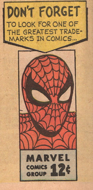
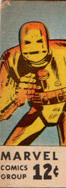
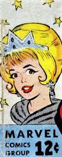
Ditko's corner box was heralded on the letters page of Amazing Spider-Man # 3, a month after it appeared on Marvel covers. The heroes' face, with the Marvel Comics Group company name alongside the price, was an attractive design.  

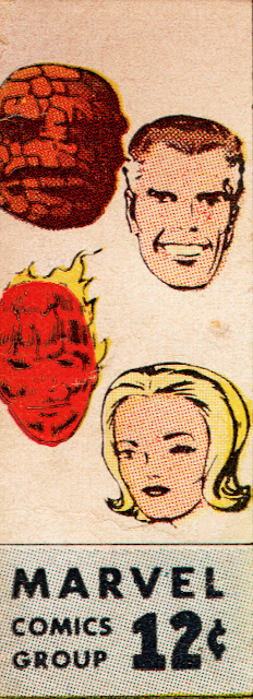
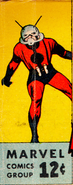
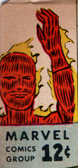
Given the go-ahead, Lee and Brodsky brought in Jack Kirby, their top artist-creator, to illustrate most of the new images, which I'll kindly reproduce below, along with the first cover appearance. 

Fantastic Four # 14. Kirby pencils and inks. 


 Tales to Astonish featuring Ant-Man # 43. Kirby pencils and inks. 


                   Strange Tales starring The Human Torch # 108. Kirby pencils and inks.

                            Journey into Mystery with Thor # 91. Kirby pencils and inks.

 Tales of Suspense featuring Iron Man # 41. Kirby pencils; Don Heck inks, taken from the cover of Suspense # 39. (this appears to be the only artwork that was not newly crafted)  


Millie the Model # 114. Stan Goldberg art.

Patsy Walker # 106. Art by Al Hartley.


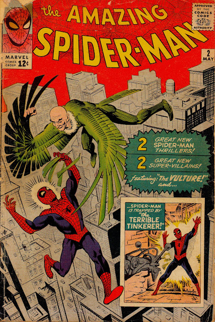
Ditko's corner box debuted on Amazing Spider-Man # 2. Artie Simek lettering, Stan Goldberg colors. 

There were four cover holdouts that did not yet adapt the new design (Kid Colt Outlaw # 110; Kathy # 22; Modeling with Millie # 22 and Two Gun Kid # 63) most likely because they were on stands in early February and produced before the concept was finalized. By the following month (dated May-June 1963) all of Marvel's comics included the corner symbol.     

Lee made mention of the new look in the Special Announcements Section of Fantastic Four # 16, July 1963:

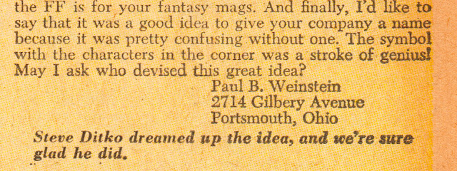
 He followed up two issues later, acknowledging Ditko's contribution in reply to a query from fan Paul Weinstein: 


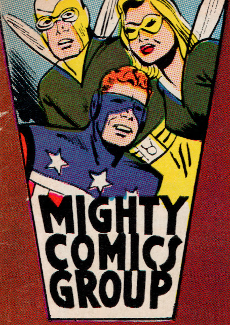
By the mid-1960s Marvel' was becoming so popular that rival Archie pilfered Ditko's corner logo and even christened their super-hero line "Mighty Comics Group".  Martin Goodman was reportedly not pleased and likely made it known to the publishers in no uncertain terms, since the design was shortly replaced. Art by Paul Reinman.   

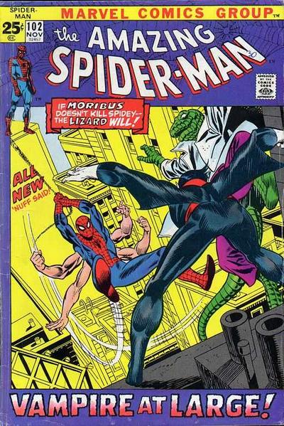
The  corner box was phased out with November-1971 dated titles. For a brief period the art was "framed" with copy appearing underneath, as seen above. Ditko's original concept as reinstituted less than five years later. Amazing Spider-Man # 101, Gil Kane pencils; Frank Giacoia inks; Morrie Kuramoto letters. 

Ditko's corner box was a staple of Marvel's covers for almost a decade, continuing until the summer of 1971. At that point it was decided to entirely revamp the cover layout, replacing the hero face/figure in a box with a less appealing open, and, for a period, circular design, moving the "Marvel Comics Group" logo to a banner atop each cover. This allowed less room for the art and made for a more crowded and cluttered cover. The original concept soon returned with minor tweaks, lasting into the 1990s. 


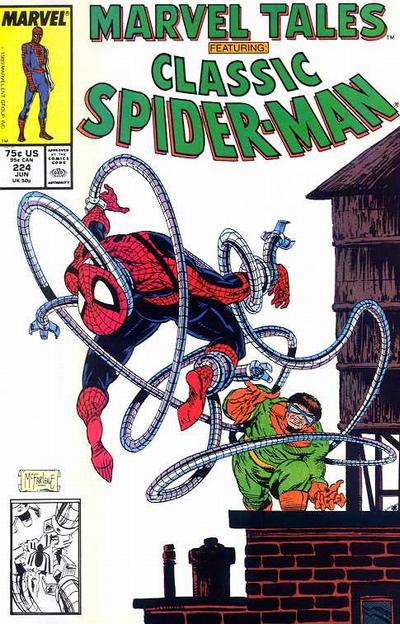
Decades later the corner symbol continued to be part of Marvel's cover design, as seen on Marvel Tales # 224, June 1989. Todd McFarlane art. It's worth pointing out that the Ditko-drawn Spider-Man image is taken from Amazing Spider-Man Annual # 2.  That classic pose appeared on covers for many years during John Romita's run on the Amazing Spider-Man.   

While Steve Ditko is justly praised for his contributions at Marvel as artist/plotter on Spider-Man and Doctor Strange and, to a lesser extent, his redesign of Iron Man and revamping of The Hulk, his concept and visualization of their corner trademark is often unnoticed. In a world where branding is an essential tool (and Stan Lee should also be recognized for promoting Marvel with great enthusiasm and success) it is noteworthy that his idea continues to endure into the present day, appearing on hardcover and trade paperback collections and the occasional comic book. It is truly a testament to the myriad levels of Ditko's versatility.        


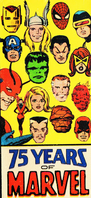
Taschen's monolithic 712 page book,  Marvel Comics From the Golden Age to the Silver Screen, authored by Roy Thomas, with contributions by yours truly, accompanied by my friends and fellow comics scholars and wise-guys Barry Pearl and Michael Vassallo, was edited and beautifully designed by Josh Baker. Fittingly, his choice for the book's spine display was Ditko's corner box, using many of the same images that appeared on the covers all those decades ago.